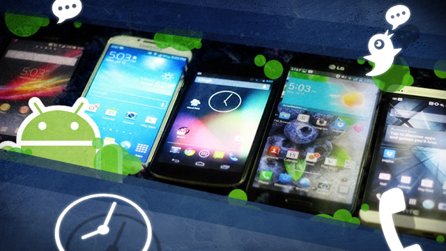

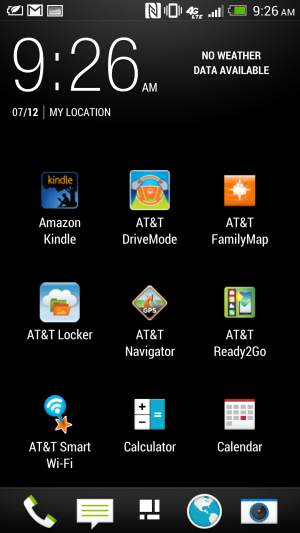
Lock screens, home screens, and settings, too
Home screens and lock screens are perhaps the most important element of a user interface because that's what the user will deal with the most. Think about it: every time you turn on your phone, you see the lock screen. We need to consider how many swipes it takes to get to the thing you want to do from the time you unlock your phone to the next executable action. (And hopefully there are some shortcuts that we can implement along the way to save time.)
The lock screen on the stock version of Android 4.2.2 Jelly Bean.
On stock Android 4.2.2 Jelly Bean, Google included a plethora of options for users to interact with their phone right from the lock screen. The Jelly Bean update that hit late last year added lock screen widgets and quick, swipe-over access to the camera application. The lock screen can also be disengaged entirely if you would rather have instant access to your applications by hitting the power button.

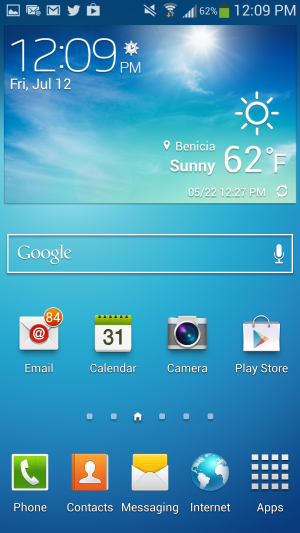
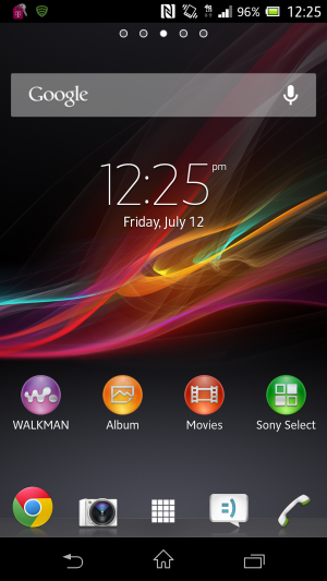
The home screen on the Galaxy S 4.
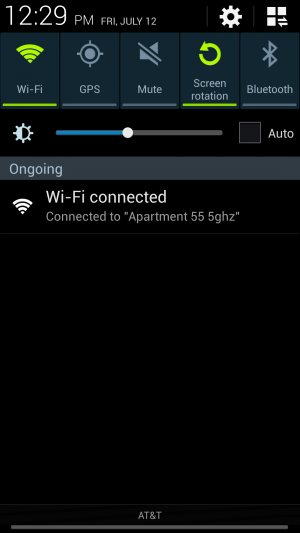
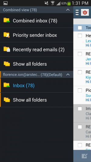
The lock screen on Samsung's TouchWiz.
In TouchWiz, Samsung kept the ability to add multiple widgets to the lock screen, including one that provides one-touch access to favorite applications and the ability to swipe over to the camera app. You can also add a clock or a personal message to the lock screen. TouchWiz even takes it a step further through the use of wake-up commands, which let you check for missed calls and messages by simply uttering a phrase at the lock screen. To actually unlock the device, you can choose to swipe you finger across the lock screen or take advantage of common Android features like Face unlock.
TouchWiz Easy mode is easy to set up...
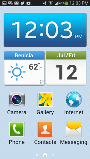
As for the home screen, Samsung continues to offer the standard Android experience here, except that it tacks on a few extra perks. Hitting the Menu button on the home screen will bring up extra options, like the ability to create a folder or easily edit and remove apps from a particular page. There's also an "Easy" home screen mode, which dials down the interface to a scant few options for those users with limited smartphone experience—like your technophobic parents, for instance. Easy mode will display bigger buttons and limit the interface to three home screens, though basic app functionality remains.
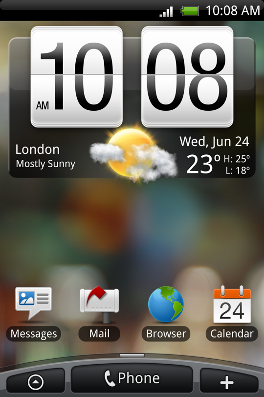
Sense 5's home screen.
Sense 5's lock screen.
The HTC One just recently received an update for Android 4.2.2, though we didn't receive it in time to update our unit for this article. Regardless, HTC's Sense 5 is a far cry from its interface of yore—but that’s not a bad thing. It features a flatter, more condensed design with a new font that makes it appear more futuristic than other interfaces.
And don't forget to choose your lock screen.
Choose your home screen—any home screen.
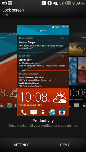
Rather than implement a lock screen widget feature, HTC lets users choose between five different lock screen modes, including a Photo album mode, music mode, and productivity mode, which lets you glance at your notifications.
HTC Sense's BlinkFeed aggregates information for at-a-glance viewing.
Sense’s home screen can be a bit of a wreck if you’re looking for something simplistic. Its BlinkFeed feature takes up an entire page. Though it’s meant for aggregating news sites and social networks that you set up yourself, you can’t link up your favorite RSS feeds. By default, it’s your home page when you unlock the phone. You can change the home page in Sense 5 so that you don’t have to actually use the feature, but it can’t be entirely removed.
The home screen.
The lock screen for the Optimus UI.
LG's lock screen is just as busy and impacted as Samsung's, with a Settings menu that's almost as disjointed. Like Samsung's, it offers different unlock screen effects, varying clocks and shortcuts, and the ability to display owner information in case you lose your phone. As for the home screen, Optimus UI offers a home backup and restore option, as well as the ability to display the home screen in constant Portrait view.

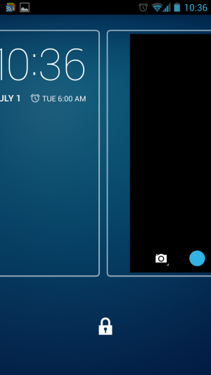
Sony's Xperia Z handset is currently limited to Android 4.1.2. Its settings are laid out like stock Android, but there is no ability to add widgets or different clocks to the lock screen. We'd expect this sort of thing to become available when the phone is updated to Android 4.2.
Notifications
Samsung's TouchWiz notifications panel.
In the latest version of Jelly Bean, Google introduced Quick Settings, meant to provide quick access to frequently used settings. This is one area where the OEMs were ahead of Google—many of the interfaces have integrated at least a few different quick settings options for a while now.
LG's crowded notifications panel.
Samsung's TouchWiz has been the most successful in implementing these features. You can scroll through a carousel of options or display them as a grid by pressing a button. LG’s Optimus UI borrows this same idea but overcrowds the Notifications panel with extra features like Qslide (more on this later). Even on the Optimus G Pro’s 5.5-inch display, the Quick Settings panel feels too congested to quickly find what you want without glancing over everything else first.
Sense UI's Notifications panel.
Xperia Z's Notification panel.
Sony and HTC kept it simple with their Notifications shade for the most part. Our HTC One and Xperia Z are running Android 4.1.2, so there's no built-in Quick Settings panel to take advantage of. Neither OEM implements its own version of the feature. The One's Android 4.2.2 update reportedly adds quick settings, and we assume that the same will be true of the Xperia Z when it gets its update.
App drawers
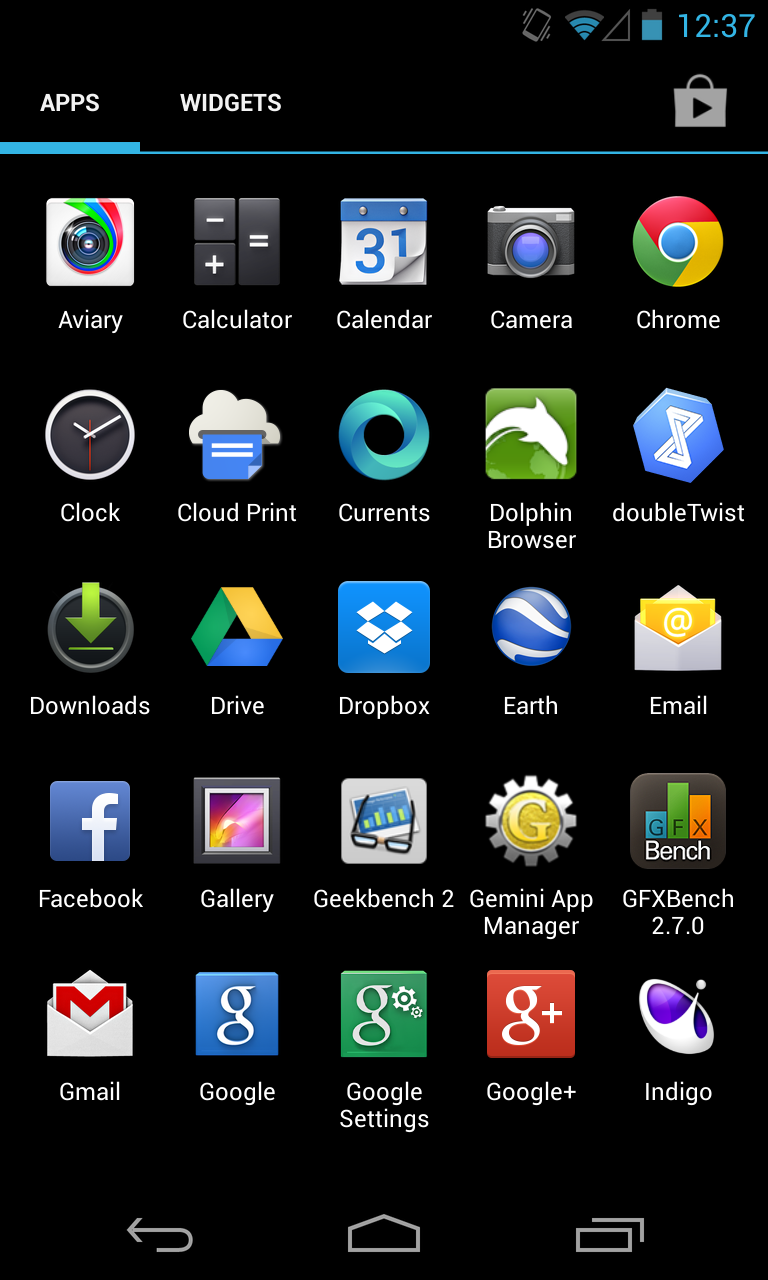
Android 4.2.2 stock app drawer.
Sony's Xperia Z app drawer.
The only OEM overlay that keeps it as simplistic and straightforward as stock Android is Sony. You can categorize how you want to display apps and in what order, but beyond that there's not much else between you and your applications. You can uninstall applications by long-pressing them and dragging them to the "remove" icon that appears rather than dragging them to one of the home screens.
LG's app drawer.
Samsung's app drawer.
That's not to say what Samsung and LG provide isn't user friendly. Both manufacturers offer additional options once you head into the applications drawer. LG enables you to sort alphabetically or by download date, and you can increase icon size and change the wallpaper just for the application menu. You can also choose which applications to hide in case you would rather not be reminded of all the bloatware that sometimes comes with handsets.
As for the Galaxy S 4, Samsung offers a quick hit button for the Play Store. You can view your apps by category or by type, and you can share applications, which essentially advertises the Play Store link to various social networks.
Sense 5's app drawer.
HTC's interface falls short when it comes to the application launcher. As Phil Nickinson from Android Central put it, the HTC Sense 5 application drawer makes simple look complicated. The grid size, for instance, appears narrower and takes up precious space. Rather than make good use of the screen resolution, HTC displays the apps in a 3-by-4 icon grid by default, with the weather and clock widget taking up a huge chunk at the top. You also can't long-press on an application to place it on a home screen. Instead, you have to drag it up to the top left corner and then select the shortcut button to finally place it on the home screen—apparently, this feature is fixed in the HTC One’s Android 4.2.2 update (but we've yet to try it ourselves). It’s a bit of an ordeal to make the app drawer feel "normal" as defined by the rest of the Android OEMs. In general, we feel like Sense takes the most work to achieve some level of comfort.
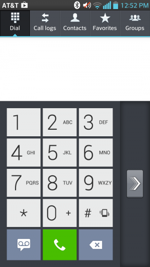
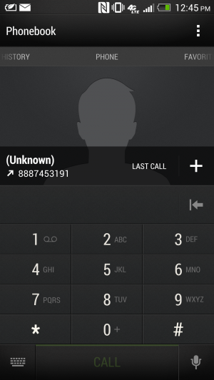
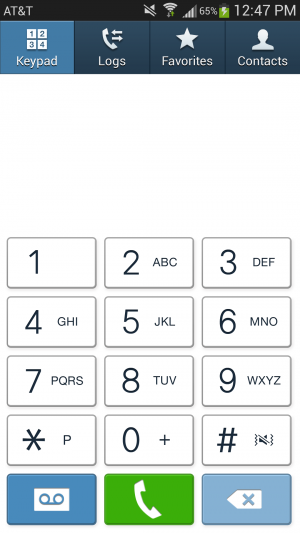
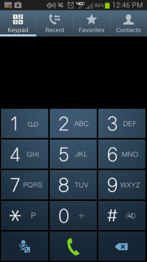
Dialers
LG's Optimus UI includes a setting that lets you switch the side the dialer is on so that it's easier to use with just one thumb.
The Optimus UI offers an information-dense Dialer app. You can sift through logs, mark certain contacts as favorites, and peruse through your contacts right from within the app. LG offers an option to make the dialer easy to use one-handed.
HTC's dialer application.
Although the Sense UI’s dialer layout feels a bit cramped, you can still bring up a contact from your address book by simply typing in a few letters of their name. You can cycle through your favorites, your contacts, and different groups. However, it would be more convenient if the Contacts screen worked like a carousel rather than a back-and-forth type of menu screen. Extra dialer settings also take up quite a bit of space at the top of the screen rather than being nested in menus as they are in other phones. Each screen in the Dialer has a different set of settings, which can be a bit confusing. Sense UI’s dialer app—and its overall interface—has a bit of a learning curve to it, but at least the aesthetic is nice.
The TouchWiz dialer on a Galaxy S 4 running Android 4.2.2.
The TouchWiz dialer on a Galaxy S III running Android 4.1.2.
Samsung’s Dialer interface also has a favorites list and a separate tab for the keypad, but otherwise It’s much more simplistic looking than the rest of TouchWiz. Sony kept the Dialer relatively untouched too, adding just an extra tab for favorites.
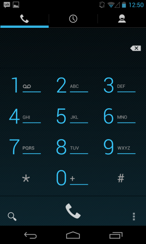
The stock Android dialer app.
In the end, Jelly Bean has the best, cleanest-looking dialer application. While the extra categories are a good idea for users with a hefty number of contacts and groups of people to compartmentalize, sometimes minimizing the number of options is better—especially in the case of an operating system that is wholly barebones to begin with.
Apps, apps, apps
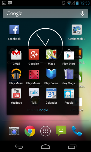
Google apps as far as the eye can see.
Google packs up a suite of applications with the stock version of Android to perfectly complement the company's offerings. On the Nexus 4 and the Google Play editions of the Samsung Galaxy S 4 and HTC One, you'll encounter applications like Google Calendar, Mail, Currents, Chrome, and Earth. Not all of the manufacturer’s handsets come with this whole set of apps out of the box. The regular edition of the Galaxy S 4, for instance, doesn't include Google Earth or Currents, but it does have the Gmail and Maps application. Some carriers will package up handsets with their own suite of apps, and carriers might also include things like a backup application or an app that lets you check on your minutes and data usage.
For the most part, however, these handsets do include their own versions of calendar and mail apps (though the Google Calendar app is available in the Play store, the non-Gmail email client isn't). They have camera apps with software tweaks that are compatible with the hardware contained on the device. Some handsets also have a bunch of extra features just because; Samsung is especially fond of this.
Camera applications
Perhaps the biggest differentiator between interfaces is the camera features and controls. We'll start with the HTC One, with its Ultrapixel camera and myriad features. You can use things like Zoe to stitch together several still images and create a Thrasher-like action photo or just combine two slightly mediocre photos to make one worthy of sharing on social networks. The Ultrapixel camera also automatically adjusts exposure and the like to produce a fine looking photo, as we found out when we tested it out in our comparative review of the Google Play edition of the HTC One and the standard version.
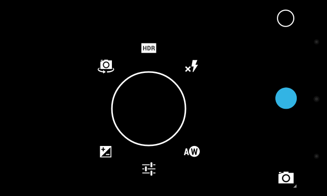
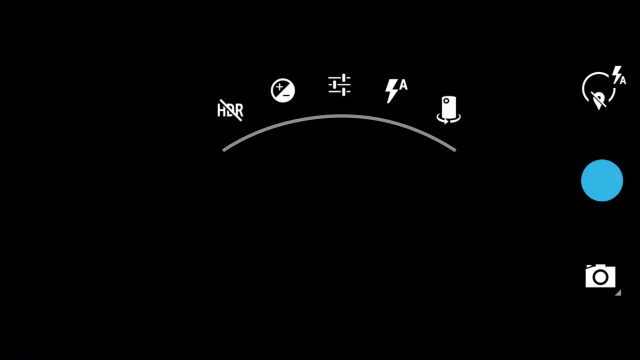
The stock Android camera application isn't totally devoid of features, however. Android 4.2.2's new camera UI has scroll-up controls that make it easy to quickly switch between things like Exposure and Scene settings. And while it could certainly use a little oomph like HTC introduced with its camera application, there is such a thing as too much good stuff—especially when you look at what LG and Samsung have crammed into their camera interfaces.
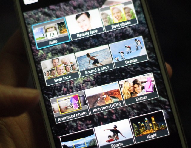
So many different camera modes to choose from on the Galaxy S 4.
Samsung's TouchWiz-provided camera application is a bit of a mess. On the Galaxy S 4, you'll have to deal with buttons and features splattered all over the place. There's a Mode button that lets you cycle between the 12 different camera modes—things like Panorama, HDR, Beauty face (which enhances the facial features of your subject), Sound & shot (which shoots a photo and then some audio to accompany it), and Drama (which works a little like HTC's Zoe feature). Those camera options are all fun to use from time to time, and you can change the menu screen from carousel to grid view so that you're not too overwhelmed by the breadth of options. But there are still so many buttons lining the sides of the viewfinder on the display.
There's also a general Settings button in the bottom corner that will expand out with more icons, taking up even more room on the screen. Below that are two buttons for switching between the front- and rear-facing cameras, as well as the ability to use the dual-camera functionality while snapping a photo. TouchWiz is great at offering a bunch of choices, but it can get a bit exhausting. If there were a more concise way of making these available, it would make the Camera application less intimidating to use.
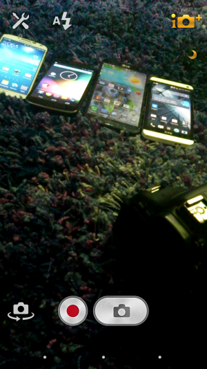
I'm not entirely sure what all of the symbols in LG's camera application stand for.
LG's Optimus UI camera application isn't any better. Rather than allowing the entire screen to be used as a viewfinder with icons that lay on top of it like with TouchWiz, the menu options take up the top and bottom third of the screen. It’s nice that LG offers a little symbol in the preview window to let you know how your battery life is doing and which mode you’re shooting in, but figuring out what symbol does what takes a bit of time. At least with Samsung’s large catalog of offerings, there’s an explicit description about what each camera function does.
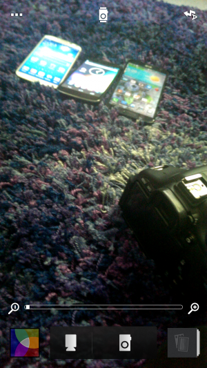
Sony's camera interface is easier to use, but the preview window is still surrounded by buttons and things.
Sony’s camera app is a bit easier to navigate. It has found the right medium between simplicity and feature-filled functionality. Unfortunately for its hardware, that doesn't translate over to how well the camera actually performs. But the interface is something that other OEMs should strive for: a straightforward, easy-to-use preview window that’s just what Goldilocks was looking for.
Where the camera application really matters is with handsets like the HTC One. That extra bit of software that HTC packs up with its One is essential for its camera functionality to operate at its prime. As our own Andrew Cunningham put it in his review of the Google Play edition of the HTC One:
...there are the HTC-specific features that the "ultrapixel" camera on the [GPe] One lacks, namely Zoe (which can stitch together several still images to convey action), the ability to stitch together "highlight movies" from short videos on your phone, and pretty much any feature that lets you combine two unsatisfactory photos to get one satisfactory one (like Always Smile or Object Removal). These have been replaced by a slightly tweaked version of the stock Android camera, which we assume will make it to the Nexus phones and tablets in the next release of Android.
Additionally, the Google Play edition One had some image quality issues when it shot in automatic shooting mode. The standard One—which is fueled by HTC's Sense 5—can adjust its exposure based on its surroundings. The Google Play edition—the stock Android 4.2.2 version—doesn't have those same software tweaks in its camera application.
In some ways, this is actually the best argument for why you would consider an OEM-tied Android handset over an unlocked, stock one: the software has been tweaked to work best with that specific handset's internals.
Calendars
In May, Google Calendar got a makeover in addition to color-coded functionality in order to vary days and events for each calendar. The new interface was particularly focused on streamlining the design aesthetic across all Google applications, and while the update didn't introduce too many new features, it did make Google's Calendar app a little more palatable.
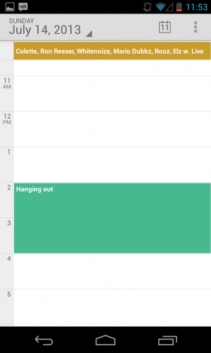
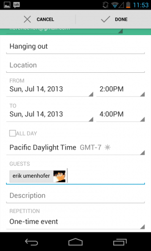
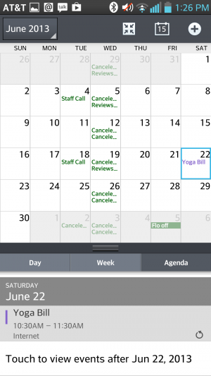
Samsung's TouchWiz calendar application.
Samsung's calendar application is not the prettiest thing to look at, but it's certainly feature-filled. Users can switch between six different calendar view modes and four different view styles, including the ability to view the calendar in a list or pop-up form. There are also a number of minor settings that you can individually adjust, including the ability to select what day your week should start on.
Sense 5's calendar app.
HTC's Sense uses its own proprietary calendar application, too. You can sync your accounts, choose the first day of the week, set the default time zone (and another if you travel frequently), and even display the weather within the calendar app. At the bottom of the screen, Sense will show upcoming events at a glance, and you can tap to add more throughout the day. You can also sort your calendar by meeting invitations.
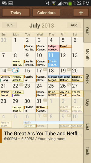
LG's calendar app.
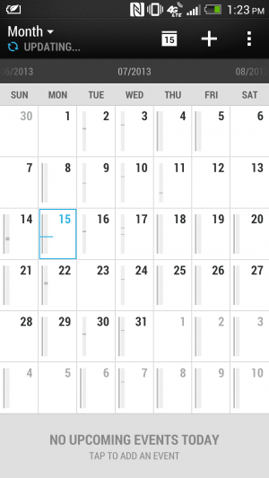
Sony's calendar app.
LG's Optimus UI employs a similar interface to Sense UI’s with the calendar view at the top and tasks for meeting invitations available at the bottom. Still, it doesn't feel as informative as what stock Android and Samsung are putting forward. Sony provides a Calendar app that uses a similar icon to Google's stock app, and while the interface looks the same, it doesn't have the color-coding abilities of Google Cal.
The Nexus 4 and Google Play edition handsets come with their own suite of Google-branded applications, including two e-mail apps: Gmail and a nondescript Email app. While Gmail is a little more feature-filled, with the option to use things like Priority inbox, the Email app's interface appears a little barren. You can add Exchange, Yahoo!, Hotmail, and other POP3/IMAP accounts to it or add your Gmail account to keep them synced up in one app. However, with the app's straightforward nature, there's not much else to it. Mail applications offered by other manufacturers don't veer too far from what's here, though. They essentially offer the same basic functionality and settings across the board.
...the server settings are annoyingly featured at the end.
From one interface to the other...
Annoyingly, most of the Mail apps, like Samsung's and LG's, bury server settings at the very end of the settings panel. But all of them take a page out of stock Android's book by providing a combined inbox view, which is especially helpful if you're juggling between a myriad of different accounts.
Samsung features a combined inbox view, just like stock Android's.
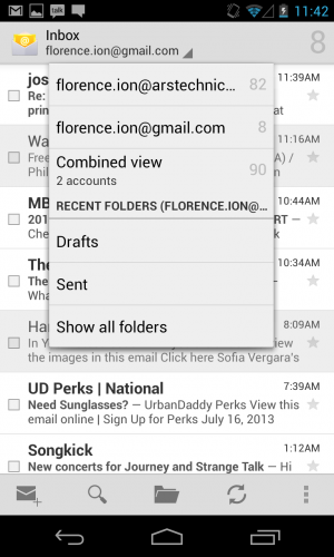
Stock Android's combined inbox view.
HTC's e-mail application has the same design as its other OEM-offered proprietary applications, but it's much easier to navigate than other apps. The Settings button resides at the top of the page with a bunch of options, including the ability to add an account or set an "out of office" message. From there, you can even access additional settings. HTC also provides a couple of different sync settings, for instance, to help preserve battery life.
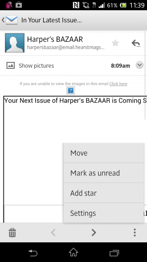
Sony's Mail app is so simple.
Sony's Mail application is nice and easy as well. You can hit the settings button in the bottom right corner to mark a piece as unread, star it, move it to another folder, or access the general settings panel.
Other apps
With each OEM overlay comes a whole set of applications that could prove to be useful in the end. Except Samsung's, that is—the manufacturer has bundled a huge set of features and capabilities that feel redundant and might even suck the life out of your battery if you're not careful.
Samsung includes its own app store with TouchWiz.
The Galaxy S 4 comes preloaded with a bunch of applications, including Samsung's own app store, entertainment hub, and app that enables you to access content on your phone from a desktop computer. The only perk of signing up for a Samsung account and going that route is being able to track where your phone is in case you lose or misplace it. Samsung can back up phone data too.
But there's more where this came from. Samsung includes a remote control application for your television called Samsung WatchON, but it's only compatible if you have an active cable or satellite television subscription. There's also S Health, which helps you manage your lifestyle and well-being. And if you're a hands-free type of user, you can take advantage of gesture-based functionality like Air gestures or enable the screen to keep track of your eye movement.
It will pop up in a desktop-like window on your screen.
Select the "small app" you want to use from the running apps screen.
Samsung isn't the only offender when it comes to stuffing applications and features onto its flagship handsets, however. Sony oversaturated its own music and movie store, and it has a Walkman music-playing application alongside Google Music. When you hold down the Menu button, there's a row of "small apps" that gives you quick access to things like the browser, a calculator, and a timer. We covered these briefly in the Xperia Tablet Z review, but they work the same on the Xperia Z handset: once you launch the "small" app, the app will appear in a pop out screen on top of the interface. It's kind of like multitasking.
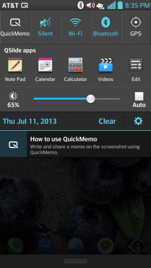
The Qslide multitasking app lets you do things like take notes while you're doing other stuff.
LG, on the other hand, lets the carrier pack it with apps. LG then includes a multitasking feature called Qslide. You can choose from several Qslide-compatible applications that pop up over an open application in order to do things like leave a note and use the calculator. It also has a setting that turns off the screen when you're not looking.
Among all phones, there are a great number of features and apps to adapt to using. While I don't find things like Samsung's Air gestures and Smart scroll gimmicky, it can get frustrating to venture into the apps drawer only to find it crowded with icons of applications that you will never use. Some of these features and apps are things you'd never find packed up with the stock version of Android—because they're not always necessary.
The future
We're still waiting to hear about Android 4.3 and what it will bring to the mobile platform. Every time Google launches an update, you can bet that the manufacturers will follow suit with their interfaces (you know, eventually). That's what causes the biggest conundrum for Android users. I had things like Quick Settings already available on my Galaxy S III before Google natively implemented them into Android 4.2 Jelly Bean, but for the OEMs that didn't build their own version of this feature, I'm constantly at the mercy of my carrier and the manufacturer. They dictate when I'll receive my update for the latest version of Jelly Bean.
The biggest gripe about OEM overlays is that each company is selling its own brand of Android rather than Google's. Remember the Android update alliance? That didn't work out too well in the end. Carriers and hardware makers aren't keeping their promises, and as that trickles down to the consumer, it eventually confuses the public. As Google attempts to implement interface and performance standards, manufacturers will go ahead and hire a team to make Android look virtually unrecognizable. Samsung's app and media store sort of feels like an insult at times, but it knows that it doesn't have all the clout to make strides with its own mobile operating system.
There is a silver lining to all this, at least for purists: why should you even bother with OEM interfaces when you can now purchase two of the most popular handsets with stock Android on them? Google has already said that it will be working with the providers of Google Play edition phones to provide timely updates, so you certainly don't have to worry about fragmentation or waiting around to get the latest version of Android.
The OEMs have provided several different experiences for both hardcore and novice Android users alike, which has only contributed to the proliferation of the platform. Here at Ars, we prefer the stock version of Android on a Google-backed handset like the Nexus 4 and Google Play editions. Even if they're not chock full of perks and applications, they'll receive the most timely updates from Android headquarters, and their interfaces are mostly free of the cruft you get from the OEMs. For many consumers, it might not matter when Google chooses to update the phone, but for us, we like to know that Google is pushing through the software updates without any setbacks.
In the end, choosing an OEM-branded version of Android means that you're a prisoner of that manufacturer's timeline—an especially unfortunate situation when that manufacturer decides to stop supporting software updates altogether. We've said it time and time again—in the end, it's really your experience that will determine which interface suits you best. So as far as the future of Android goes, it's not just in Google's hands.
