The Microsoft Surface RT is a PC. It’s not a mobile device and
it’s not a tablet, it’s a PC. And Microsoft’s first self-branded
computer. It is, in short, the physical incarnation of Microsoft’s
Windows 8.
The expectations and competition for the Surface are daunting. It’s
been said that Microsoft built the Surface to show up HP, Dell, and the
rest of the personal computing establishment. PC sales are stagnant
while Apple is selling the iPad at an incredible pace. But the Surface
is something different from other tablets. Microsoft built a PC for the
post-PC consumer and chose to power it with a limited operating system
called Windows RT. These trade-offs, real or imagined, are what really
makes or breaks this device.
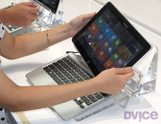
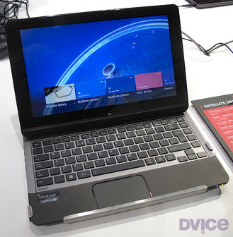
While the Surface RT is a solid piece of hardware, there are a few
things that makes the device a bit hard to handle. The Surface RT is a
widescreen tablet. It’s 16×9, making it a lot wider than it is tall, so
using this 10.6-inch tablet is slightly different from an iPad or Galaxy
Note 10.1. When holding it properly, that is, in landscape, it’s a bit
too long to be held with one hand. Likewise, when holding it in
portrait, it’s too tall to be held comfortably one-handed. In fact, it’s
slightly awkward overall.
For starters, it’s rather tough to type efficiently on the Surface
RT’s on-screen keyboard when holding the tablet. I’m 6 feet tall and
have normal size hands; I cannot grasp the Surface and hit all the
on-screen keys without shifting my hands. Moreover, when holding the
Surface in this orientation, I cannot touch the Windows home button.
Windows 8 compensates for this flawed design by incorporating an
additional Windows home button into a slide-out virtual tray activated
by a bezel gesture.
It’s clear Microsoft designed the Surface RT to be a convertible PC
rather than a tablet with an optional keyboard. This is an important
distinction. By comparison, tablets such as the iPad and Galaxy Note
10.1 feel complete without anything else. I own a Logitech Ultrathin
Keyboard and use it daily. But only for work. I enjoy using the iPad
without it. Due equally to Windows 8 and the large 16:9 form factor, the
Surface RT is naked without a $119 Touch Cover.
Without a Touch Cover, the Surface RT feels incomplete in design and
function. The problem here is that the Surface is basically a big laptop
screen without the keyboard. The cover rights the design’s wrongs by
forcing the user to use the physical keyboard rather than the on-screen
keyboard. Microsoft knows this. After all, Surface is rarely advertised
without a Touch Cover, but that doesn’t alleviate the sting of paying
another $100+ for a keyboard.
The Surface RT runs a limited version of Windows 8 called Windows RT.
It shares the same ebb and flow as Windows 8, which is a radical take
on the classic operating system. The operating system was clearly built
for the mobile era and it shows promise. But right now, at launch,
Windows RT needs work. Most of the apps are limited in features and the
touch version of Internet Explorer is slow and clunky. Pages load very
slowly and the bezel gesture to switch between tabs is unreliable and
buggy. And worse yet, due to Windows RT’s lack of apps like Facebook or
Twitter, you’re forced to use Internet Explorer for nearly everything.
Don’t expect to load your favorite Windows applications on the Surface
RT. It’s just not possible. Think of this as Windows 8 Lite, a cross
between a desktop and a mobile OS.
Despite its shortcomings, the Surface RT is a very functional
productivity device in a traditional sense. I wrote the majority of this
review on the Surface with the $129 Type Cover. It feels like an
ultraportable Ultrabook. Using Windows RT’s classic Desktop mode, I was
able to compose and edit within TechCrunch’s WordPress back-end as if I
was sitting at my Windows 7 desktop. In this use, the Surface outshines
other tablets as it allows for a full desktop workspace. But here is
where the problem lies – the Surface acts like a tablet and ends up
working more like a notebook. This interface between flat tablet and
horizontal laptop is frustrating and confusing.
Physically, the Surface feels like it’s from the future. It employs
just the right amount of neo-brutalist industrial design. The casing is
made out of magnesium alloy, called VaporMg by Microsoft, which is more
durable and scratch resistant than aluminum. The iPad feels pedestrian
compared to the Surface. But the iPad is a different sort of device.
Where the iPad is a tablet, the Surface is convertible PC.
The Surface’s marque feature is a large kickstand that props the
tablet at a 22 degree angle. The Kickstand pops out with an air of
confidence. A hidden hinge snaps it away from the body and likewise,
when collapsing the kickstand, the hinge forcefully snaps it back in
place.
Unlike most tablets, the Surface sports a large range of I/O ports.
Along with the bottom-mounted Touch Cover port, there’s a microHDMI
output, microSDXC slot, and a full-size USB port for connecting a
camera, phone, USB flash drive, or XBOX 360 controller. This last
feature sets the Surface apart from other tablets, allowing the Surface
to nearly match the functions of a laptop.
You cannot pick up a Surface and be disappointed by the feel.
Remember, the Surface is a PC, not a tablet in the traditional sense.
It should have all these ports and, although it looks comical, a
full-sized USB port on this tablet is absolutely necessary.
There are front and rear cameras, 802.11a/b/g/n Wi-Fi, Bluetooth 4.0
and a non-removable battery. There are no 3G or 4G wireless connectivity
options. The speakers are nice and loud (but not booming), though there
is very little bass in the sound.
The Surface feels fantastic. The hardware is its strongest selling
point. You cannot pick up a Surface and be disappointed by the feel.
There isn’t another tablet on the market with the same build quality or
connectivity options in such a svelte package, including the iPad.
Microsoft didn’t just build the Surface. The company also spent
resources developing the Surface’s Touch Covers. These covers, one with
physical keys and the other with touch-sensitive keypads, magnetically
snap onto the bottom of the Surface like Apple’s Smart Covers.
Both versions of the Touch Covers enhance the overall feel of the
device. It’s impossible not to appreciate the Surface’s design when you
snap one of these covers onto the Surface, close it up, and carry it
around. I’m completely taken by the feel of the Surface.
The Surface is ungainly large when deployed.
The Touch Covers work equally as well as they look. There are two
versions: one has chicklet keys that feel a lot like the keyboards used
in Ultrabooks. This version is called the Type Cover and costs $129. The
$119 Touch Cover uses touch-sensitive buttons that do not physically
move. This Touch Cover is half as thin as its brother, but after
spending a week with both, I found I was about half as productive on the
Touch Cover versus the Type Cover (see WPP chart below). Both have
little touchpads with right and left clicking buttons under the
keyboard.
However, the Touch Covers reveal the Surface’s fundamental flaw: The
Surface is ungainly large when deployed. When used with the Surface’s
kickstand and a Touch Cover, the whole contraption is 10-inches deep.
That’s the same depth as a 15-inch MacBook Pro. An iPad with a Logitech
Ultrathin Keyboard is only 7-inches deep; most ultrabooks are 9-inches
or under. A Surface with a Touch Cover barely fits on most airplane
seat-back trays; it doesn’t work at all on the trays that pull out of an
armrest. That’s a problem.
The sheer size of the Surface negates its appeal. At 10-inches deep
with a Touch Cover, when used, it’s larger than many more capable
ultrabooks. Additionally, with the nicer Type Cover, the Surface isn’t
much thinner or less expensive than many full-powered notebooks.
The Touch Covers of course are optional, but Microsoft saw them as a
key component for the device. Look at the market or pre-release press
coverage: a good amount of the message is about these Touch Covers and
not the Surface RT itself. Microsoft is attempting to see them as one
unit. To Microsoft, it’s not if Surface buyers are going to purchase a Touch Cover, but rather when. It’s expected. Unfortunately the Touch Covers are not as functional as keyboards for other tablets.
As previously mentioned, the Touch Covers magnetically snap onto the
bottom of the Surface and then the kickstand props the screen at a
pleasing angle. But the connection point is not rigid. Pick up the
Surface and the Touch Cover dangles in place.
This design makes it very hard to use the Surface with a Touch Cover
anywhere but a tabletop. It needs a 10-inch deep flat surface. I could
not use the Surface with a Touch Cover sitting in an armchair, walking
around, or laying on my back in bed. Forget about using it on the
commode; it sits too precariously on the legs for comfort. These are
use-cases that I do nearly daily with my iPad and Logitech Ultrathin
Keyboard. The Surface is only usable when seated at a table or desk.
The Surface RT uses a 10.6-inch 16×9 ClearType HD Display at
1366×768. The screen can handle 5 points of contact at once. Indoors,
the screen is deep and rich with vibrant colors. Colors wash out in
direct sunlight and the glossy overlay results in a lot of glare — but
slightly less glare than the iPad’s. The screen is fairly sharp, but
overall is far inferior to the Retina screen in the new iPad or even the
screen found in the iPad 2.
When sitting side-by-side, it’s easy to see the difference between
the Surface RT and new iPad, both $499 tablets. The new iPad is more
detailed and the colors are much more accurate. There is no contest,
really. The Retina display in the new iPad has nearly twice the
resolution of the Surface’s and can handle 10 points of contact instead
of just 5. The Retina screen is brighter, has a deeper color palette,
and, most importantly, makes text easier to read thanks to the higher
resolution screen.
Microsoft advertises its tablet with a keyboard and mouse.
I found the Surface RT’s screen to be a tad frustrating at times. It
seemingly doesn’t register touches properly. I often had to reattempt
selecting a particular on-screen item. The Surface RT (or maybe it’s
Windows RT?) is not as accurate as I would like it to be. This happened
more often in the classic Desktop environment where the buttons and
elements are lot smaller than those found in the new tile interface.
But per Microsoft’s marketing, the interaction with the display is
not as critical with the Surface as, say, with an iPad or Galaxy Note
10.1. That’s where the Touch Covers with their little trackpads come
into play. Apple and Samsung advertise their tablets’ touchscreen
capabilities. Microsoft advertises its tablet with a keyboard and mouse.
The Surface RT packs two 1MP cameras: one on the front, one on the
back. They’re a joke. The picture quality is horrible under any lighting
condition and completely unacceptable for a $500 device. See the
examples below.
Note: Results are based on a standardized test that requires the
device to search Google Images until the battery is depleted. The
screens are set to max brightness.
The Surface RT cannot write its own story. Unfortunately for the
Surface RT, its fate rests solely in the hands of Windows 8, and
moreover, Windows RT. No matter how good the hardware is, the operating
system makes or breaks the device. As it sits right now, at the launch
of Windows 8/RT, the experience is a mish-mash of interfaces and the
experience is poor.
At launch, Windows 8 feels like a brand-new playground built in an
affluent retirement complex. It’s pretty, full of bold colors, seemingly
fun, but built for a different generation. Microsoft is clearly
attempting to bring relevance to Windows with the touch-focused
interface and post PC concepts but is unwilling and unable to fully
commit completely to touch.
Again, the Surface RT runs a version of Windows called Windows RT.
This is not Windows 8, although they look and work very similarly. It’s
stripped down, and designed to run better on mobile computing platforms.
The main difference is Windows RT requires apps be coded for ARM
processors rather than x86/x64 chips that have powered Windows computers
since Windows 3.1. This means users cannot replace Internet Explorer
with Chrome (even in Desktop) until Google releases a version of Chrome
coded specifically for Windows RT. Likewise, a trusty version of the
Print Shop Pro application cannot be installed on Windows RT, or for
that matter, nearly any other Windows application built over the last 20
years. For that, you’ll need a Surface Pro which runs Windows 8 on an
Intel CPU.
As of this review’s writing, Microsoft had yet to detail the price or
release schedule of the Surface Pro. It is expected to hit stores by
the end of 2012 for around $1,000.
Windows 8/RT is different. It’s a stark departure from previous
Windows builds. It’s built for the post-PC world but still holds onto
the past with a classic desktop mode. It boots to the touch-friendly UI,
previously called Metro and now called Modern UI, where apps are
presented in a pleasing grid. This is also the Start Menu, so there is
no longer a comfortable Windows button to click to get around the OS.
Like Windows Phone, most of the tiles representing the apps are live,
providing quick insight into the content held within. The tile for the
application called Photo previews the pics within the app. Mail shows
the sender and subject line of the last received message. Likewise,
Weather shows the current weather, Messages shows the top message, and
People shows the latest social media update. It’s a smooth, versatile
and smart take on a mobile tablet OS.
The Surface seems built specifically for the touch interface. The
16:9 screen matches the widescreen flow of the operating system
perfectly. The Surface utilizes bezel gestures to hide menus. Starting
with your finger on the Surface’s black bezel, slide onto the screen to
reveal a menu tray. Done on the right side displays the main menu where
most options are held. Done on the left switches between applications.
Make a quick on and off swipe on the left side to display the
application switcher. Most apps also have customized option drawers on
the top and bottom of the screen.
These hidden menus allow the apps to take full advantage of the
screen; there’s no need to display a menu bar when they’re just a bezel
swipe away.
Microsoft itself didn’t fully commit to the touch interface.
As great as Windows 8/RT looks, it sadly fails to provide a cohesive user experience.
Even though Windows RT features myriad next-gen features, most of
them are half-baked at launch. The application store is missing key
apps, the single sign-on fails to sync user profiles across devices, and
the social sharing features do not nativity include Twitter or
Facebook.
Microsoft itself didn’t fully commit to the touch interface. Windows
8’s dependency on the classic environment will not allow the Surface to
be a tablet. Half the apps pre-installed on the Surface RT launches in
the classic desktop interface, most notably Microsoft Office, where the
smaller user elements do not play nicely with the touch interface.
Windows traditionalists will find the Classic interface a lovely
memory of the good ol’ times. Most everything is where it’s supposed to
be – besides the Start Menu – and it runs and acts like Windows 7. But
for the Surface, with its 10.6-inch 16:9 screen, it’s hard to use with
the touchscreen alone. The elements are too small to efficiently be
controlled with just touch. After all, the Desktop emulates an
environment designed a several generations ago for use with a keyboard
and mouse.
Windows RT is launching fairly bereft of apps. Windows RT ships with an
app store but right now there isn’t anything worthwhile available
besides Evernote and Netflix. The operating system is on the verge of
launching and it doesn’t have the support of a vast library of apps.
There isn’t a Facebook app. Twitter is missing, as well as anything
pertaining to Google Apps. There is no Dropbox, Fruit Ninja, or Angry
Birds. And don’t trust the application store: there are a bunch of 3rd
party apps masquerading as official apps. Worse yet, IE 10 is painful to
use.
Windows 8/RT ships with two different versions of Internet Explorer.
One lives in the new touch interface and the other lives a different
life in Desktop; both are completely oblivious to each other’s
existence. Open up a couple of tabs in one and the other does not
replicate the behavior. The Internet Explorer in Desktop is the good ol’
IE — it should be very familiar to most. The one in the touch interface
is completely different. It’s slow and clunky. Thanks to larger
buttons, it’s easier to use by touch, but that’s its only redeeming
quality. I hate using it.
The lack of apps is one of the Surface’s main downfalls.
The sad state of Windows RT’s application store is eerily similar to
that of Windows Phone. Launched nearly two years ago, the application
selection on Windows Phone still pales in comparison to that of Android
or iOS. Microsoft has spent two years attempting to get developers
on-board its smartphone platform. Will developers ignore Windows RT as
well? No one knows and that’s the trick.
It’s true that the iPad launched with very few apps, but owners could
also run iPhone apps while the legions of iOS developers furiously
adapted to the larger screen. Windows 8/RT lacks the ability to run
mobile apps and Microsoft seemingly doesn’t have the same sort of rabid
developers at its disposal (otherwise there would already be apps).
Bing Apps
Moments after the Surface is turned on for the first time, it’s easy
to dive right into content thanks to Bing Apps. Bing Daily, Bing Sports,
Bing Sports, Bing Travel, and Bing Finance look fantastic and they’re
loaded with content. With large lead photos and strong headlines,
they’re sure to be some of the most used apps — until Windows 8 is
embraced by 3rd party devs at least.
These apps offer a lot of info. For instance, Bing Sports leads with
the news, but swipe left and it reveals the schedule for user-designated
teams. Swipe a little more to reveal standings charts. The next section
shows panels of leading players followed by panels of the leading teams
of the default sport. Swipe a little bit more and you get a large
advertisement.
The Surface ships with ad-supported apps installed. Every Bing App
has a single ad located at the end of its news feed. It’s a little shady
but not exactly scandalous.
Video
The Surface seems designed specifically to watch movies with the 16:9
screen. Launch the video player app and it immediately loads the Xbox
Video store. This app can playback movies loaded on the internal storage
or microSD card, but it’s primarily designed to be a video store. And
like the Xbox dashboard it emulates, there are ads here too.
Xbox
Video offers a good selection of movies but they’re a tad pricey like
on iTunes. The Avengers in HD costs $20; it’s $15 on Amazon. A single HD
episode of The Walking Dead costs $2.99 on Xbox but $1.99 on Amazon.
The Surface RT lacks a powerful video playback solution. Microsoft
didn’t include Windows Media Player or Windows Media Center in Windows
RT. The included video app is very limited but it did manage to playback
720p .avi files off of a microSD card. Fans of sideloading content,
however, may find themselves disappointed.
Photos
The Windows RT photo app is a thing of beauty. It’s fast, flexible
and easily pulls in photos from Facebook and Flickr. It’s deeply
integrated into Windows RT so sharing and printing is built in.
Once authorized, the app can access Facebook photos and videos and displays them in such a way as if they’re stored locally.
While the app runs great, it lacks any editing tools — even basic
items like cropping are missing. It’s mostly designed to show off the
screen and UI elements.
The Surface launches to a crowded market dominated by just a few
players. The $499 iPad is the top tablet in the world, currently
commanding a dominant portion of the tablet market share. The $199
tablets, the Kindle Fire HD, Nexus 7, and Nook Tablet HD, offer a lot of
tablet for the money. But Surface is fundamentally different from the
aforementioned options.
The Surface is a convertible PC, meaning it’s a personal computer
with a detachable keyboard, not a consumer tablet. The Surface is
incomplete without a Touch Cover. It’s not designed to simply be a
tablet. It’s too large and clunky to be used without a keyboard.
With its awkward size and incomplete operating system, the Surface
fails to excel at anything particular in the way other tablets have. The
iPad provides better casual computing. The Android tablets sync
beautifully with Google accounts and the media tablets by Amazon and
B&N offer an unmatched content selection.
The Surface’s closest natural competitor is a budget Ultrabook. But
even here, most Ultrabooks run Windows 8 rather than Windows RT,
allowing for the full Windows experience. Plus most Ultrabooks have a
larger screen but smaller footprint when used, offer longer battery
life, and are generally more powerful.
Microsoft built the Surface to be a Jack of all trades, but failed to make sure it was even competent at any one task.
Should you buy the Surface RT? No.
The Surface RT is a product of unfortunate timing. The hardware is
great. The Type Cover turns it into a small convertible tablet powered
by a promising OS in Windows RT. That said, there are simply more mature
options available right now.
Microsoft needs to court developers for Windows RT. As a consumer
tablet, the Surface lacks all of the appeal of the iPad. There aren’t
any mainstream apps and Microsoft has failed to connect Windows desktop
and mobile ecosystem in any meaningful way like Android or iOS/OS X.
Windows RT is a brand new operating system that is incompatible with
legacy Windows software. This immediately limits the appeal since the
Surface RT is dependent on Windows RT’s application Store – a storefront
that is currently devoid of anything useful.
The Surface RT isn’t a tablet. It’s not a legitimate alternative to
the iPad or Galaxy Note 10.1. That’s not a bad thing. With the Touch
Covers, the Surface RT is a fine alternative to a laptop, offering a
slightly limited Windows experience in a small, versatile form. Just
don’t call it an iPad killer.
If properly nurtured, Windows RT and the Surface RT could be
something worthwhile. But right now, given Microsoft’s track record with
Windows Phone, buying the Surface RT is a huge risk. The built-in apps
are very limited and the Internet experience is fairly poor. Skip this
generation of the Surface RT or at least wait until it offers a richer,
more useful experience. While we’re bullish on Windows 8, the RT
incarnation just isn’t quite there.
Is it heavy?
Not heavy, but solid. Listed by Microsoft as “under 1.5lbs”. The new iPad with 3G is 1.46 lbs.
How much does the Surface cost?
$499 for the 32GB. $599 for the 32GB plus Touch Cover. $699 for 64GB plus Touch Cover.
Who should buy one?
Very few people. Perhaps a student who already utilizes Microsoft’s
cloud storage system, SkyDrive, and is looking for a compact note-taking
device that can sometime play a movie.
Is there a lot of glare?
Yes, but no more than other tablets.
Is the Kickstand adjustable?
No, locked in at 22 degrees.
Can I open up the Surface?
Yes, the backplate is secured with 12 Torex head screws.
Can I download pictures from my camera to the Surface?
Yes, from the microSD card slot or over USB.
Does the Surface work with 3G/4G networks?
No, the Surface RT does not have a built-in cellular modem and
because of Windows RT’s application requirement, you cannot install a
carrier’s application for USB modems. A WiFi hotspot will work
Does Windows RT have a lot of apps?
No, it likely doesn’t have any of your top apps. The most popular ones in Windows RT is Netflix and Kindle.
Swipe, swipe, pinch-zoom. Fifth-grader Josephine Nguyen is researching the definition of an adverb on her iPad and her fingers are flying across the screen. Her 20 classmates are hunched over their own tablets doing the same.
Conspicuously absent from this modern scene of high-tech learning: a mouse.
Nguyen, who is 10, said she has used one before — once — but the
clunky desktop computer/monitor/keyboard/mouse setup was too much for
her.
“It was slow,” she recalled, “and there were too many pieces.”
Gilbert Vasquez, 6, is also baffled by the idea of an external pointing device named after a rodent.
“I don’t know what that is,” he said with a shrug.
Nguyen and Vasquez, who attend public schools here, are part of the first generation growing
up with a computer interface that is vastly different from the one the
world has gotten used to since the dawn of the personal-computer era in
the 1980s.
This fall, for the first time, sales of iPads are
cannibalizing sales of PCs in schools, according to Charles Wolf, an
analyst for the investment research firm Needham & Co. And a growing
number of even more sophisticated technologies for communicating with
your computer — such as the Leap Motion boxes and Sony Vaio laptops that
read hand motions, as well as voice recognition services such as
Apple’s Siri — are beginning to make headway in the commercial market.
John Underkoffler, a former MIT researcher who was the adviser for the high-tech wizardry that Tom Cruise used in “Minority Report,” says that the transition is inevitable and that it will happen in as soon as a few years.
Underkoffler,
chief scientist for Oblong, a Los Angeles-based company that has
created a gesture-controlled interface for computer systems, said that
for decades the mouse was the primary bridge to the virtual world — and
that it was not always optimal.
“Human hands and voice, if you use them in the digital world in the
same way as the physical world, are incredibly expressive,” he said. “If
you let the plastic chunk that is a mouse drop away, you will be able
to transmit information between you and machines in a very different,
high-bandwidth way.”
This type of thinking is turning industrial
product design on its head. Instead of focusing on a single device to
access technology, innovators are expanding their horizons to gizmos
that respond to body motions, the voice, fingers, eyes and even thoughts. Some devices can be accessed by multiple people at the same time.
Keyboards might still be used for writing a letter, but designing, say,
a landscaped garden might be more easily done with a digital pen, as
would studying a map of Lisbon by hand gestures, or searching the
Internet for Rihanna’s latest hits by voice. And the mouse — which many
agree was a genius creation in its time — may end up as a relic in a
museum.
The mouse is born
The first computer mouse, built at the Stanford Research Institute in
Palo Alto, Calif., by Douglas Englebart and Bill English in 1963, was
just a block of wood fashioned with two wheels. It was just one of a
number of interfaces the team experimented with. There were also foot
pedals, head-pointing devices and knee-mounted joysticks.
But the mouse proved to be the fastest and most accurate, and with the backing of Apple
founder Steve Jobs — who bundled it with shipments of Lisa, the
predecessor to the Macintosh, in the 1980s — the device suddenly became a
mainstream phenomenon.
Englebart’s daughter, Christina, a cultural anthropologist,
said that her father was able to predict many trends in technology over
the years, but she said the one thing he has been surprised about is
that the mouse has lasted as long as it has.
“He never assumed the mouse would be it,” said the younger Englebart,
who wrote her father’s biography. “He always figured there would be
newer ways of exploring a computer.”
She was 8 years old when her
father invented the mouse. Now 57, she says she is finally seeing
glimpses of the next stage of computing with the surging popularity of
the iPad. These days her two children, 20 and 23, do not use a mouse
anymore.
San Antonio and LUCHA elementary schools in eastern San
Jose, just 17 miles south of where Englebart conducted his research,
provide a glimpse at the future. The schools, which share a campus, have
integrated iPod Touches and iPads into the curriculum for all 700
students. The teachers all get Mac Airbooks with touch pads.
“Most children here have never seen a computer mouse,” said Hannah Tenpas, 24, a kindergarten teacher at San Antonio.
Kindergartners,
as young as 4, use the iPod Touch to learn letter sounds. The older
students use iPads to research historical information and prepare
multimedia slide-show presentations about school rules. The intuitive
touch-screen interface has allowed the school to introduce children to
computers at an age that would have been impossible in the past, said
San Antonio Elementary’s principal, Jason Sorich.
Even toddlers
are able manipulate a touch screen. A popular YouTube video shows a baby
trying to swipe the pages of a fashion magazine that she assumes is a
broken iPad.
“For my one-year-old daughter, a magazine is an iPad
that does not work. It will remain so for her whole life,” the creator
of the video says in a slide at the end of the clip.
The iPad side of the brain
“The popularity of iPads and other tablets is changing how
society interacts with information,” said Aniket Kittur, an assistant
professor at the Human-Computer Interaction Institute at Carnegie Mellon
University. “.?.?. Direct manipulation with our fingers,
rather than mediated through a keyboard/mouse, is intuitive and easy for
children to grasp.”
Underkoffler said that while desktop
computers helped activate the language and abstract-thinking parts of a
child’s brain, new interfaces are helping open the spatial part.
“Once our user interface can start to talk to us that way .?.?. we sort of blow the barn doors off how we learn,” he said.
That
may explain why iPads are becoming so popular in schools. Apple said in
July that the iPad outsold the Mac 2 to 1 for the second consecutive
quarter in the education market. In all, the company sold 17 million
iPads in the April-to-June quarter; at the same time, mouse sales in the
United States are down, some manufacturers say.
“The adoption rate of iPad in education is something I’d never seen from any technology product in history,” Apple chief executive Tim Cook said in July.
At
San Antonio Elementary and LUCHA, which started their $300,000 iPad and
iPod experiment last school year, the school board president, Esau
Herrera, said he is thrilled by the results. Test scores have gone up
(although officials say they cannot directly correlate that to the new
technology), and the level of engagement has increased.
The
schools are now debating what to do with the handful of legacy desktop
PCs, each with its own keyboard and mouse, and whether they should
bother teaching students to move a pointer around a monitor.
“Things
are moving so fast,” said LUCHA Principal Kristin Burt, “that we’re not
sure the computer and mouse will even be around when they get old
enough to really use them.”
A few months after the iPad came out, computer makers who had made
convertible laptops started phasing them out, believing the iPad usurped
their need. What's old is new again: several computer makers are
planning to introduce new Windows 8 convertible laptops soon after Microsoft makes the OS official on October 26.
I agree with the assessment that the iPad stymied the need for
convertible laptops; if you need a keyboard with the
lighter-than-a-convertible iPad, or even an Android tablet, you could
buy an auxiliary Bluetooth QWERTY keypad. In fact, your bag would
probably be lighter with an iPad and an ultrabook both contained
therein, as opposed to a single convertible laptop.
But if these new hybrids succeed, we can't keep calling them
"convertible laptops" (for one thing, it takes too long to type). So,
I'm inventing a new name for these sometimes-a-laptop,
sometimes-a-tablet combo computers.
"Laptabs!"
It's a name I'd trademark if I could (I wish I'd made up "phablet,"
for instance). Please cite me if you use it. (And don't get dyslexically
clever and start calling them "tablaps" — I'm claiming that
portmanteau, too.)
Here's the convertible rundown on the five laptabs I found during
last months IFA electronics showcase in Berlin, Germany — some have
sliding tops and some have detachable tabs, but they're all proper
laptabs.
1. Dell XPS Duo 12 It looks like a regular clamshell at first
glance, but the 12.5-inch screen pops out and swivels 360 degrees on its
central horizontal axis inside the machined aluminum frame, then lies
back-to-front over the keyboard to create one fat tablet. The idea isn't
exactly original — the company put out a 10.1-inch Inspiron Duo netbook
a few years back with the same swinging configuration, but was
discontinued when the iPad also killed the netbook.
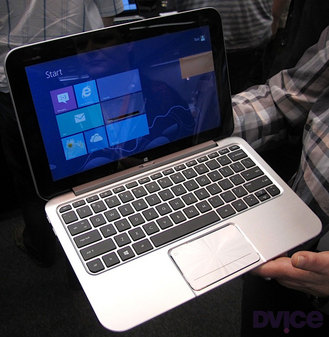
2. HP Envy X2 Here's a detachable tablet laptab with an
11.6-inch snap-off screen. Combined with its keyboard, the X2 weighs a
whopping 3.1 pounds; the separated screen/tablet tips the scales at just
1.5 pounds. Its heavier-than-thou nature stems from HP building a
battery into both the X2's keyboard and the screen/tablet. HP didn't
have a battery life rating, only saying the dual configuration meant it
will be naturally massive.
3. Samsung ATIV Smart PC/Smart PC Pro Like the HP, Samsung's
offering has an 11.6-inch screen that pops off the QWERTY keypad. The
Pro sports an Intel Core i5 processor, measures 11.9 mm thick when
closed and will run for eight hours on a single charge, while its
sibling is endowed with an Intel Core i3 chip, measures a relatively
svelte 9.9mm thin and operates for a healthy 13.5 hours on its battery.
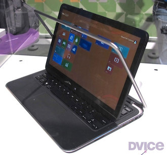
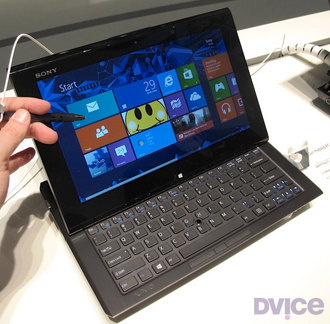
4. Sony VAIO Duo 11 Isn't it odd that Sony and Dell came up
with similar laptab appellations? Or maybe not. The VAIO Duo 11 is
equipped with an 11.1-inch touchscreen that slides
flat-then-back-to-front so it lies back-down on top of the keypad. You
also get a digitizer stylus. Sony's Duo doesn't offer any weight
advantages compared to an ultrabook, though, which I think poses a
problem for most of these laptabs. For instance, both the Intel i3 and
i5 Duo 11 editions weigh in nearly a half pound more than Apple's
11-inch Mac Book Air, and at 2.86 pounds, just 0.1 pounds lighter than
the 13-inch MacBook Air.
5. Toshiba Satellite U920t Like the Sony Duo, the Satellite
U920t is a back-to-front slider, but lacks the seemingly overly complex
mechanism of its sliding laptab competitor. Instead, you lay the U920t's
12.5-inch screen flat, then slide it over the keyboard. While easier to
slide, it's a bit thick at 19.9 mm compared to Duo 11's 17.8 mm depth,
and weighs a heftier 3.2 pounds.
Choices, Choices And More Choices
So: a light ultrabook, or a heavier laptab? And once you pop the tab
top off the HP and Samsung when mobile, your bag continues to be weighed
down by the keyboard, obviating the whole advantage of carrying a
tablet.
In other words, laptabs carry all the disadvantages of a heavier
laptop with none of the weight advantages of a tablet. Perhaps there are
some functionality advantages by having both; I just don't see these
worth a sore back.
Check out the gallery below for a closer look at each laptab written about here.
Of course, Apple didn’t cut the iPad from whole cloth (which probably
would have been linen). It was built upon decades of ideas, tests,
products and more ideas. Before we explore the iPad’s story, it’s
appropriate to consider the tablets and the pen-driven devices that
preceded it.
So Popular So Quickly
Today the iPad is so popular that it’s easy to overlook that it’s
only three years old. Apple has updated it just twice. Here’s a little
perspective to reinforce the iPad’s tender age:
When President Barak Obama was inaugurated as America’s 44th president, there was no iPad.
In 2004 when the Boston Red Sox broke the Curse of the Bambino
and won the World Series for the first time in 86 years, there was no
iPad. Nor did it exist three years later, when they won the championship
again.
Elisha Gray
was an electrical engineer and inventor who lived in Ohio and
Massachusetts between 1835 and 1901. Elisha was a wonderful little geek,
and became interested in electricity while studying at Oberlin College. He collected nearly 70 patents in his lifetime, including that of the Telautograph. [PDF].
The Telautograph let a person use a stylus that was connected to two rheostats,
which managed the current produced by the amount of resistance
generated as the operator wrote with the stylus. That electronic record
was transmitted to a second Telautograph, reproducing the author’s
writing on a scroll of paper. Mostly. Gray noted that, since the scroll
of paper was moving, certain letters were difficult or impossible to
produce. For example, you couldn’t “…dot an i or cross a t or underscore
or erase a word.” Users had to get creative.
Still, the thing was a hit, and was used in hospitals, clinics,
insurance firms, hotels (as communication between the front desk and
housekeeping), banks and train dispatching. Even the US Air Force used the Telautograph to disseminate weather reports.
It’s true that the Telautograph is more akin to a fax machine than a
contemporary tablet, yet it was the first electronic writing device to
receive a patent, which was awarded in 1888.
Of course, ‘ol Elisha is better known for arriving at the US patent
office on Valentine’s Day, 1876, with what he described as an apparatus
“for transmitting vocal sounds telegraphically” just two hours after
Mr. Alexander Graham Bell showed up with a description of a device that
accomplished the same feat. After years of litigation, Bell was legally
declared the inventor of what we now call the telephone, even though
the device described in his original patent application wouldn’t have
worked (Gray’s would have). So Gray/Bell have a Edison/Tesla thing going on.
Back to tablets.
Research Continues
Research continued after the turn of the century. The US Patent Office awarded a patent to Mr. Hyman Eli Goldberg of Chicago in 1918,
for his invention of the Controller. This device concerned the “a
moveable element, a transmitting sheet, a character on said sheet formed
of conductive ink and electrically controlled operating mechanism for
said moveable element.” It’s considered the first patent awarded for a
handwriting recognition user interface with a stylus.
Photo credit: Computer History Museum
Jumping ahead a bit, we find the Styalator (early 1950’s) and the RAND tablet
(1964). Both used a pen and a tablet-like surface for input. The RAND
(above) is more well-known and cost an incredible $18,000. Remember,
that’s 18 grand in 1960?s money. Both bear little resemblance to
contemporary tablet computers, and consisted of a tablet surface and an
electronic pen. Their massive bulk — and price tags ?- made them a
feasible purchase for few.
Alan Kay and the Dynabook
In 1968, things got real. Almost. Computer scientist Alan Kay1
described his concept for a computer meant for children. His “Dynabook”
would be small, thin, lightweight and shaped like a tablet.
In a paper entitled “A Personal Computer For Children Of All Ages,” [PDF] Kay described his vision for the Dynabook:
”The size should be no larger than a notebook; weigh less
than 4 lbs.; the visual display should be able to present 4,000
printing quality characters with contrast ratios approaching that of a
book; dynamic graphics of reasonable quality should be possible; there
should be removable local file storage of at least one million
characters (about 500 ordinary book pages) traded off against several
hours audio (voice/music) files.”
In the video below, Kay explains his thoughts on the original prototype:
That’s truly amazing vision. Alas, the Dynabook as Kay envisioned it was never produced.
Apple’s First Tablet
The first commercial tablet product from Apple appeared in 1979. The Apple Graphics Tablet was meant to compliment the Apple II and use the “Utopia Graphics System” developed by musician Todd Rundgren. 2
That’s right, Todd Rundgren. The FCC soon found that it caused radio
frequency interference, unfortunately, and forced Apple to discontinue
production.
A revised version was released in the early 1980’s, which Apple described like this:
“The Apple Graphics Tablet turns your Apple II system
into an artist’s canvas. The tablet offers an exciting medium with easy
to use tools and techniques for creating and displaying
pictured/pixelated information. When used with the Utopia Graphics
Tablet System, the number of creative alternatives available to you
multiplies before your eyes.
The Utopia Graphics Tablet System includes a wide array of brush
types for producing original shapes and functions, and provides 94 color
options that can generate 40 unique brush shades. The Utopia Graphics
Tablet provides a very easy way to create intricate designs, brilliant
colors, and animated graphics.”
The GRiDpad
This early touchscreen device cost $2,370 in 1989 and reportedly inspired Jeff Hawkins
to create the first Palm Pilot. Samsung manufactured the GRiDpad
PenMaster, which weighed under 5 lbs., was 11.5“ x 9.3” x 1.48? and ran
on a 386SL 20MHz processor with a 80387SX coprocessor. It had 20 MB RAM
and the internal hard drive was available at 40 MB, 60 MB, 80 MB or 120
MB. DigiBarn has a nice GRiDpad gallery.
The Newton Message Pad
With Steve Jobs out of the picture, Apple launched its second pen-computing product, the Newton Message Pad.
Released in 1993, the Message Pad was saddled with iffy handwriting
recognition and poor marketing efforts. Plus, the size was odd; too big
to fit comfortably in a pocket yet small enough to suggest that’s where
it ought to go.
The Newton platform evolved and improved in the following years, but was axed in 1998 (I still use one, but I’m a crazy nerd).
Knight-Ridder and the Tablet Newspaper
This one is compelling. Back in 1994, media and Internet publishing company Knight-Ridder3
produced a video demonstrating its faith in digital newspaper. Its
predictions are eerily accurate, except for this bold statement:
“Many of the technologists…assume that information is
just a commodity and people really don’t care where that information
comes from as long as it matches their set of personal interests. I
disagree with that view. People recognize the newspapers they subscribe
to…and there is a loyalty attached to those.”
Knight-Ridder got a lot right, but I’m afraid the technologists
quoted above were wrong. Just ask any contemporary newspaper publisher.
The Late Pre-iPad Tablet Market
Many other devices appeared at this time, but what I call the “The
Late Pre-iPad Tablet Market” kicked off when Bill Gates introduced the
Compaq tablet PC in 2001. That year, Gates made a bold prediction at COMDEX:
“‘The PC took computing out of the back office and into
everyone’s office,’ said Gates. ‘The Tablet takes cutting-edge PC
technology and makes it available wherever you want it, which is why I’m
already using a Tablet as my everyday computer. It’s a PC that is
virtually without limits – and within five years I predict it will be
the most popular form of PC sold in America.’”
None of these devices, including those I didn’t mention, saw the
success of the iPad. That must be due to in a large part to iOS. While
the design was changing dramatically — flat, touch screen, light weight,
portable — the operating system was stagnant and inappropriate. When
Gates released the Compaq tablet in 2001, it was running Windows XP.
That system was built for a desktop computer and it simply didn’t work
on a touch-based tablet.
Meanwhile, others dreamed of what could be, unhindered by the limitations of hardware and software. Or reality.
Tablets in Pop Culture
The most famous fictional tablet device must be Star Trek’s Personal Access Display Device
or “PADD.” The first PADDs appeared as large, wedge-shaped clipboards
in the original Star Trek series and seemed to operate with a stylus
exclusively. Kirk and other officers were always signing them with a
stylus, as if the yeomen were interstellar UPS drivers and Kirk was
receiving a lot of packages. 4
As new Trek shows were developed, new PADD models appeared. The
devices went multi-touch in The Next Generation, adopting the LCARS
Interface. A stylus was still used from time to time, though there was
less signing. And signing. Aaand signing.
In Stanley Kubrick’s 2001: A Space Odyssey, David Bowman and
Frank Poole use flat, tablet-like devices to send and receive news from
Earth. In his novel, Arthur C. Clarke described the “Newspad” like
this:
“When he tired of official reports and memoranda and
minutes, he would plug his foolscap-sized Newspad into the ship’s
information circuit and scan the latest reports from Earth. One by one
he would conjure up the world’s major electronic papers; he knew the
codes of the more important ones by heart, and had no need to consult
the list on the back of his pad. Switching to the display unit’s
short-term memory, he would hold the front page while he quickly
searched the headlines and noted the items that interested him.
Each had its own two-digit reference; when he punched that, the
postage-stamp-sized rectangle would expand until it neatly filled the
screen and he could read it with comfort. When he had finished, he would
flash back to the complete page and select a new subject for detailed
examination.
Floyd sometimes wondered if the Newspad, and the fantastic technology
behind it, was the last word in man’s quest for perfect communications.
Here he was, far out in space, speeding away from Earth at thousands of
miles an hour, yet in a few milliseconds he could see the headlines of
any newspaper he pleased. (That very word ‘newspaper,’ of course, was an
anachronistic hangover into the age of electronics.) The text was
updated automatically on every hour; even if one read only the English
versions, one could spend an entire lifetime doing nothing but absorbing
the ever-changing flow of information from the news satellites.
It was hard to imagine how the system could be improved or made more
convenient. But sooner or later, Floyd guessed, it would pass away, to
be replaced by something as unimaginable as the Newspad itself would
have been to Caxton or Gutenberg.”
The iPad was released in 2010, so Clarke missed reality by only nine years. Not bad for a book published in 1968.
Next Time: Apple Rumors Begin
In the next article in this series, I’ll pick things up in the early
2000’s when rumors of an Apple-branded tablet gained momentum. For now,
I’ll leave you with this quote from an adamant Steve Jobs, taken from an AllThingsD conference in 2003:
“Walt Mossberg: A lot of people think given the success
you’ve had with portable devices, you should be making a tablet or a
PDA.
Steve Jobs: There are no plans to make a tablet. It turns out people
want keyboards. When Apple first started out, people couldn’t type. We
realized: Death would eventually take care of this. We look at the
tablet and we think it’s going to fail. Tablets appeal to rich guys with
plenty of other PCs and devices already. I get a lot of pressure to do a
PDA. What people really seem to want to do with these is get the data
out. We believe cell phones are going to carry this information. We
didn’t think we’d do well in the cell phone business. What we’ve done
instead is we’ve written what we think is some of the best software in
the world to start syncing information between devices. We believe that
mode is what cell phones need to get to. We chose to do the iPod instead
of a PDA.”
We’ll pick it up from there next time. Until then, go and grab your
iPad and give a quiet thanks to Elisha Gray, Hyman Eli Goldberg, Alan
Kay, the Newton team, Charles Landon Knight and Herman Ridder, Bill
Gates and yes, Stanley Kubrick, Arthur C. Clarke and Gene Roddenberry.
Without them and many others, you might not be holding that wonderful
little device.
More recently known as a co-developer on the the One Laptop Per Child machine. The computer itself was inspired, in part, by Kay’s work on the Dynabook.
I’m really sorry for all the Flash on Todd’s site. It’s awful.
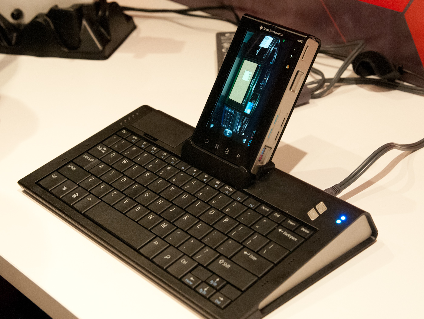
On our last day at MWC 2012, TI pulled me aside for a private
demonstration of WiFi Display functionality they had only just recently
finalized working on their OMAP 5 development platform. The demo showed
WiFi Display mirroring working between the development device’s 720p
display and an adjacent notebook which was being used as the WiFi
Display sink.
TI emphasized that what’s different about their WiFi Display
implementation is that it works using the display framebuffer natively
and not a memory copy which would introduce delay and take up space. In
addition, the encoder being used is the IVA-HD accelerator doing the
WiFi Display specification’s mandatory H.264 baseline Level 3.1 encode,
not a software encoder running on the application processor. The demo
was running mirroring the development tablet’s 720p display, but TI says
they could easily do 1080p as well, but would require a 1080p
framebuffer to snoop on the host device. Latency between the development
platform and display sink was just 15ms - essentially one frame at 60
Hz.
The demonstration worked live over the air at TI’s MWC booth and also
used a WiLink 8 series WLAN combo chip. There was some stuttering,
however this is understandable given the fact that this demo was using
TCP (live implementations will use UDP) and of course just how crowded
2.4 and 5 GHz spectrum is at these conferences. In addition, TI
collaborated with Screenovate for their application development and WiFi
Display optimization secret sauce, which I’m guessing has to do with
adaptive bitrate or possibly more.
Enabling higher than 480p software encoded WiFi Display is just one
more obvious piece of the puzzle which will eventually enable
smartphones and tablets to obviate standalone streaming devices.
-----
Personal Comment:
Kind of obvious and interesting step forward as it is more and more requested by mobile devices users to be able to beam or 'to TV' mobile device's screens... which should lead to transform any (mobile) device in a full-duplex video broadcasting enabled device (user interaction included!) ... and one may then succeed in getting rid of some cables in the same sitting?!
Asus’ Transformer (and Transformer Prime) seems to have resonated well with consumers, and now Microsoft
may be looking to create a similar concept in the future. A new patent
reveals Microsoft nurturing an idea that could see a tablet turning into
a full fledged laptop or desktop PC, complete with not one but two
separate processors.
How is that any different from the Transformer Prime, you ask? Unwired View
reports that Microsoft would be including a processor not only in the
tablet itself, but also the keyboard base unit. The processor in the
tablet would be optimized for low-power, pointing towards an ARM chip of
some kind, while the processor in the keyboard base unit would be
focused more on performance. That could mean either a speedier ARM chip,
or even an ULV Intel chip.
Right now with the Transformer Prime,
you hold the same amount of processing power whether or not you’re
docked with the keyboard, which only provides additional power.
Microsoft’s vision would see different performance scenarios depending
on your mobility requirements, which seems much more appealing.
Not only that, the operating system would adapt to the change.
Microsoft lay out in their patent that the device would switch between a
“resource-conserving computing environment” when in tablet mode, and a
“resource-intensive computing environment” when in laptop mode. This is
idle speculation, but that sounds ideal for Windows 8, switching to the
Metro interface when in tablet mode, and back to the traditional desktop
when in laptop mode.
OLPC had already announced it was bringing along its XO-3 tablet to CES this coming week; now we know what the new education-focused slate will look like. Less slimline than the older concepts and nowhere near as space-age as the earlier dual-screen XO-2 renders,
the new silicone-clad XO-3 does at least have the bonus of actually
fitting inside the Marvell ARMADA PXA618 processor and half gig of RAM
we’re expecting.
Up front is an 8-inch screen – a 1024 x 768 Pixel Qi panel,
no less, for indoor and outdoor visibility – with a peel-off silicone
cover so as to protect it from scratches and bumps while in a schoolbag.
There’ll also be solar panels on the inside, one of a trio of
recharging options to keep the OLPC XO-3 running: as well as plugging it
into the mains, should you have the luxury of being near an AC supply,
there’ll be a hand-crank to manually top up the battery.
Sixty seconds of cranking is good for ten minutes of use, or so OLPC
tells us, and the OS is either Android or the specialist
education-focused Sugar platform. Ports – which are also covered up by
that clever cover – include full-sized USB, audio and a memory card
slot.
Best of all, though, is the price: OLPC expects the XO-3 to kick off
at $100, though that will be for regular LCD rather than Pixel Qi
versions. Unfortunately, you won’t be able to drop by Best Buy and pick
one up, as OLPC will be selling direct to educational organizations and
charities.
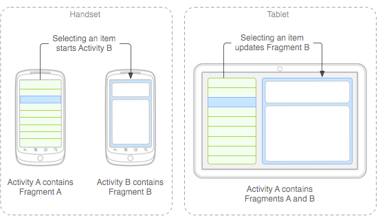
The next major version of Google's Android platform, codenamed Ice Cream Sandwich (ICS), is expected to reach the market
in October or November. ICS is expected to bring some significant
changes to Android because it will unify Google's tablet and phone
variants into a single environment.
Although the SDK is not available yet, Google has published some
technical guidance to help third-party application developers start
preparing for the ICS transition. An entry posted this week on the
Android developer blog describes some steps that developers can take to
better accommodate the breadth of screen sizes supported by ICS.
The documentation also provides some insight into how several
elements of the Honeycomb user interface could be translated to
phone-sized screens in ICS. For example, it includes mockups that show
the distinctive Honeycomb action bar on a tablet and a phone. It's not
clear, however, if the mockups accurately depict the user experience
that will be delivered in ICS.
This seems to suggest that tablet user interfaces developed with
standard Honeycomb APIs will largely work on phones in ICS without
requiring much modification by third-party developers. That's good news,
especially if it ends up being equally true the other way, which would
allow phone applications built for ICS to look and feel more native on
tablet devices. Google's existing Fragments framework will also help
simplify interface scalability by making it easy to transition
data-driven applications between single-pane to multi-pane layouts.
Developers who use Fragments and stick to the standard Honeycomb user
interface components are on the right track for the upcoming ICS
release, but developers who have built more complicated tablet-specific
user interfaces or haven't stayed within the boundaries imposed by the
documented APIs might face some challenges.
Honeycomb applications that were designed only for the tablet screen
size might not scale down correctly on phones. That's a problem, because
Android's versioning model doesn't prevent old applications from
running on devices with new versions of the operating system—it's going
to be possible for users to install Honeycomb tablet applications on ICS
phones, even in cases where the result is going to be a very broken
application.
In cases where third-party developers can't adapt their tablet
software to work well at phone sizes, Google suggests changing the
application manifest file to block the application from being installed
on devices with small screens.
Another challenge is the large body of legacy devices that aren't
going to be updated to ICS. Developers who want to reach the largest
possible audience will have to refrain from using the new APIs, which
means that it will be harder for them to take advantage of the
platform's increasingly sophisticated capabilities for scaling across
different screen sizes.
Google has already partially addressed this issue by backporting the
Fragments framework and making it available as a static library for
older versions of the operating system. It might be beneficial for them
to go a step further and do the same with the Action Bar and other
critical user interface components that will be designed to scale
seamlessly in ICS.
It's going to take some time for the Android application ecosystem to
sort all of this out after ICS is released, but Google's approach seems
reasonably practical. In theory, developers who are solely targeting
ICS APIs might not have to make a significant development investment to
get their application working well across tablet and phone form factors.
During a lovely September week in 2011, Microsoft Windows 8 was announced and launched for developers. The event this launch occurred at was what Microsoft was presenting as a welcome to Windows 8, especially in regards to the 5,000 developers at BUILD, launching the platform with there eyes directly fixed on applications, the whole situation a large opportunity for developers. This is the beginning of Windows 8 as it exists in a sense that there’s no product launch here from Microsoft, instead there’s an opportunity for 3rd party developers to get on board here right at the start of the next-wave OS. What lies beneath is a living document which takes what Microsoft Windows 8 is at the start here in 2011 and how it will evolve over time.
Three years ago was when Windows 7 launched, since then 450 million copies have sold. Inside September 2011, the amount of users using Windows 7 has finally trumped the amount of users using Windows XP on the consumer market. Microsoft tells us they know this because they’re working with the numbers coming from machines hitting the Windows Update Service. As with any update to a new version of a major operating system, one must ask a similar question as – and you’ll have to allow me to nerd out for a moment here – Alan Bradley from TRON when he asked what changes had REALLY been made to the system that Microsoft would find it necessary to give it a whole new number.
Turns out 1,502 product changes have been made to Windows XP since Microsoft released it to manufacturing, these all being non-security updates. Improvements galore! Now what does this mean for Windows 8? Does it mean that the software will be continuously updated as the folks at Microsoft see ways to improve it? Of course, that’s a given. How many changes have been made between the Windows XP and Windows 7 we’ve known between their inception date and this end-of-summer 2011 timeframe where Windows 8 is released? That’s a number we’ll have to figure out on our own.
Reimagining Windows
Microsoft brings you Windows 8 as a operating system that is said to improve everything they brought forth in Windows 7, and what’s more, every bit of software that runs currently on Windows 7 will be able to run on Windows 8 without a problem.
Chipsets
ARM chips equal integrated engineering. Where X86, Microsoft says, was the same for every system, ARM chips are optimized for unique situations. Like what Microsoft says about software made for working on Windows 7 now also working on Windows 8, so too does everything they present here work on ARM chips.
Boldness
What’s so bold about Windows 8 is that they’re envisioning an operating system that scales from small form factors, keyboardless tablets, all the way up to gigantic servers running hundreds of processors.
Julie Larson Green, Corporate Vice President of the Windows Experience at Microsoft noted during the week of the reveal of Windows 8 that they had started planning Windows 8 in June of 2009, before they even shipped Windows 7 out the door. Of course changes in both industry and technology spark change, and in this mobile landscape and move by many from one platform to another and/or the adoption of several platforms happening by the public, Microsoft planned accordingly. Microsoft wanted to top the release of Windows 7, but they did not want to do it in a way that was either linear or reactive – this being an interesting goal of course at that time as the idea of a tablet computer simply wasn’t a reality at the time – so what is there to react to?
In Windows 7 there were studies on form factor, user action models, and best of all touch. Microsoft has noted that they were the first group to add touch to a major operating system. As you know well, since that time, touch has all but consumed the mobile market, and recent developments in non-mobile computing have trended toward touch as well to a degree. With this, the demand for developers to create apps for every single little function, one by one, this showing itself prevalently again on mobile, but non-mobile beginning to take back what is theirs in the recent past as well with on-device app stores on all machines. These are only two of a whole slew of points Microsoft touched on during the BUILD conference showing off the first real look at Windows 8 in September of 2011.
Tablets and PCs
You begin with a lockscreen (seen at the top of this post). This screen doesn’t look unlike what you’re used to with Windows Phone devices, giving you pre-opening updates about time, date, updates, and of course its all displayed with a background of your choice. One of the new ideas Microsoft has to make this experience unique is “Picture Password”.
What Picture Password consists of is a specific photo or digital image that, when you see it, you’ll know to draw a certain combination of shapes and lines on your display. If you draw the correct combination, you will be logged in. Circles and lines are what’s at play here – perhaps drawing a hat on a squirrel will be your password combo?
Then there’s a Start Screen. This is the place where you’ll return all the time before and after moving to other screens and apps. You’ll again recognize the look of this space as being a rather Windows Phone experience, and as each app is represented by what Microsoft calls a “tile”, you’ll certainly feel at home if you’re an avid Windows Phone user. Each tile has the ability to show off different actions before its activated to reveal the app inside, movement and, for example, feeds showing social networking news. The “serendipity of the web” has here been brought into Windows.
Tiles can express essentially anything you want and are themselves resizable and customizable. Tiles can open up to apps or they can sit by themselves and work. There are “groups” that can hold tiles “like folders” as they say, and there’s a new feature called “Semantic Zoom.” What this Semantic Zoom does is to pull you back from your interface in a way that you’ve never been able to do on a Windows device before. Fast and fluid touch language throughout, allowing you access to all of your media, all of your content, all of your apps at once.
There is a new kind of app called Metro-Style Apps. The first thing that makes a Metro-Style app what it is full immersion. What Windows has done here is to change what they’ve done in the past, that is adding widgets and “doodads” all around the majority of apps and is now being a bit more humble, letting the app take the show.
Any app on Windows Phone 8 can be turned into a Secondary Tile. You can, for instance, “pin” a webpage to your Start Screen – in this case you’ll have all the same features your original app had, here because this is a webpage and your original app was a web-based app, you’re able to see a changing feed straight from your desktop.
Charms
Charms are next – what this feature, activated by a swipe across your screen, is comprised of several icons, these depending on the app or location inside your system you are at. This may seem intuitive to those of you who’ve been using computers for years and years now, but as software engineers make the transition between mobile and stationary OS being separate to being one in the same, it’s little points like this that make all the difference.
What Microsoft is showing us here in Windows 8 is their next step towards a singularity in operating systems. Moving in and out of apps, shutting them down and opening them up, and even having more than one application open and working at once on the same page. This again is something that desktop mobile operating systems have been able to do for many years now, but as mobile moves into the fold, this is a big step taken.
Windows Key
There’s a button, be it physical or on the screen, wherever, that will always bring you back to your Start Screen. This is your Windows Key. If you’re using a Windows 8 tablet, you’ll likely have a physical or haptic-feedback-filled Windows Key. If you’re using a device with no physical keys, the Windows Key will be in some sneaky places for you to access.
Windows Store
For developers (who will be mentioned many more times before this guide is through), it’s the newly minted Windows Store that should be paid attention to. Windows users will be able to access this store for apps anywhere Windows is sold worldwide. Go wild!
Apps
Microsoft feels that all apps should be able to work together, all of this without any extra work done by the developers of the apps in question. One of the most obvious “contracts” this connectedness will be working on is sharing. Have a bit of content you’d like to share? Grab your Charms, hit the Share Charm, and share it through, for example, “Friend Share.” Here you’re able to contact your contacts through a huge variety of ways – share and go! The data package is taken by one app and sent to another app, all of this possible with any set of apps that have sharing activated.
Sharing can happen from any app in Windows.
Search is next, it being one the most essential bits in any successful computer system, operating systems a must. The Search Charm is present in quite a few apps and in the system to search files. You expect Windows to know how to search files, but here we’ve got a few new options, one of them being autocomplete of options if you like. You search your term and you get results PLUS you get a list of apps that are able to also search themselves. Search a term and find results on your own computer, then search through your web app, search a social networking site, search anything that supports search.
A hypothetical situation for this ability to search and select content from a variety of apps and services is if you’re creating an album of photos on a website. You can search from your local device, your app which seeks photos you’ve got on a cloud on the internet, and an app that seeks photos on your local network. Grab em all without having to launch every single app, all at once with search only. The selling point, if I may be so bold here, is that the apps are what makes up the system. Just like console video game systems, inkjet printers, and… well… every home computer in history, essentially, this system relies on the apps that it runs to run. That’s the promotion in part.
Spellcheck, auto-correct, “squiggle” underlining of words to show you they’re not necessarily understood by the system as English (or whatever language(s) you’ve got running). All of this is what you remember it as being from your current and past tens of years on your Windows machine – all of it’s intact here and is available free as part of Microsoft’s dealings with third party app developers. The same is true of the on-screen touch keyboard keyboard.
Measuring Style Device App / Connections
As you may well know by now, computers of all types, most recently mobile devices like tablets are able to connect to a plethora of other devices via Bluetooth, HDMI cable, USB, and a bunch of other slightly less popular means right this moment. In Windows 8, these connections will be handled by your Charms. Much in the same way that selecting File-Print works in most Windows systems now (though I’m sure some developers would disagree), you’re able to hit a charm, hit print, and if you like, work with a selection of settings. This interface has another name: Measuring Style Device App.
What a Measuring Style Device App does is represent a device in the system. This could be compared, if you wish, to drivers provided by manufacturers for specific devices, instead here it’s a whole new entity called a MSDA (for short) and has the ability to bring you a large set of options in, for example, a Charm.
Internet Explorer 10
The newest version of IE aka Internet Explorer will be available as a metro-style app. Full screen action for you lovers of your monitors with all of the same hardware acceleration (even more than IE 9 does), same performance and better, same compliance and standards as IS and better, same security and same privacy as IE 9. But it’s better, better I tell you! Here you’ve got a totally immersive mode like with the other metro-style apps, and you’ve got four big gestures that, like with a lot of the rest of your system here, do the following:
Top to Bottom: Use the User Interface, in this case see your controls for webpages. Right Side: Charms. Left Side: Go back.
Of course you can create new tabs including the forever helpful “private” tab, you can travel to webpages, go back and forth, and use the internet in the same sort of hands-off way that all great web browsers work with. Internet Explorer 10 is able to go full screen and will, with gestures, be able to access the same lovely menus many other Windows 8 optimized apps will be able to as well.
Whispers of Photoshop
Adobe’s photo editing app has become so well known and used that an edited photo in our modern world is better known as having been “Photoshopped” than it is as having been “modified” or “photo manipulated”. We know this week at BUILD 2011 that Windows 8 will work with Photoshop on a touch platform. This isn’t the first time we’ve seen Adobe bring a Photoshop branded app to a mobile platform, but it is the first time we’ve seen what appears very much to be a full-fledged Photoshop app that, as you know from above, will be able to work with keyboard and mouse, but will here be able to work with touch in a way that’s only been available through third party touchscreen displays and drawing pads. What we can hope for is a much more optimized experience in the near future.
Pen (Stylus)
Handwriting, drafting, and graphic arts are promoted in Windows 8 by a new optimization and integration of the pen, or the stylus as you may call it. You may use pen with touch at the same time and you may navigate the whole system with pen as well. Much in the same way that the on-screen keyboard, the physical mouse, and the physical keyboard are all supported for 3rd party developers by Microsoft, so too is the Pen. Get your drawing hand out and try to remember what it was like to use a pencil!
Cloud Connections
Windows 8 will have the ability to work with online clouds of information, developers at Microsoft keeping in mind that this new operating system is most certainly going to be used to access the connected web on many levels and with many different devices and types of devices. Microsoft gives one of the most obvious reasons for this: what if you reach an awesome level on your favorite game, then you’ve got to switch to a new device? You’d have to start over if it wasn’t for the idea of cloud computing – all that information can be stored for access by multiple computers without a hassle, and Windows 8 is built with this idea deep in its heart. Settings down to the state you last left your app in can be saved to the cloud with this system. One you, one system, any number of multiple machines to work with.
Mail and Calendar
Improvements have been made to your basic Mail app on Windows 8. You’ve now got the simple addition of Folders to your Mail app, this right next to Inbox and Content. Organization is key, and the ability to place pieces of content in folders has been a tried and true way to make this happen. As far as Calendar goes, you’re now able to view more than one person’s Calendar at once. For instance if you need to see your wife’s calendar at the same time as your own to plan an event, this dual display mode can come in extremely handy.
People
There’s an app called People which organizes all the humans you know, each of the people displayed with connections to their Facebook, Linkedin, phone number, email(s), and more. This app People acts as an all-encompassing social network hub as you’re not only able to connect to People’s different profile pages on social networks, you can instant messenge them through what appears to be every single instant messenger network in existence, threads of conversation set up, organization abound. The networks take a back seat, Microsoft hopes here, to your connection to the person.
Photos
Your Photos library app connects you to your local photos as well as photos (and other types of images) you’ve got on a large number of photo hosting services and apps. This app, like the rest of the content browsing and interaction apps, appears to be working quite quickly and efficiently on every platform Microsoft is using to show off Windows 8 at BUILD 2011. This Photos app brings your photos together in a way that Microsoft hopes is easy to manifest and understand. Select photos, place them in your digital basket, and share them, only a few gestures from start to finish.
Skydrive
Connected applications is at the heart of Windows 8. Using Windows Phone, you likely know about Skydrive which allows you to place media for later editing and access from the cloud. Your Skydrive Camera Roll on Windows Phone automatically collects photos you’ve taken and uploads them to the cloud. When you’re emailing photos from your Photos app, you’ll automatically be doing so using Skydrive, this allowing you to have these photos hosted by Skydrive instead of having to pack them into the email. You’ve got the option of attaching to the email in a traditional way as well, but Skydrive gives you the ability to, in many cases, send a whole lot quicker.
Heading online to Windows Live and Skydrive will also be optimized to work with Windows 8 to give you access to any of your connected computers. For example if you’re out in the park and you meet Auntie Sue and you want to show her a picture of your half-uncle Fred but all your Fred photos are at your PC at home, you can connect to your PC at home with your mobile device by accessing Windows Live in a web browser and check your Skydrive, there’s your content.
Windows Phone
Along these same lines, syncing and cloud connectedness flows freely through Windows Phone which, at the time Windows 8 is revealed at BUILD 2011, is currently at Windows Phone 7.5 Mango. On Windows Phone here you have only to log in once and you’ve got all of your connections to your various services you
Microsoft Windows chief Steven Sinofsky has taken to theBuilding Windows 8 blogto explain the company’s decision to keep two interfaces: the traditional desktop UI and the more tablet-friendly Metro UI. His explanation seemed to be in response to criticism and confusion after the latest details were revealed on the newWindows 8 Explorer interface.
On Monday, details on the Windows 8 Explorer file manager interface were revealed showing what looked to be a very traditional Windows UI without any Metro elements. Reactions were mixed with many confused as to what direction Microsoft was heading with its Windows 8 interface. Well, Sinofsky is attempting to answer that and says that it is a “balancing act” of trying to get both interfaces working together harmoniously.
Sinofsky writes in his post:
Some of you are probably wondering how these parts work together to create a harmonious experience. Are there two user interfaces? Why not move on to a Metro style experience everywhere? On the other hand, others have been suggesting that Metro is only for tablets and touch, and we should avoid “dumbing down” Windows 8 with that design.
He proceeds to address each of these concerns, saying that the fluid and intuitive Metro interface is great on the tablet form factor, but when it comes down to getting serious work done, precision mouse and keyboard tools are still needed as well as the ability to run traditional applications. Hence, he explains that in the end they decided to bring the best of both worlds together for Windows 8.
With Windows 8 on a tablet, users can fully immerse themselves in the Metro UI and never see the desktop interface. In fact, the code for the desktop interface won’t even load. But, if the user needs to use the desktop interface, they can do so without needing to switch over to a laptop or other secondary device just for business or work.
A more detailed preview of Windows 8 is expected to take place during Microsoft’s Build developer conference in September. It’s been rumored that the first betas may be distributed to developers then along with a Windows 8 compatible hardware giveaway.
-----
Personal comments:
In order to complete the so-called 'Desktop Crisis' discussion, the point of view of Microsoft who has decided to avoid mixing functionalities between desktop's GUI and tablet's GUI.


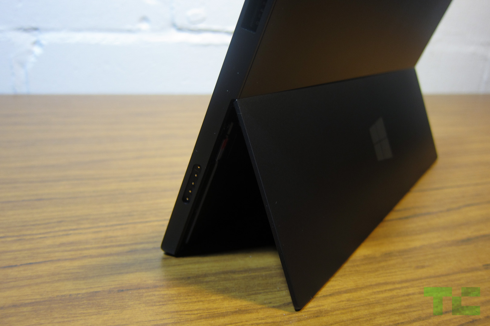
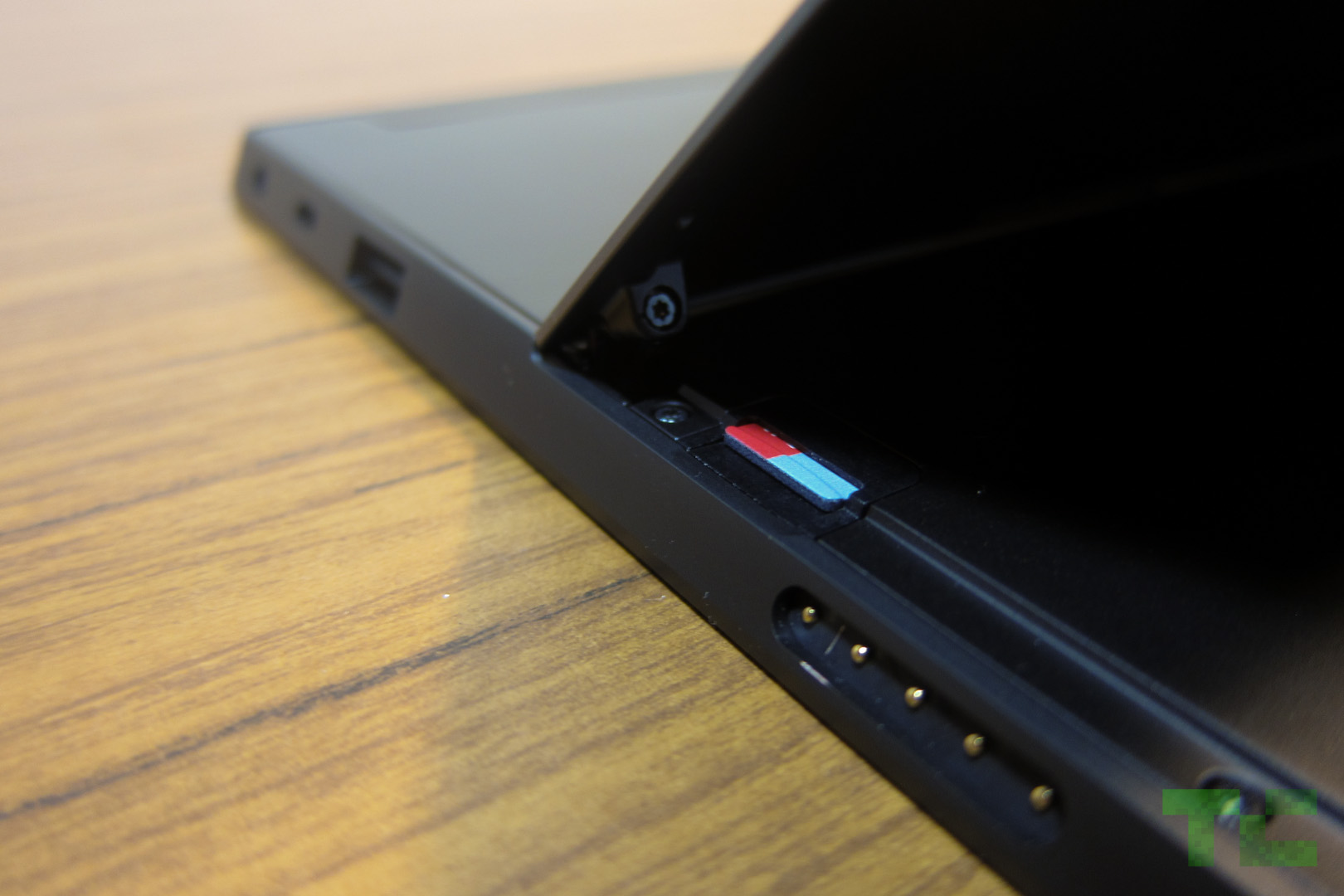

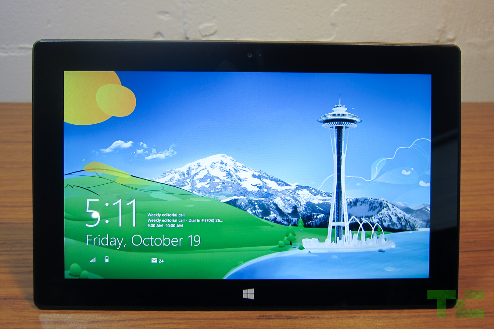


 Xbox
Video offers a good selection of movies but they’re a tad pricey like
on iTunes. The Avengers in HD costs $20; it’s $15 on Amazon. A single HD
episode of The Walking Dead costs $2.99 on Xbox but $1.99 on Amazon.
Xbox
Video offers a good selection of movies but they’re a tad pricey like
on iTunes. The Avengers in HD costs $20; it’s $15 on Amazon. A single HD
episode of The Walking Dead costs $2.99 on Xbox but $1.99 on Amazon. Once authorized, the app can access Facebook photos and videos and displays them in such a way as if they’re stored locally.