Via Mark Shuttleworth
-----
The desktop remains central to our everyday work and play, despite
all the excitement around tablets, TV’s and phones. So it’s exciting for
us to innovate in the desktop too, especially when we find ways to
enhance the experience of both heavy “power” users and casual users at
the same time. The desktop will be with us for a long time, and for
those of us who spend hours every day using a wide diversity of
applications, here is some very good news: 12.04 LTS will include the
first step in a major new approach to application interfaces.
This work grows out of observations of new and established /
sophisticated users making extensive use of the broader set of
capabilities in their applications. We noticed that both groups of users
spent a lot of time, relatively speaking, navigating the menus of their
applications, either to learn about the capabilities of the app, or to
take a specific action. We were also conscious of the broader theme in
Unity design of leading from user intent. And that set us on a course
which lead to today’s first public milestone on what we expect will be a
long, fruitful and exciting journey.
The menu has been a central part of the GUI since Xerox PARC invented ‘em in the 70?s. It’s the M in WIMP and has been there, essentially unchanged, for 30 years.
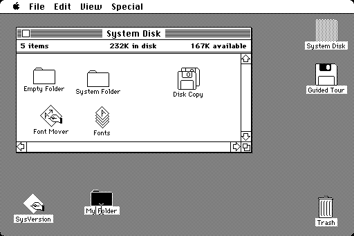
The original Macintosh desktop, circa 1984, courtesy of Wikipedia
We can do much better!
Say hello to the Head-Up Display, or HUD, which will ultimately replace menus in Unity applications. Here’s what we hope you’ll see in 12.04 when you invoke the HUD from any standard Ubuntu app that supports the global menu:
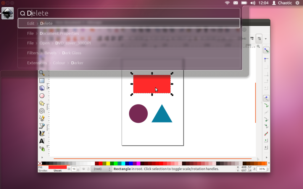
Snapshot of the HUD in Ubuntu 12.04
The intenterface – it maps your intent to the interface
This is the HUD. It’s a way for you to express your intent and
have the application respond appropriately. We think of it as “beyond
interface”, it’s the “intenterface”. This concept of “intent-driven
interface” has been a primary theme of our work in the Unity shell, with
dash search as a first class experience pioneered in Unity. Now we are
bringing the same vision to the application, in a way which is
completely compatible with existing applications and menus.
The HUD concept has been the driver for all the work we’ve done in
unifying menu systems across Gtk, Qt and other toolkit apps in the past
two years. So far, that’s shown up as the global menu. In 12.04, it also
gives us the first cut of the HUD.
Menus serve two purposes. They act as a standard way to invoke commands which are too infrequently used to warrant a dedicated piece of UI real-estate, like a toolbar button, and they serve as a map of the app’s functionality,
almost like a table of contents that one can scan to get a feel for
‘what the app does’. It’s command invocation that we think can be
improved upon, and that’s where we are focusing our design exploration.
As a means of invoking commands, menus have some advantages. They are
always in the same place (top of the window or screen). They are
organised in a way that’s quite easy to describe over the phone, or in a
text book (“click the Edit->Preferences menu”), they are pretty fast
to read since they are generally arranged in tight vertical columns.
They also have some disadvantages: when they get nested, navigating the
tree can become fragile. They require you to read a lot when you
probably already know what you want. They are more difficult to use from
the keyboard than they should be, since they generally require you to
remember something special (hotkeys) or use a very limited subset of the
keyboard (arrow navigation). They force developers to make often
arbitrary choices about the menu tree (“should Preferences be in Edit or
in Tools or in Options?”), and then they force users to make equally
arbitrary effort to memorise and navigate that tree.
The HUD solves many of these issues, by connecting users directly to what they want. Check out the video,
based on a current prototype. It’s a “vocabulary UI”, or VUI, and
closer to the way users think. “I told the application to…” is common
user paraphrasing for “I clicked the menu to…”. The tree is no longer
important, what’s important is the efficiency of the match between what
the user says, and the commands we offer up for invocation.
In 12.04 LTS, the HUD is a smart look-ahead search through the app
and system (indicator) menus. The image is showing Inkscape, but of
course it works everywhere the global menu works. No app modifications
are needed to get this level of experience. And you don’t have to adopt
the HUD immediately, it’s there if you want it, supplementing the
existing menu mechanism.
It’s smart, because it can do things like fuzzy matching, and it can learn what you usually do
so it can prioritise the things you use often. It covers the focused
app (because that’s where you probably want to act) as well as system
functionality; you can change IM state, or go offline in Skype, all
through the HUD, without changing focus, because those apps all talk to
the indicator system. When you’ve been using it for a little while it
seems like it’s reading your mind, in a good way.
We’ll resurrect the (boring) old ways of displaying the menu in
12.04, in the app and in the panel. In the past few releases of Ubuntu,
we’ve actively diminished the visual presence of menus in anticipation
of this landing. That proved controversial. In our defence, in user
testing, every user finds the menu in the panel, every time, and it’s
obviously a cleaner presentation of the interface. But hiding the menu
before we had the replacement was overly aggressive. If the HUD lands in
12.04 LTS, we hope you’ll find yourself using the menu less and less,
and be glad to have it hidden when you are not using it. You’ll
definitely have that option, alongside more traditional menu styles.
Voice is the natural next step
Searching is fast and familiar, especially once we integrate voice
recognition, gesture and touch. We want to make it easy to talk to any
application, and for any application to respond to your voice. The full
integration of voice into applications will take some time. We can start
by mapping voice onto the existing menu structures of your apps. And it
will only get better from there.
But even without voice input, the HUD is faster than mousing through a
menu, and easier to use than hotkeys since you just have to know what
you want, not remember a specific key combination. We can search through
everything we know about the menu, including descriptive help text, so
pretty soon you will be able to find a menu entry using only vaguely
related text (imagine finding an entry called Preferences when you
search for “settings”).
There is lots to discover, refine and implement. I have a feeling this will be a lot of fun in the next two years 
Even better for the power user
The results so far are rather interesting: power users say things
like “every GUI app now feels as powerful as VIM”. EMACS users just
grunt and… nevermind  . Another comment was “it works so well that the rare occasions when it
can’t read my mind are annoying!”. We’re doing a lot of user testing on
heavy multitaskers, developers and all-day-at-the-workstation personas
for Unity in 12.04, polishing off loose ends in the experience that
frustrated some in this audience in 11.04-10. If that describes you, the
results should be delightful. And the HUD should be particularly
empowering.
Even casual users find typing faster than mousing. So while there are
modes of interaction where it’s nice to sit back and drive around with
the mouse, we observe people staying more engaged and more focused on
their task when they can keep their hands on the keyboard all the time.
Hotkeys are a sort of mental gymnastics, the HUD is a continuation of
mental flow.
Ahead of the competition
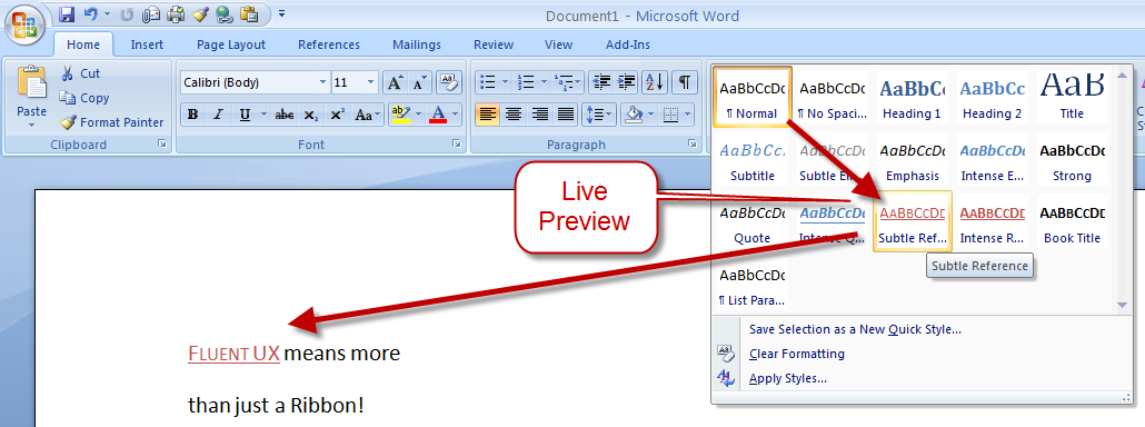
There are other teams interested in a similar problem space. Perhaps
the best-known new alternative to the traditional menu is Microsoft’s
Ribbon. Introduced first as part of a series of changes called Fluent UX
in Office, the ribbon is now making its way to a wider set of Windows
components and applications. It looks like this:

You can read about the ribbon from a supporter (like any UX change, it has its supporters and detractors  ) and if you’ve used it yourself, you will have your own opinion about
it. The ribbon is highly visual, making options and commands very
visible. It is however also a hog of space (I’m told it can be
minimised). Our goal in much of the Unity design has been to return
screen real estate to the content with which the user is working; the
HUD meets that goal by appearing only when invoked.
Instead of cluttering up the interface ALL the time, let’s clear out
the chrome, and show users just what they want, when they want it.
Time will tell whether users prefer the ribbon, or the HUD, but we
think it’s exciting enough to pursue and invest in, both in R&D and
in supporting developers who want to take advantage of it.
Other relevant efforts include Enso and Ubiquity from the original Humanized team (hi Aza &co), then at Mozilla.
Our thinking is inspired by many works of science, art and
entertainment; from Minority Report to Modern Warfare and Jef Raskin’s
Humane Interface. We hope others will join us and accelerate the shift
from pointy-clicky interfaces to natural and efficient ones.
Roadmap for the HUD
There’s still a lot of design and code still to do. For a start, we
haven’t addressed the secondary aspect of the menu, as a visible map of
the functionality in an app. That discoverability is of course entirely
absent from the HUD; the old menu is still there for now, but we’d like
to replace it altogether not just supplement it. And all the other
patterns of interaction we expect in the HUD remain to be explored.
Regardless, there is a great team working on this, including folk who
understand Gtk and Qt such as Ted Gould, Ryan Lortie, Gord Allott and
Aurelien Gateau, as well as designers Xi Zhu, Otto Greenslade, Oren
Horev and John Lea. Thanks to all of them for getting this initial work
to the point where we are confident it’s worthwhile for others to invest
time in.
We’ll make sure it’s easy for developers working in any toolkit to
take advantage of this and give their users a better experience. And
we’ll promote the apps which do it best – it makes apps easier to use,
it saves time and screen real-estate for users, and it creates a better
impression of the free software platform when it’s done well.
From a code quality and testing perspective, even though we consider
this first cut a prototype-grown-up, folk will be glad to see this:
Overall coverage rate:
   lines......: 87.1% (948 of 1089 lines)
   functions..: 97.7% (84 of 86 functions)
   branches...: 63.0% (407 of 646 branches)
Landing in 12.04 LTS is gated on more widespread testing. You can of course try this out from a PPA or branch the code in Launchpad (you will need these two branches). Or dig deeper with blogs on the topic from Ted Gould, Olli Ries and Gord Allott. Welcome to 2012 everybody!


 . Another comment was “it works so well that the rare occasions when it
can’t read my mind are annoying!”. We’re doing a lot of user testing on
heavy multitaskers, developers and all-day-at-the-workstation personas
for Unity in 12.04, polishing off loose ends in the experience that
frustrated some in this audience in 11.04-10. If that describes you, the
results should be delightful. And the HUD should be particularly
empowering.