Thursday, November 24. 2011
Kinect for Windows Coming in 2012
Via Nexus
-----
The Kinect for Windows team has announced that Microsoft is releasing PC-specific Kinect hardware in 2012, along with a Kinect SDK that will enable developers to build all sorts of apps for Kinect. Will the emergence of motion-based interfaces eventually overtake touchscreens in terms of intuitiveness in computing user interfaces?

Microsoft earlier announced the beta release of the Kinect for Windows SDK, which enabled hackers and enthusiasts to build programs that can take advantage of the Kinect’s motion-sensing capabilities. Just recently, Kinect for Windows GM Craig Eisler announced that the company’s commercial program will launch 2012, which will involve not only software, but also new Kinect hardware specifically designed for personal computers. These will take advantage of computers’ different capabilities, as well as the drawbacks of using the Kinect sensor meant for Microsoft’s Xbox 360 console.
In particular, the benefits of the upcoming hardware will include the following:
- Shorter USB cable to ensure reliable communication between the Kinect sensor and the different computer hardware. A small dongle will be included as a USB hub, so that other USB peripherals can also work alongside Kinect.
- New “Near Mode” that changes the minimum distance from the usual 6 to 8 feet feet down to 40 to 50 cm, so that users sitting in front of their computer can still manipulate elements through movement, even at close range. Firmware optimizations will also make the Kinect more sensitive and responsive. It is hoped that these changes can lead to various new applications like virtual keyboards, hand gestures and even the use of facial expressions to manipulate programs on a computer.
Microsoft is also launching a new Kinect Accelerator business incubator through Microsoft BizSpark, through which the company will actively provide assistance to 10 companies in using the Kinect as a development platform. Microsoft sees businesses and end-users taking advantage of Kinect in more than just gaming. This can include developing special apps for people with disabilities, special needs, or injuries, and can also open the floodgates to other gesture and motion-based UI engineering.
Will Kinect be the next big thing in user experience engineering after multi-touch touchscreens and accelerometers?
Wednesday, November 23. 2011
Kilobots - tiny, collaborative robots - are leaving the nest
Via PhysOrg
-----
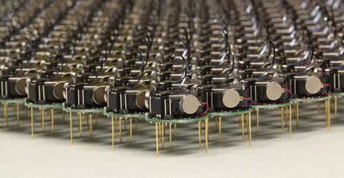
The Kilobots are an inexpensive system for testing synchronized and collaborative behavior in a very large swarm of robots. Photo courtesy of Michael Rubenstein
The Kilobots are coming. Computer scientists and engineers at Harvard University have developed and licensed technology that will make it easy to test collective algorithms on hundreds, or even thousands, of tiny robots.
Called Kilobots, the quarter-sized bug-like devices scuttle around on three toothpick-like legs, interacting and coordinating their own behavior as a team. A June 2011 Harvard Technical Report demonstrated a collective of 25 machines implementing swarming behaviors such as foraging, formation control, and synchronization.
Once up and running, the machines are fully autonomous, meaning there is no need for a human to control their actions.
The communicative critters were created by members of the Self-Organizing Systems Research Group led by Radhika Nagpal, the Thomas D. Cabot Associate Professor of Computer Science at the Harvard School of Engineering and Applied Sciences (SEAS) and a Core Faculty Member at the Wyss Institute for Biologically Inspired Engineering at Harvard. Her team also includes Michael Rubenstein, a postdoctoral fellow at SEAS; and Christian Ahler, a fellow of SEAS and the Wyss Institute.
Thanks to a technology licensing deal with the K-Team Corporation, a Swiss manufacturer of high-quality mobile robots, researchers and robotics enthusiasts alike can now take command of their own swarm.
One key to achieving high-value applications for multi-robot systems in the future is the development of sophisticated algorithms that can coordinate the actions of tens to thousands of robots.
"The Kilobot will provide researchers with an important new tool for understanding how to design and build large, distributed, functional systems," says Michael Mitzenmacher, Area Dean for Computer Science at SEAS.
"Plus," he adds, "tiny robots are really cool!"
The name "Kilobot" does not refer to anything nefarious; rather, it describes the researchers' goal of quickly and inexpensively creating a collective of a thousand bots.
Inspired by nature, such swarms resemble social insects, such as ants and bees, that can efficiently search for and find food sources in large, complex environments, collectively transport large objects, and coordinate the building of nests and other structures.
Due to reasons of time, cost, and simplicity, the algorithms being developed today in research labs are only validated in computer simulation or using a few dozen robots at most.
In contrast, the design by Nagpal's team allows a single user to easily oversee the operation of a large Kilobot collective, including programming, powering on, and charging all robots, all of which would be difficult (if not impossible) using existing robotic systems.
So, what can you do with a thousand tiny little bots?
Robot swarms might one day tunnel through rubble to find survivors, monitor the environment and remove contaminants, and self-assemble to form support structures in collapsed buildings.
They could also be deployed to autonomously perform construction in dangerous environments, to assist with pollination of crops, or to conduct search and rescue operations.
For now, the Kilobots are designed to provide scientists with a physical testbed for advancing the understanding of collective behavior and realizing its potential to deliver solutions for a wide range of challenges.
-----
Personal comment:
This remembers me one project I have worked on, back in 2007, called "Variable Environment", which was involving swarm based robots called "e-puck" developed at EPFL. E-pucks were reacting in an autonomous manner to human activity around them.
Tuesday, November 22. 2011
Electronic contact lens displays pixels on the eyes
-----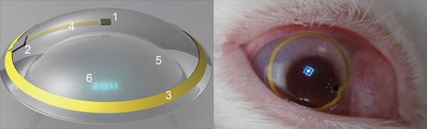
(Image: Institute of Physics)
The future of augmented-reality technology is here - as long as you're a rabbit. Bioengineers have placed the first contact lenses containing electronic displays into the eyes of rabbits as a first step on the way to proving they are safe for humans. The bunnies suffered no ill effects, the researchers say.
The first version may only have one pixel, but higher resolution lens displays - like those seen in Terminator - could one day be used as satnav enhancers showing you directional arrows for example, or flash up texts and emails - perhaps even video. In the shorter term, the breakthrough also means people suffering from conditions like diabetes and glaucoma may find they have a novel way to monitor their conditions.
In February, New Scientist revealed the litany of research projects underway in the field of contact lens enhancement. While one company has fielded a contact lens technology using a surface-mounted strain gauge to assess glaucoma risk, none have built in a display, or the lenses needed for focused projection onto the retina - and then tested it in vivo. They have now.
"We have demonstrated the operation of a contact lens display powered by a remote radiofrequency transmitter in free space and on a live rabbit," says a US and Finnish team led by Babak Praviz of the University of Washington in Seattle.
"This verifies that antennas, radio chips, control circuitry, and micrometre-scale light sources can be integrated into a contact lens and operated on live eyes."
The test lens was powered remotely using a 5-millimetre-long antenna printed on the lens to receive gigahertz-range radio-frequency energy from a transmitter placed ten centimetres from the rabbit's eye. To focus the light on the rabbit's retina, the contact lens itself was fabricated as a Fresnel lens - in which a series of concentric annular sections is used to generate the ultrashort focal length needed.
They found their lens LED glowed brightly up to a metre away from the radio source in free space, but needed to be 2 centimetres away when the lens was placed in a rabbit's eye and the wireless reception was affected by body fluids. All the 40-minute-long tests on live rabbits were performed under general anaesthetic and showed that the display worked well - and fluroescence tests showed no damage or abrasions to the rabbit's eyes after the lenses were removed.
While making a higher resolution display is next on their agenda, there are uses for this small one, say the researchers: "A display with a single controllable pixel could be used in gaming, training, or giving warnings to the hearing impaired."
"This is clearly way off in the future. But we're aware of the research that is ongoing in this field and we're watching the technology's potential for biosensing and drug delivery applications in particular," says a spokesperson for the British Contact Lens Association in London.
Monday, November 21. 2011
Cotton Candy Device Puts Small Android-Powered Computer In A Thumb Drive
Via nexus404
-----
The rush to make computers smaller and smaller has been going on for some time now, but we may have a winner–at least for now–in terms of the small computer race. It’s called the Cotton Candy from FXI Tech, and though it just looks like your standard USB thumb drive, it turns out it’s packing an entire very small computer in its tiny packaging.

The specs, admittedly, aren’t anything truly spectacular, offering up a dual-core ARM Cortex A9 on the processor end, backed up by an ARM Mali-400MP GPU, wi-fi and Bluetooth connectivity, a USB plug and a microSD card slot as well as its own Android operating system. But when you consider that it’s all encased in a device that’s the size of a basic key chain, well, suddenly the whole picture looks a lot more interesting.
What this is designed to do is hook into much larger displays, thanks to that HDMI plug, and allow you to perform many of your basic computer functions. You’ve got Bluetooth for the peripherals, microSD for the storage, cloud access from the Android app…it’s a very simple, very basic, but extremely portable setup. And, you can even hook it into another computer with the USB plug included, which in turn will let you borrow the peripherals hooked into that computer (great if you needed to print something, I’d say) to do the various jobs you want done.
And if you want an ultra-small computer to take with you most anywhere you go, Cotton Candy should be on hand in time for Christmas 2012, and the pricing is expected to land at the $200 mark, which isn’t half bad. Though it does make me wonder why most wouldn’t just buy a full on laptop for not too much more, especially if they buy used.
Still though, an ultra-small PC for an ultra-small price tag is in the offing, so what do you guys think? Will the Cotton Candy catch on? Or will we be seeing these go for half that or less just to clear them out? No matter what you think, we love hearing from you, so head on down to the comments section and tell us what you think!
Wednesday, November 09. 2011
NVIDIA Tegra 3 quad-core mobile processor revealed and detailed
Via Slash Gear
By Chris Burns
-----
The next generation of mobile processors has arrived in the form of the NIVIDA Tegra 3, formerly known as Project Kal-El, a quad-core chipset with aspirations to dominate the Android landscape in 2012 as theTegra 2 dual-core processor dominated the majority of 2011. Though many of the details have already been revealed by NVIDIA before today on how Tegra 3 functions and is able to bring you the consumer more power, less battery consumption, and more effective workload distribution, this marks both the official naming of the chip as well as the official distribution of easy to process videos on how Tegra 3 will affect the average mobile device user.

NVIDIA’s Tegra 3 chipset has been gone over in full detail by your humble narrator in two posts here on SlashGear just a few weeks ago in two posts, one on how there are actually [five cores, not just four], and another all about [Variable Symmetric Multiprocessing] aka vSMP. Note that back then NVIDIA had not yet revealed that the final market name for the processor would be “Tegra 3? at the time these posts were published, instead still using the codename “Project Kal-El” to identify the chipset. The most important thing you should take away from these posts is this: your battery life will be better and the distribution of power needed by your processor cores will be handled more intelligently.

NVIDIA has provided a few videos that will explain again in some rather easy to process detail what we’re dealing with here in the Tegra 3. The first of these videos shows visually what cores use which amount of power as several different tasks are performed. Watch as a high-powered game uses all four cores while browsing a webpage might only use a single core. This is the power of Variable Symmetric Multiprocessing in action.
NVIDIA Tegra 3: Fifth Companion Core
Next there’s a demonstration of an upcoming game that would never have been able to exist on a mobile platform if it hadn’t been for NVIDIA’s new chip architecture and the power of a quad-core chipset – along with NVIDIA’s twelve GPU cores of course. We had a look at this game back earlier this year in the first Glowball post – now we go underwater:
Glowball Video 2: Tegra 3 goes underwater
Finally there’s a lovely set of videos showing you exactly what it means for game developers and gamers to be working with the Tegra 3 chipset. The first video shows off how next-generation games are being made specifically for this chipset, developers working hand in hand with NVIDIA to optimize their games for the Tegra 3 so that gamers can get the most awesome experience in mobile history. Devour this, if you will:
NVIDIA Tegra 3: Developers bring Next-Generation Games to Mobile
You can also see several examples of the games in the video and how they’ve been improved in the Tegra 3 world. Riptide GP as well as Shadowgun have been reviewed and given hands-on videos by your humble narrator in the past – can’t wait for the enhanced visions! Next have a look at these games running side-by-side with their original versions. Make sure you’re sitting down, because you’re going to get pumped up.
Side-by-side Gameplay Competition vs Tegra 3
Down to the frames per second, this new chipset will change the world you live in as far as gaming goes. Of course it doesn’t stop there, but in that gaming is one of the best ways to test a processor on this platform, one made with gaming in mind of course, you’ve got to appreciate the power. Have a peek at this tiny chart to see what we mean:

Then head over to the post from ASUS on what the very first hardware running the Tegra 3 will look like. It’s the ASUS Eee Pad Transformer Prime, a 10.1-inch tablet from the makers of the original Transformer, a device made to pummel the competition and usher in a whole new age in mobile computing. We look forward to the future, NVIDIA, bring on another year of complete and total annihilation of the competition!
Monday, November 07. 2011
Introducing the 5-watt server that runs on cell phone chips
Via giagom
-----
Can ARM wrestle its way into the server market? Calxeda and Hewlett-Packard think so. On Tuesday Calxeda launched its EnergyCore ARM server-on-a-chip (SoC), which it says consumes as little as 1.5 watts (and idles at half a watt). And HP, the world’s largest server maker, committed to building EnergyCore-based servers that will consume as little as 5 watts when running all out. Compare that to the lowest-power x86 server chips from Intel, which consume about 20 watts but deliver higher performance.
Calxeda, backed in part by ARM Holdings, is banking that the success that ARM chips found in smartphones and mobile devices will carry over into data centers serving large, scale-out workloads. In that arena, it is facing off squarely against chip giant Intel and its x86-based architecture, which dominates the market for chips running in commodity servers.
Said Calxeda in a statement:
Thanks to its mobile phone heritage and patent-pending innovations from Calxeda, the new processor consumes less than one tenth the power of today’s most energy-efficient server processors and is ideal for workloads such as web serving, ‘Big Data’ applications, scalable analytics such as Apache Hadoop, media streaming and mid-tier infrastructure such as caching and in-memory databases.
EnergyCore targets web serving, big data apps
The small form factor and energy stinginess of EnergyCore, based on the ARM Cortex processor, suits an emerging and fast-growing class of web and cloud applications, but it lacks in terms of software support and currently won’t support the enterprise demand for 64-bit processors. Thus, for traditional data centers locked into the Intel x86 architecture and with lots of legacy software to run, Calxeda might be a stretch. But that might not matter.
“For big cloud companies that buy gargantuan numbers of servers and for whom the power and space issues get linearly nasty as they build up the number of nodes, this is a good solution,” said analyst Roger Kay, the founder and president of Endpoint Technologies Associates.
These sorts of transactions take on an almost consultative nature, where the server vendor works with the customer’s developers, he said.
EnergyCore is 32-bit only, a fact that Intel will no doubt trumpet. “High-performance computing [HPC] needs 64 bits to deal with larger address space, but that doesn’t mean that 32-bit [processors] can’t address certain data center applications,” Kay said. “This new chip is designed to handle very large databases that in turn handle lots of queries from many end points. Think Google Earth where there are lots of simple queries — ‘show me the bits in the X-Y grid specified.’”
HP estimates that those big scale-out web and cloud data center scenarios represent a healthy 10 to 15 percent of the data center market, Kay noted. That’s certainly worth fighting for. Intel pegs that segment at 10 percent of the overall market.
 Richard
Fichera, the VP and an analyst at Forrester Research, said Calxeda did
its homework. “This looks to be at least three to five times more energy
efficient than other chips and [energy use] is a growing concern for
data centers.” Some of what Calxeda has done will be hard for
competitors to replicate, he said.
Richard
Fichera, the VP and an analyst at Forrester Research, said Calxeda did
its homework. “This looks to be at least three to five times more energy
efficient than other chips and [energy use] is a growing concern for
data centers.” Some of what Calxeda has done will be hard for
competitors to replicate, he said.
Calxeda, like SeaMicro, which makes low-power servers running Intel Atom processors, also builds on a fabric that lets all the various SoC components communicate inside the box.
Skeptics point out that big data center buyers tend to be a conservative lot, not likely to gamble on a new chip architecture. “Many CIOs will go with the devil they know. They have software that runs on Intel so why move?” Kay said. But again, Calxeda and HP are seeking out the biggest of the big data center companies — those that have a lot of in-house development talent that are not as bound by legacy software concerns.
What’s in EnergyCore SoC?
- Multicore ARM Cortex processor running at 1.1 GHz to 1.4 GHz
- Supports FPU (scalar) and NEON (SIMD) Floating Point
- 4 MB of onboard shared L2 cache
- Integrated Memory Controller with 72-bit datapath, and ECC
- Typical maximum power consumption (running 100% CPU load under normal conditions) is 5 watts
- Typical idle power consumption is less than .5 watts
Calxeda and HP will start rolling out sample products later this year, with volume ramping up in 2012. Calxeda is not alone in this arena: Marvell Inc. is already in the market with its own ARM-based servers. NVIDIA is also building an ARM-based server, dubbed Denver, for HPC.
While Calxeda is tiny compared to Intel, it also doesn’t manufacture its own silicon, which could end up hurting it when comparing it to Intel, one of the last silicon vendors to own its own chip manufacturing. Fichera notes that Calxeda has no control over the distribution and sales of what it designs: The server partner has all the leverage. If someone else has a better SoC next year, Calxeda (or whatever SoC provider they use) could be gone.
Tuesday, November 01. 2011
Multi-Device Web Design: An Evolution
Via LUKEW
By Luke Wroblewski
-----
As mobile devices have continued to evolve and spread, so has the process of designing and developing Web sites and services that work across a diverse range of devices. From responsive Web design to future friendly thinking, here's how I've seen things evolve over the past year and a half.
If you haven't been keeping up with all the detailed conversations about multi-device Web design, I hope this overview and set of resources can quickly bring you up to speed. I'm only covering the last 18 months because it has been a very exciting time with lots of new ideas and voices. Prior to these developments, most multi-device Web design problems were solved with device detection and many still are. But the introduction of Responsive Web Design really stirred things up.
Responsive Web Design
Responsive Web Design is a combination of fluid grids and images with media queries to change layout based on the size of a device viewport. It uses feature detection (mostly on the client) to determine available screen capabilities and adapt accordingly. RWD is most useful for layout but some have extended it to interactive elements as well (although this often requires Javascript).
Responsive Web Design allows you to use a single URL structure for a site, thereby removing the need for separate mobile, tablet, desktop, etc. sites.
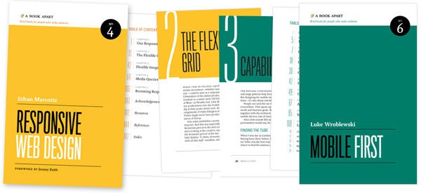
For a short overview read Ethan Marcotte's original article. For the full story read Ethan Marcotte's book. For a deeper dive into the philosophy behind RWD, read over Jeremy Keith's supporting arguments. To see a lot of responsive layout examples, browse around the mediaqueri.es site.
Challenges
Responsive Web Design isn't a silver bullet for mobile Web experiences. Not only does client-side adaptation require a careful approach, but it can also be difficult to optimize source order, media, third-party widgets, URL structure, and application design within a RWD solution.
Jason Grigsby has written up many of the reasons RWD doesn't instantly provide a mobile solution especially for images. I've documented (with concrete) examples why we opted for separate mobile and desktop templates in my last startup -a technique that's also employed by many Web companies like Facebook, Twitter, Google, etc. In short, separation tends to give greater ability to optimize specifically for mobile.
Mobile First Responsive Design
Mobile First Responsive Design takes Responsive Web Design and flips the process around to address some of the media query challenges outlined above. Instead of starting with a desktop site, you start with the mobile site and then progressively enhance to devices with larger screens.
The Yiibu team was one of the first to apply this approach and wrote about how they did it. Jason Grigsby has put together an overview and analysis of where Mobile First Responsive Design is being applied. Brad Frost has a more high-level write-up of the approach. For a more in-depth technical discussion, check out the thread about mobile-first media queries on the HMTL5 boilerplate project.
Techniques
Many folks are working through the challenges of designing Web sites for multiple devices. This includes detailed overviews of how to set up Mobile First Responsive Design markup, style sheet, and Javascript solutions.
Ethan Marcotte has shared what it takes for teams of developers and designers to collaborate on a responsive workflow based on lessons learned on the Boston Globe redesign. Scott Jehl outlined what Javascript is doing (PDF) behind the scenes of the Globe redesign (hint: a lot!).
Stephanie Rieger assembled a detailed overview (PDF) of a real-world mobile first responsive design solution for hundreds of devices. Stephan Hay put together a pragmatic overview of designing with media queries.
Media adaptation remains a big challenge for cross-device design. In particular, images, videos, data tables, fonts, and many other "widgets" need special care. Jason Grigsby has written up the situation with images and compiled many approaches for making images responsive. A number of solutions have also emerged for handling things like videos and data tables.
Server Side Components
Combining Mobile First Responsive Design with server side component (not full page) optimization is a way to extend client-side only solutions. With this technique, a single set of page templates define an entire Web site for all devices but key components within that site have device-class specific implementations that are rendered server side. Done right, this technique can deliver the best of both worlds without the challenges that can hamper each.
I've put together an overview of how a Responsive Design + Server Side Components structure can work with concrete examples. Bryan Rieger has outlined an extensive set of thoughts on server-side adaption techniques and Lyza Gardner has a complete overview of how all these techniques can work together. After analyzing many client-side solutions to dynamic images, Jason Grigsby outlined why using a server-side solution is probably the most future friendly.

Future Thinking
If all the considerations above seem like a lot to take in to create a Web site, they are. We are in a period of transition and still figuring things out. So expect to be learning and iterating a lot. That's both exciting and daunting.
It also prepares you for what's ahead. We've just begun to see the onset of cheap networked devices of every shape and size. The zombie apocalypse of devices is coming. And while we can't know exactly what the future will bring, we can strive to design and develop in a future-friendly way so we are better prepared for what's next.
Resources
I referenced lots of great multi-device Web design resources above. Here they are in one list. Read them in order and rock the future Web!
- Effective Design for Multiple Screen Sizesby Bryan Rieger
- Responsive Web Design (article) by Ethan Marcotte
- Responsive Web Design (book) by Ethan Marcotte
- There Is No Mobile Web by Jeremy Keith
- mediaqueri.es by various artisits
- CSS Media Query for Mobile is Fool’s Gold by Jason Grigsby
- Why Separate Mobile & Desktop Web Pages? by Luke Wroblewski
- About this site... by Yiibu
- Where are the Mobile First Responsive Web Designs? by Jason Grigsby
- Mobile-First Responsive Web Design by Brad Frost
- Mobile-first Media Queries by various artists
- The Responsive Designer’s Workflow by Ethan Marcotte
- Responsible & Responsive (PDF) by Scott Jehl
- Pragmatic Responsive Design (further details) by Stephanie Rieger
- A Closer Look at Media Queries by Stephen Hay
- Responsive IMGs — Part 1 by Jason Grigsby
- Responsive IMGs — Part 2 by Jason Grigsby
- Device detection as the future friendly img option by Jason Grigsby
- Responsive Video Embeds with FitVids by Dave Rupert
- Responsive Data Tables by Chris Coyier
- RESS: Responsive Design + Server Side Components by Luke Wroblewski
- Adaptation (PDF) by Bryan Rieger
- How I Learned to Stop Worrying and Set my Mobile Web Sites Free by Lyza Danger Gardner
- The Coming Zombie Apocalypse by Scott Jenson
- Future Friendly by various artists
Quicksearch
Popular Entries
- The great Ars Android interface shootout (131399)
- Norton cyber crime study offers striking revenue loss statistics (102204)
- MeCam $49 flying camera concept follows you around, streams video to your phone (100420)
- Norton cyber crime study offers striking revenue loss statistics (58433)
- The PC inside your phone: A guide to the system-on-a-chip (58259)
