According toNieman Journalism Lab, an graduate student of MIT is developing a way to check for lying in political writing as easily as you check for spelling errors.
In a partnership with PolitiFact,Dan Schultzis looking to “bridge the gap between the corpus of facts and the actual media consumption experience.” That’s a lot of words to say this – it will know when you’re full of crap.
The project is using natural language processing to verify facts, via API, against the information contained in PolitiFact. That is to say that it’s not able to tell a lie from the truth on its own, but rather it does so by pulling in data on phrases that are in a system. Sometime next year, when the project is finished, Schultz plans to open-source it and then the abilities should grow.
As NJL posits, and we hope this to be the eventual truth, Schultz’s work could eventually end up being built into software that would scan sites such as Snopes, allowing you to easily debunk claims that so often get passed around as facts on the Internet.
“I’m very interested in looking at ways to trigger people’s critical abilities so they think a little bit harder about what they’re reading…before adopting it into their worldview.”
For a bit less B.S. in this world? Here’s hoping that this project gets the time, attention and money that it will undoubtedly need.
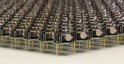
The Kilobots are an inexpensive system for testing synchronized and collaborative behavior in a very large swarm of robots. Photo courtesy of Michael Rubenstein
The Kilobots are coming. Computer scientists and engineers at Harvard University have developed and licensed technology that will make it easy to test collective algorithms on hundreds, or even thousands, of tiny robots.
Called Kilobots, the quarter-sized bug-like devices scuttle around on three toothpick-like legs, interacting and coordinating their own behavior as a team. AJune 2011 Harvard Technical Reportdemonstrated a collective of 25 machines implementing swarming behaviors such as foraging, formation control, and synchronization.
Once up and running, the machines are fully autonomous, meaning there is no need for a human to control their actions.
The communicative critters were created by members of the Self-Organizing Systems Research Group led by Radhika Nagpal, the Thomas D. Cabot Associate Professor of Computer Science at the Harvard School of Engineering and Applied Sciences (SEAS) and a Core Faculty Member at the Wyss Institute for Biologically Inspired Engineering at Harvard. Her team also includes Michael Rubenstein, a postdoctoral fellow at SEAS; and Christian Ahler, a fellow of SEAS and the Wyss Institute.
Thanks to a technology licensing deal with the K-Team Corporation, a Swiss manufacturer of high-quality mobile robots, researchers and robotics enthusiasts alike can now take command of their own swarm.
One key to achieving high-value applications for multi-robot systems in the future is the development of sophisticated algorithms that can coordinate the actions of tens to thousands of robots.
"The Kilobot will provide researchers with an important new tool for understanding how to design and build large, distributed, functional systems," says Michael Mitzenmacher, Area Dean for Computer Science at SEAS.
The name "Kilobot" does not refer to anything nefarious; rather, it describes the researchers' goal of quickly and inexpensively creating a collective of a thousand bots.
Inspired by nature, such swarms resemble social insects, such as ants and bees, that can efficiently search for and find food sources in large, complex environments, collectively transport large objects, and coordinate the building of nests and other structures.
Due to reasons of time, cost, and simplicity, the algorithms being developed today in research labs are only validated in computer simulation or using a few dozen robots at most.
In contrast, the design by Nagpal's team allows a single user to easily oversee the operation of a large Kilobot collective, including programming, powering on, and charging all robots, all of which would be difficult (if not impossible) using existing robotic systems.
So, what can you do with a thousand tiny little bots?
Robot swarms might one day tunnel through rubble to find survivors, monitor the environment and remove contaminants, and self-assemble to form support structures in collapsed buildings.
They could also be deployed to autonomously perform construction in dangerous environments, to assist with pollination of crops, or to conduct search and rescue operations.
For now, the Kilobots are designed to provide scientists with a physical testbed for advancing the understanding of collective behavior and realizing its potential to deliver solutions for a wide range of challenges.
-----
Personal comment:
This remembers me one project I have worked on, back in 2007, called "Variable Environment", which was involving swarm based robots called "e-puck" developed at EPFL. E-pucks were reacting in an autonomous manner to human activity around them.
The rush to make computers smaller and smaller has been going on for some time now, but we may have a winner–at least for now–in terms of the small computer race. It’s called the Cotton Candy from FXI Tech, and though it just looks like yourstandard USBthumb drive, it turns out it’s packing an entire very small computer in its tiny packaging.
The specs, admittedly, aren’t anything truly spectacular, offering up a dual-core ARM Cortex A9 on the processor end, backed up by an ARM Mali-400MP GPU, wi-fi and Bluetooth connectivity, a USB plug and a microSD card slot as well as its own Android operating system. But when you consider that it’s all encasedin a devicethat’s the size of a basic key chain, well, suddenly the whole picture looks a lot more interesting.
What this is designed to do is hook into much larger displays, thanks to that HDMI plug, and allow you to perform many of your basic computer functions. You’ve got Bluetooth for the peripherals, microSD for the storage, cloud access from the Android app…it’s a very simple, very basic, but extremely portable setup. And, you can even hook it into another computer with the USB plug included, which in turn will let you borrow the peripherals hooked into that computer (great if you needed to print something, I’d say) to do the various jobs you want done.
And if you want an ultra-small computer to take with you most anywhere you go, Cotton Candy should be on hand in time for Christmas 2012, and the pricing is expected to land at the $200 mark, which isn’t half bad. Though it does make me wonder why most wouldn’t just buy a full on laptop for not too much more, especially if they buy used.
Still though, an ultra-small PC for an ultra-small price tag is in the offing, so what do you guys think? Will the Cotton Candy catch on? Or will we be seeing these go for half that or less just to clear them out? No matter what you think, we love hearing from you, so head on down to the comments section and tell us what you think!
Focus in future will be on HTML5 as mobile world shifts towards
non-proprietary open standards – and now questions will linger over use
of Flash on desktop
Adobe is killing off development of its
mobile Flash plugin, and laying off 750 staff as part of broader
restructuring. Photograph: Paul Sakuma/AP
Mobile Flash is being killed off. The plugin that launched a thousand online forum arguments and a technology standoff between Apple and the format's creator, Adobe,
will no longer be developed for mobile browsers, the company said in a
note that will accompany a financial briefing to analysts.
Instead the company will focus on development around HTML5
technologies, which enable modern browsers to do essentially the same
functions as Flash did but without relying on Adobe's proprietary
technologies, and which can be implemented across platforms.
The existing plugins for the Android and BlackBerry platforms will be given bug fixes and security updates, the company said in a statement first revealed by ZDNet. But further development will end.
The
decision also raises a question mark over the future of Flash on
desktop PCs. Security vulnerabilities in Flash on the desktop have been
repeatedly exploited to infect PCs in the past 18 months, while Microsoft
has also said that the default browser in its forthcoming Windows 8
system, expected at the end of 2012, will not include the Flash plugin
by default. Apple, which in the third quarter captured 5% of the world
market, does not include Flash in its computers by default.
John Nack, a principal product manager at Adobe, commented on his personal blog
(which does not necessarily reflect Adobe views) that: "Adobe saying
that Flash on mobile isn't the best path forward [isn't the same as]
Adobe conceding that Flash on mobile (or elsewhere) is bad technology.
Its quality is irrelevant if it's not allowed to run, and if it's not
allowed to run, then Adobe will have to find different ways to meet
customers' needs."
Around 250m iOS (iPhone, iPod Touches and iPad)
devices have been sold since 2007. There are no clear figures for how
many are now in use. More recently Larry Page, chief executive of
Google, said that a total of 190m Android devices have been activated.
It is not clear how many of those include a Flash plugin in the browser.
"Our
future work with Flash on mobile devices will be focused on enabling
Flash developers to package native apps with Adobe Air for all the major
app stores," Adobe said in the statement. "We will no longer adapt
Flash Player for mobile devices to new browser, OS version or device
configurations.
"Some of our source code licensees may opt to
continue working on and releasing their own implementations. We will
continue to support the current Android and PlayBook configurations with
critical bug fixes and security updates."
The decision comes as
Adobe plans to cut 750 staff, principally in North America and Europe.
An Adobe spokesperson declined to give any figures for the extent of
layoffs in the UK. The company reiterated its expectation that it will
meet revenue targets for the fourth quarter.
The reversal by Adobe
– and its decision to focus on the open HTML5 platform for mobile –
brings to an end a long and tumultuous row between Apple and Adobe over
the usefulness of Flash on the mobile platform. The iPhone launched in
2007 without Flash capability, as did the iPad in 2010.
Steve
Jobs, then Apple's chief executive, and Apple's engineers insisted that
Flash was a "battery hog" and introduced security and stability flaws;
Adobe countered that it was broadly implemented in desktop PCs and used
widely on the web.
Jobs's antagonism was partly driven, his
biography reveals, by Adobe's reluctance after he rejoined Apple in 1996
to port its movie-editing programs to the Mac and to keep its Photoshop
suite comparable on the Mac platform with the Windows one.
But
Jobs also insisted that mobile Flash failed in the role of providing a
good user experience, and also would restrict Apple's ability to push
forward on the iOS platform. Studies of browser crash reports by Apple's
teams showed that Flash was responsible for a signficant proportion of
user problems; Apple was also not satisfied that a Flash plugin would be
available for the first iPhone in 2007 which would not consume more
battery power than would be acceptable.
Jobs managed to persuade
Eric Schmidt, then Google's chief executive and a member of the Apple
board, to get YouTube to make videos available in the H.264 format
without a Flash "wrapper", as was then used for the desktop
implementation.
But the disagreements between Apple and Adobe
intensified, especially when Android devices began appearing which did
use the Flash plugin. Apple refused to use it, and banned apps from its
App Store which tried to use or include Flash.
In "Thoughts on Flash",
an open letter published by Jobs in April 2010, he asserted that "Flash
was created during the PC era – for PCs and mice. Flash is a successful
business for Adobe, and we can understand why they want to push it
beyond PCs. But the mobile era is about low power devices, touch
interfaces and open web standards – all areas where Flash falls short.
"New
open standards created in the mobile era, such as HTML5, will win on
mobile devices (and PCs too). Perhaps Adobe should focus more on
creating great HTML5 tools for the future, and less on criticizing Apple
for leaving the past behind."
At the beginning of last week, I launched GreedAndFearIndex
- a SaaS platform that automatically reads thousands of financial news
articles daily to deduce what companies are in the news and whether
financial sentiment is positive or negative.
It’s an app built largely on Scala, with MongoDB and Akka playing prominent roles to be able to deal with the massive amounts of data on a relatively small and cheap amount of hardware.
The app itself took about 4-5 weeks to build, although the underlying
technology in terms of web crawling, data cleansing/normalization, text
mining, sentiment analysis, name recognition, language grammar
comprehension such as subject-action-object resolution and the
underlying “God”-algorithm that underpins it all took considerably
longer to get right.
Doing it all was not only lots of late nights of coding, but also
reading more academic papers than I ever did at university, not only on
machine learning but also on neuroscience and research on the human
neocortex.
What I am getting at is that financial news and sentiment analysis
might be a good showcase and the beginning, but it is only part of a
bigger picture and problem to solve.
Unlocking True Machine Intelligence & Predictive Power The
human brain is an amazing pattern matching & prediction machine -
in terms of being able to pull together, associate, correlate and
understand causation between disparate, seemingly unrelated strands of
information it is unsurpassed in nature and also makes much of what has
passed for “Artificial Intelligence” look like a joke.
However, the human brain is also severely limited: it is slow, it’s
immediate memory is small, we can famously only keep track of 7 (+-)
things at any one time unless we put considerable effort into it. We are
awash in amounts of data, information and noise that our brain is
evolutionary not yet adapted to deal with.
So the bigger picture of what I’m working on is not a SaaS sentiment
analysis tool, it is the first step of a bigger picture (which
admittedly, I may not solve, or not solve in my lifetime):
What if we could make machines match our own ability to find patterns
based on seemingly unrelated data, but far quicker and with far more
than 5-9 pieces of information at a time?
What if we could accurately predict the movements of financial
markets, the best price point for a product, the likelihood of natural
disasters, the spreading patterns of infectious diseases or even unlock
the secrets of solving disease and aging themselves?
The Enablers I see a number of enablers that are making this future a real possibility within my lifetime:
Advances in neuroscience: our understanding of
the human brain is getting better year by year, the fact that we can now
look inside the brain on a very small scale and that we are starting to
build a basic understanding of the neocortex will be the key to the
future of machine learning. Computer Science and Neuroscience must
intermingle to a higher degree to further both fields.
Cloud Computing, parallelism & increased computing power:
Computing power is cheaper than ever with the cloud, the software to
take advantage of multi-core computers is finally starting to arrive and
Moore’s law is still advancing at ever (the latest generation of
MacBook Pro’s have roughly 2.5 times the performance of my barely 2 year
old MBP).
“Big Data”: we have the data needed to both train
and apply the next generation of machine learning algorithms on
abundantly available to us. It is no longer locked away in the silos of
corporations or the pages of paper archives, it’s available and
accessible to anyone online.
Crowdsourcing: There are two things that are very
time intensive when working with machine learning - training the
algorithms, and once in production, providing them with feedback (“on
the job training”) to continually improve and correct. The internet and
crowdsourcing lowers the barriers immensely. Digg, Reddit, Tweetmeme,
DZone are all early examples of simplistic crowdsourcing with little
learning, but where participants have a personal interest in
participating in the crowdsourcing. Combine that with machine learning
and you have a very powerful tool at your disposal.
Babysteps & The Perfect Storms All
things considered, I think we are getting closer to the perfect storm of
taking machine intelligence out of the dark ages where they have
lingered far too long and quite literally into a brave new world where
one day we may struggle to distinguish machine from man and artificial
intelligence from biological intelligence.
It will be a road fraught with setbacks, trial and error where the
errors will seem insurmountable, but we’ll eventually get there one
babystep at a time. I’m betting on it and the first natural step is
predictive analytics & adaptive systems able to automatically detect
and solve problems within well-defined domains.
As mobile devices have continued to evolve and spread,
so has the process of designing and developing Web sites and services
that work across a diverse range of devices. From responsive Web design
to future friendly thinking, here's how I've seen things evolve over the
past year and a half.
If
you haven't been keeping up with all the detailed conversations about
multi-device Web design, I hope this overview and set of resources can
quickly bring you up to speed. I'm only covering the last 18 months
because it has been a very exciting time with lots of new ideas and
voices. Prior to these developments, most multi-device Web design
problems were solved with device detection and many still are. But the introduction of Responsive Web Design really stirred things up.
Responsive Web Design
Responsive
Web Design is a combination of fluid grids and images with media
queries to change layout based on the size of a device viewport. It uses
feature detection (mostly on the client) to determine available screen
capabilities and adapt accordingly. RWD is most useful for layout but
some have extended it to interactive elements as well (although this
often requires Javascript).
Responsive Web Design allows you to
use a single URL structure for a site, thereby removing the need for
separate mobile, tablet, desktop, etc. sites.
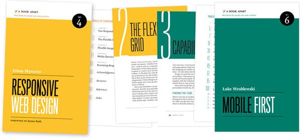
For a short overview read Ethan Marcotte's original article. For the full story read Ethan Marcotte's book. For a deeper dive into the philosophy behind RWD, read over Jeremy Keith's supporting arguments. To see a lot of responsive layout examples, browse around the mediaqueri.es site.
Challenges
Responsive
Web Design isn't a silver bullet for mobile Web experiences. Not only
does client-side adaptation require a careful approach, but it can also
be difficult to optimize source order, media, third-party widgets, URL
structure, and application design within a RWD solution.
Jason Grigsby has written up many of the reasons RWD doesn't instantly provide a mobile solution especially for images. I've documented (with concrete) examples why we opted for separate mobile and desktop templates in my last startup -a technique that's also employed by many Web companies like Facebook, Twitter, Google, etc. In short, separation tends to give greater ability to optimize specifically for mobile.
Mobile First Responsive Design
Mobile
First Responsive Design takes Responsive Web Design and flips the
process around to address some of the media query challenges outlined
above. Instead of starting with a desktop site, you start with the
mobile site and then progressively enhance to devices with larger
screens.
The Yiibu team was one of the first to apply this approach and wrote about how they did it. Jason Grigsby has put together an overview and analysis of where Mobile First Responsive Design is being applied. Brad Frost has a more high-level write-up of the approach. For a more in-depth technical discussion, check out the thread about mobile-first media queries on the HMTL5 boilerplate project.
Techniques
Many
folks are working through the challenges of designing Web sites for
multiple devices. This includes detailed overviews of how to set up
Mobile First Responsive Design markup, style sheet, and Javascript
solutions.
Ethan Marcotte has shared what it takes for teams of developers and designers to collaborate on a responsive workflow based on lessons learned on the Boston Globe redesign. Scott Jehl outlined what Javascript is doing (PDF) behind the scenes of the Globe redesign (hint: a lot!).
Stephanie Rieger assembled a detailed overview (PDF)
of a real-world mobile first responsive design solution for hundreds of
devices. Stephan Hay put together a pragmatic overview of designing with media queries.
Media
adaptation remains a big challenge for cross-device design. In
particular, images, videos, data tables, fonts, and many other "widgets"
need special care. Jason Grigsby has written up the situation with images and compiled many approaches for making images responsive. A number of solutions have also emerged for handling things like videos and data tables.
Server Side Components
Combining
Mobile First Responsive Design with server side component (not full
page) optimization is a way to extend client-side only solutions. With
this technique, a single set of page templates define an entire Web site
for all devices but key components within that site have device-class
specific implementations that are rendered server side. Done right, this
technique can deliver the best of both worlds without the challenges
that can hamper each.
I've put together an overview of how a Responsive Design + Server Side Components structure can work with concrete examples. Bryan Rieger has outlined an extensive set of thoughts on server-side adaption techniques and Lyza Gardner has a complete overview of how all these techniques can work together. After analyzing many client-side solutions to dynamic images, Jason Grigsby outlined why using a server-side solution is probably the most future friendly.
Future Thinking
If
all the considerations above seem like a lot to take in to create a Web
site, they are. We are in a period of transition and still figuring
things out. So expect to be learning and iterating a lot. That's both
exciting and daunting.
It also prepares you for what's ahead.
We've just begun to see the onset of cheap networked devices of every
shape and size. The zombie apocalypse of devices is coming. And while we can't know exactly what the future will bring, we can strive to design and develop in a future-friendly way so we are better prepared for what's next.
Resources
I
referenced lots of great multi-device Web design resources above. Here
they are in one list. Read them in order and rock the future Web!


