Friday, April 19. 2013
A new way to report data center's Power and Water Usage Effectiveness (PUE and WUE)
-----
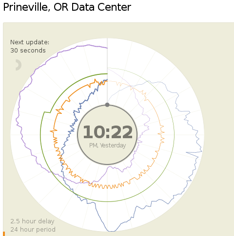
Today (18.04.2013) Facebook launched two public dashboards that report continuous, near-real-time data for key efficiency metrics – specifically, PUE and WUE – for our data centers in Prineville, OR and Forest City, NC. These dashboards include both a granular look at the past 24 hours of data and a historical view of the past year’s values. In the historical view, trends within each data set and correlations between different metrics become visible. Once our data center in Luleå, Sweden, comes online, we’ll begin publishing for that site as well.
We began sharing PUE for our Prineville data center at the end of Q2 2011 and released our first Prineville WUE in the summer of 2012. Now we’re pulling back the curtain to share some of the same information that our data center technicians view every day. We’ll continue updating our annualized averages as we have in the past, and you’ll be able to find them on the Prineville and Forest City dashboards, right below the real-time data.
Why are we doing this? Well, we’re proud of our data center efficiency, and we think it’s important to demystify data centers and share more about what our operations really look like. Through the Open Compute Project (OCP), we’ve shared the building and hardware designs for our data centers. These dashboards are the natural next step, since they answer the question, “What really happens when those servers are installed and the power’s turned on?”
Creating these dashboards wasn’t a straightforward task. Our data centers aren’t completed yet; we’re still in the process of building out suites and finalizing the parameters for our building managements systems. All our data centers are literally still construction sites, with new data halls coming online at different points throughout the year. Since we’ve created dashboards that visualize an environment with so many shifting variables, you’ll probably see some weird numbers from time to time. That’s OK. These dashboards are about surfacing raw data – and sometimes, raw data looks messy. But we believe in iteration, in getting projects out the door and improving them over time. So we welcome you behind the curtain, wonky numbers and all. As our data centers near completion and our load evens out, we expect these inevitable fluctuations to correspondingly decrease.
We’re excited about sharing this data, and we encourage others to do the same. Working together with AREA 17, the company that designed these visualizations, we’ve decided to open-source the front-end code for these dashboards so that any organization interested in sharing PUE, WUE, temperature, and humidity at its data center sites can use these dashboards to get started. Sometime in the coming weeks we’ll publish the code on the Open Compute Project’s GitHub repository. All you have to do is connect your own CSV files to get started. And in the spirit of all other technologies shared via OCP, we encourage you to poke through the code and make updates to it. Do you have an idea to make these visuals even more compelling? Great! We encourage you to treat this as a starting point and use these dashboards to make everyone’s ability to share this data even more interesting and robust.
Lyrica McTiernan is a program manager for Facebook’s sustainability team.
Quicksearch
Popular Entries
- The great Ars Android interface shootout (131479)
- Norton cyber crime study offers striking revenue loss statistics (102326)
- MeCam $49 flying camera concept follows you around, streams video to your phone (100495)
- The PC inside your phone: A guide to the system-on-a-chip (58655)
- Norton cyber crime study offers striking revenue loss statistics (58555)
Categories

Show tagged entries
Syndicate This Blog
Calendar
|
|
July '26 | |||||
| Mon | Tue | Wed | Thu | Fri | Sat | Sun |
| 1 | 2 | 3 | 4 | 5 | ||
| 6 | 7 | 8 | 9 | 10 | 11 | 12 |
| 13 | 14 | 15 | 16 | 17 | 18 | 19 |
| 20 | 21 | 22 | 23 | 24 | 25 | 26 |
| 27 | 28 | 29 | 30 | 31 | ||