Entries tagged as data visualisation
Wednesday, November 16. 2011
Artist Prints Out 24 Hours of Flickr Uploads, Over One Million Photos
Via GeekOSystem
-----

A new installation at the Amsterdam Foam gallery by Erik Kessels takes a literal look at the digital deluge of photos online by printing out 24 hours worth of uploads to Flickr. The result is rooms filled with over 1,000,000 printed photos, piled up against the walls.
There’s a sense of waste and a maddening disorganization to it all, both of which are apparently intentional. According to Creative Review, Kessels said of his own project:
“We’re exposed to an overload of images nowadays,” says Kessels. “This glut is in large part the result of image-sharing sites like Flickr, networking sites like Facebook, and picture-based search engines. Their content mingles public and private, with the very personal being openly and un-selfconsciously displayed. By printing all the images uploaded in a 24-hour period, I visualise the feeling of drowning in representations of other peoples’ experiences.”
Humbling, and certainly thought provoking, Kessel’s work challenges the notion that everything can and should be shared, which has become fundamental to the modern web. Then again, perhaps it’s only wasteful and overwhelming when you print all the pictures and divorce them from their original context.


")
Tuesday, November 08. 2011
The Big Picture: True Machine Intelligence & Predictive Power
Friday, July 29. 2011
New Geographic Data Analysis Gives Historians a Futuristic Window Into the Past
Via POPSCI
By Rebecca Boyle
-----
"Spatial humanities," the future of history
Even using the most detailed sources, studying history often requires a great imagination, so historians can visualize what the past looked and felt like. Now, new computer-assisted data analysis can help them really see it.
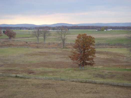
Geographic Information Systems, which can analyze information related to a physical location, are helping historians and geographers study past landscapes like Gettysburg, reconstructing what Robert E. Lee would have seen from Seminary Ridge. Researchers are studying the parched farmlands of the 1930s Dust Bowl, and even reconstructing scenes from Shakespeare’s 17th-century London.
But far from simply adding layers of complexity to historical study, GIS-enhanced landscape analysis is leading to new findings, the New York Times reports. Historians studying the Battle of Gettysburg have shed light on the tactical decisions that led to the turning point in the Civil War. And others examining records from the Dust Bowl era have found that extensive and irresponsible land use was not necessarily to blame for the disaster.
GIS has long been used by city planners who want to record changes to the landscape over time. And interactive map technology like Google Maps has led to several new discoveries. But by analyzing data that describes the physical attributes of a place, historians are finding answers to new questions.
Anne Kelly Knowles and colleagues at Middlebury College in Vermont culled information from historical maps, military documents explaining troop positions, and even paintings to reconstruct the Gettysburg battlefield. The researchers were able to explain what Robert E. Lee could and could not see from his vantage points at the Lutheran seminary and on Seminary Hill. He probably could not see the Union forces amassing on the eastern side of the battlefield, which helps explain some of his tactical decisions, Knowles said.
Geoff Cunfer at the University of Saskatchewan studied a trove of data from all 208 affected counties in Texas, New Mexico, Colorado, Oklahoma and Kansas — annual precipitation reports, wind direction, agricultural censuses and other data that would have been impossible to sift through without the help of a computer. He learned dust storms were common throughout the 19th century, and that areas that saw nary a tiller blade suffered just as much.
The new data-mapping phenomenon is known as spatial humanities, the Times reports. Check out their story to find out how advanced technology is the future of history.
Wednesday, July 27. 2011
Volume of data darn near indescribable ...
Via Network World
-----
The world's digital data is doubling every two years and the amount created or replicated in 2011 will reach 1.8 zettabytes, a pile so gargantuan that its size can only be rendered understandable to the layman when translated into iPads.
That's right, words no longer suffice; we need something magical for this job.
The problem is presented in a press release touting the fifth annual IDC Digital Universe study, sponsored by EMC. A bar chart, right, and enormous infographic at the bottom of this post will give you an overview of the study's findings. Here we're going to try to get our minds around 1.8 zettabytes. The sentences in bold are from the press release.
In terms of sheer volume, 1.8 zettabytes of data is equivalent to:
Every person in the United States tweeting 3 tweets per minute for 26,976 years nonstop.
The trouble here is that even if you know the population of the United States (311 million, give or take) and the length of a tweet (140 characters, maximum) you're still left to plug those pieces into a length of time (26,976 years) that has no meaning to most anyone not a paleontologist.
Every person in the world having over 215 million high-resolution MRI scans per day.
Don't worry, I looked it up for you; the world has almost 7 billion people. And while I haven't the foggiest notion as to how much data would be represented by a single high-resolution MRI scan, never mind 215 million of them, I can tell you based on recent experience that the so-called "open MRI machines" are really not all that open.
Over 200 billion HD movies (each 2 hours in length) - Would take 1 person 47 million years to watch every movie.
Honestly, that one doesn't help at all.
But look what happens when the study's authors use their handy-dandy zettabyte-to-iPad translator:
The amount of information needed to fill 57.5 billion 32GB Apple iPads. With that many iPads we could:
Create a wall of iPads, 4,005-miles long and 61-feet high extending from Anchorage, Alaska to Miami, Florida.
There's a map of the United States, and there's a wall of iPads about 10 times my height.
Build a mountain 25-times higher than Mt. Fuji.
You don't even need to know the elevation of the mountain (12,388 feet) to form that mental picture.
Cover 86% of Mexico City.
Take a big city, cover almost all of it with iPads. Got it.
Build the Great iPad Wall of China - at twice the average height of the original.
Bet that baby would be visible from space.
Yes, yes, I understand that this exercise need not be about the iPad at all and that any old 9.5-by-7.31-by-.34-inch box packing 32 GB would do. But what picture of what tablet has been seared into your brain by two-plus years of Apple marketing?
I mean they used to use the Library of Congress for these types of comparisons. Libraries don't stack as well.
(Disclaimer: All of the math here belongs to IDC and EMC; blame me not for any errors.)

Tuesday, July 19. 2011
Time-lapse video shows how iPhones move across Europe
Via geek.com
-----

Back in April, the news of Apple’s somewhat-secret iPhone location-data-tracking broke to much disapproval. The Internet was abuzz with outraged iPhone users concerned about their privacy. With a few months’ time, the dust has settled a bit, and a few people have even figured out ways to put this technology to good use.
Take Crowdflow’s Michael Kreil for example. Kreil took location data from 880 iPhones all across Europe over one month’s time, he aggregated the data from April 2011, and then visualized it by creating an amazing time-lapse video. We’re able to see how iPhone customers move across the different countries in Europe. The video definitely has a psychedelic feel to it with its bright undulating lights flying around the eye-catching-colored maps of Europe.
The map style resembles a bunch of fireflies buzzing about Europe. The lights fade on and off to represent when data is turned off, presumably at night when we tend to turn off our phones when going to sleep. Kreil said that most iPhones don’t collect data at night since the owner is, typically, not moving. Because of this, the image becomes blurry at night, and the lights dissolve.
Kreil said that he couldn’t decide on a color scheme, so he made three videos of the same data, but in different colors. We chose our favorite below, but make sure to watch the others if you have a different color preference. We also recommend watching the videos in full HD and in full-screen mode.
He also noted that he’d like to see the same project applied to the entire globe, which makes our little time-lapse-loving geek hearts flutter with excitement.
-----
More videos @ CrowdFlow
Friday, May 06. 2011
Visual Dashboard
-----
The data entered by millions of social-network users could be turned into revealing infographics.
Ever wondered just how much coffee you drank last year, or which movies you saw, and when? New Web and mobile apps make it possible to track, and visualize, this personal information graphically, and the trend could be set to expand dramatically.
This is because Facebook recently acquired one of the leading personal-data-tracking mobile apps and hired its creators. The social-networking giant could be gearing up to offer users ways to chart the minutiae of their lives with personalized infographics.
Nick Felton and Ryan Case, two New York-based designers, have pioneered turning the mundane contours of an everyday life into a kind of visual narrative. Each year, Felton publishes an "annual report" on his own life: an infographic that charts out his habits and lifestyle in great detail.
Felton and Case have also created a mobile app, called Daytum, that lets users gather personal data and represent it using infographics. Daytum already has 80,000 users, whose pages provide a detailed snapshot of everything from coffee drinking habits to baseball stadium visits. The app gives users the ability to easily record their own information, whatever it might be, and display it in an attractive manner, whether or not they are a designer.
Daytum is part of a larger trend in tracking personal information. But traditional personal tracking applications tend to revolve around medical data, sleep schedules, and the like. In Felton's creative visualizations, even something as mundane as how many concerts he attended in the past year becomes a kind of art. "I think there's storytelling potential in data," he says.
Felton says he can't talk about what he'll be doing at Facebook, but says, "Clearly, companies like Facebook recognize the value of the kind of work we were doing."
Quicksearch
Popular Entries
- The great Ars Android interface shootout (131525)
- Norton cyber crime study offers striking revenue loss statistics (102446)
- MeCam $49 flying camera concept follows you around, streams video to your phone (100543)
- The PC inside your phone: A guide to the system-on-a-chip (58715)
- Norton cyber crime study offers striking revenue loss statistics (58675)
Categories

Show tagged entries
Syndicate This Blog
Calendar
|
|
July '26 | |||||
| Mon | Tue | Wed | Thu | Fri | Sat | Sun |
| 1 | 2 | 3 | 4 | 5 | ||
| 6 | 7 | 8 | 9 | 10 | 11 | 12 |
| 13 | 14 | 15 | 16 | 17 | 18 | 19 |
| 20 | 21 | 22 | 23 | 24 | 25 | 26 |
| 27 | 28 | 29 | 30 | 31 | ||