In
the closing weeks of 2016, Google published an article that quietly
sailed under most people’s radars. Which is a shame, because it may just
be the most astonishing article about machine learning that I read last
year.
This doesn’t exactly scream must read,
does it? Especially when you’ve got projects to wind up, gifts to buy,
and family feuds to be resolved — all while the advent calendar
relentlessly counts down the days until Christmas like some kind of
chocolate-filled Yuletide doomsday clock.
Luckily, I’m here to bring you up to speed. Here’s the deal.
Up
until September of last year, Google Translate used phrase-based
translation. It basically did the same thing you and I do when we look
up key words and phrases in our Lonely Planet language guides. It’s
effective enough, and blisteringly fast compared to awkwardly thumbing
your way through a bunch of pages looking for the French equivalent of
“please bring me all of your cheese and don’t stop until I fall over.”
But it lacks nuance.
Phrase-based
translation is a blunt instrument. It does the job well enough to get
by. But mapping roughly equivalent words and phrases without an
understanding of linguistic structures can only produce crude results.
This
approach is also limited by the extent of an available vocabulary.
Phrase-based translation has no capacity to make educated guesses at
words it doesn’t recognize, and can’t learn from new input.
All
that changed in September, when Google gave their translation tool a
new engine: the Google Neural Machine Translation system (GNMT). This
new engine comes fully loaded with all the hot 2016 buzzwords, like neural network and machine learning.
The
short version is that Google Translate got smart. It developed the
ability to learn from the people who used it. It learned how to make
educated guesses about the content, tone, and meaning of phrases based
on the context of other words and phrases around them. And — here’s the
bit that should make your brain explode — it got creative.
Google Translate invented its own language to help it translate more effectively.
What’s more, nobody told it to. It didn’t develop a language (or interlingua,
as Google call it) because it was coded to. It developed a new language
because the software determined over time that this was the most
efficient way to solve the problem of translation.
Stop
and think about that for a moment. Let it sink in. A neural computing
system designed to translate content from one human language into
another developed its own internal language to make the task more
efficient. Without being told to do so. In a matter of weeks.
To
understand what’s going on, we need to understand what zero-shot
translation capability is. Here’s Google’s Mike Schuster, Nikhil Thorat,
and Melvin Johnson from the original blog post:
Let’s
say we train a multilingual system with Japanese⇄English and
Korean⇄English examples. Our multilingual system, with the same size as a
single GNMT system, shares its parameters to translate between these
four different language pairs. This sharing enables the system to
transfer the “translation knowledge” from one language pair to the
others. This transfer learning and the need to translate between
multiple languages forces the system to better use its modeling power.
This
inspired us to ask the following question: Can we translate between a
language pair which the system has never seen before? An example of this
would be translations between Korean and Japanese where Korean⇄Japanese
examples were not shown to the system. Impressively, the answer is
yes — it can generate reasonable Korean⇄Japanese translations, even
though it has never been taught to do so.
Here
you can see an advantage of Google’s new neural machine over the old
phrase-based approach. The GMNT is able to learn how to translate
between two languages without being explicitly taught. This wouldn’t be
possible in a phrase-based model, where translation is dependent upon an
explicit dictionary to map words and phrases between each pair of
languages being translated.
And this leads the Google engineers onto that truly astonishing discovery of creation:
The
success of the zero-shot translation raises another important question:
Is the system learning a common representation in which sentences with
the same meaning are represented in similar ways regardless of
language — i.e. an “interlingua”? Using a 3-dimensional representation
of internal network data, we were able to take a peek into the system as
it translates a set of sentences between all possible pairs of the
Japanese, Korean, and English languages.
Within
a single group, we see a sentence with the same meaning but from three
different languages. This means the network must be encoding something
about the semantics of the sentence rather than simply memorizing
phrase-to-phrase translations. We interpret this as a sign of existence
of an interlingua in the network.
So
there you have it. In the last weeks of 2016, as journos around the
world started penning their “was this the worst year in living memory”
thinkpieces, Google engineers were quietly documenting a genuinely
astonishing breakthrough in software engineering and linguistics.
I just thought maybe you’d want to know.
Ok, to really
understand what’s going on we probably need multiple computer science
and linguistics degrees. I’m just barely scraping the surface here. If
you’ve got time to get a few degrees (or if you’ve already got them)
please drop me a line and explain it all me to. Slowly.
Update 1:
in my excitement, it’s fair to say that I’ve exaggerated the idea of
this as an ‘intelligent’ system — at least so far as we would think
about human intelligence and decision making. Make sure you read Chris McDonald’s comment after the article for a more sober perspective.
But the TechAeris report suggests copresence will do
more than what GCM does today. Based on a source that scanned the latest
Google Play Services build, numerous references to copresence were
found along with images alluding to peer-to-peer file transfers, similar
to how Apple’s
AirDrop works between iOS and OS X. One of the images in the software
appears to be song sharing between an iPhone and an Android device.
Copresence could even be location-based, where the appropriate app
could tell you when other friends are nearby and in range for transfers
or direct communications. Obviously, without an official Google
announcement we don’t know what this project is about. All of the
evidence so far suggests, however, that a new cross-platform
communication method is in the works.
When it comes to speeding up Web traffic over the Internet, sometimes
too much of a good thing may not be such a good thing at all.
The Internet Engineering Task Force is putting the final touches on
HTTP/2, the second version of the Hypertext Transport Protocol (HTTP).
The working group has issued a last call draft, urging interested parties to voice concerns before it becomes a full Internet specification.
Not everyone is completely satisfied with the protocol however.
“There is a lot of good in this proposed standard, but I have some
deep reservations about some bad and ugly aspects of the protocol,”
wrote Greg Wilkins, lead developer of the open source Jetty server
software, noting his concerns in a blog item posted Monday.
Others, however, praise HTTP/2 and say it is long overdue.
“A lot of our users are experimenting with the protocol,” said Owen
Garrett, head of products for server software provider NGINX. “The
feedback is that generally, they have seen big performance benefits.”
First created by Web originator Tim Berners-Lee and associates, HTTP
quite literally powers today’s Web, providing the language for a browser
to request a Web page from a server.
SPDY is speediest
Version 2.0 of HTTP, based largely on the SPDY protocol developed by Google, promises to be a better fit for how people use the Web.
“The challenge with HTTP is that it is a fairly simple protocol, and
it can be quite laborious to download all the resources required to
render a Web page. SPDY addresses this issue,” Garrett said.
While the first generation of Web sites were largely simple and
relatively small, static documents, the Web today is used as a platform
for delivering applications and bandwidth intensive real-time multimedia
content.
HTTP/2 speeds basic HTTP in a number of ways. HTTP/2 allows servers
to send all the different elements of a requested Web page at once,
eliminating the serial sets of messages that have to be sent back and
forth under plain HTTP.
HTTP/2 also allows the server and the browser to compress HTTP, which
cuts the amount of data that needs to be communicated between the two.
As a result, HTTP/2 “is really useful for organization with
sophisticated Web sites, particularly when its users are distributed
globally or using slower networks—mobile users for instance,” Garrett
said.
While enthusiastic about the protocol, Wilkins did have several areas
of concern. For instance, HTTP/2 could make it more difficult to
incorporate new Web protocols, most notably the communications protocol WebSocket, Wilkins asserted.
Wilkins noted that HTTP/2 blurs what were previously two distinct
layers of HTTP—the semantic layer, which describes functionality, and
the framework layer, which is the structure of the message. The idea is
that it is simpler to write protocols for a specification with discrete
layers.
The protocol also makes it possible to hide content, including
malicious content, within the headers, bypassing the notice of today’s
firewalls, Wilkins said.
Servers need more power
HTTP/2 could also put a lot more strain on existing servers, Wilkins
noted, given that they will now be fielding many more requests at once.
HTTP/2 “clients will send requests much more quickly, and it is quite
likely you will see spikier traffic as a result,” Garrett agreed.
As a result, a Web application, if it doesn’t already rely on caching
or load balancing, may have to do so with HTTP/2, Garrett said.
The SPDY protocol is already used by almost 1 percent of all the websites, according to an estimate of the W3techs survey company.
NGINX has been a big supporter of SPDY and HTTP/2, not surprising
given that the company’s namesake server software was designed for
high-traffic websites.
Approximately 88 percent of sites that offer SPDY do so with NGINX, according to W3techs.
Yet NGINX has characterized SPDY to its users as “experimental,”
Garrett said, largely because the technology is still evolving and
hasn’t been nailed down yet by the formal specification.
“We’re really forward to when the protocol is rubber-stamped,”
Garrett said. Once HTTP/2 is approved, “We can recommend it to our
customers with confidence,” Garrett said.
After Leap Motion's somewhat disappointing debut,
you'd be forgiving for wanting to wave off the idea of third-party
gesture control peripherals. But wait! Unlike Leap, Reactiv isn't trying
to revolutionize human-computer interactions with its Touch+
controller—there's no wizard-like finger waggling or Minority Report-style hand waving here. Instead, the Touch+'s dual cameras turn any surface into multi-touch input device.
Touch+ was born out of Haptix,
a Kickstarter project that raised more than $180,000 from backers. Over
the past year, Reactiv refined the Haptix vision to eventually become
Touch+.
While Touch+ certainly won't be for everyone, Reactiv is positioning the
multitouch PC controller as more than a mere tool for games and art
projects. The video above shows the device being used in an office
meeting, acting as a cursor control for a businessman's laptop before
being repositioned on the fly to point at a projected display, instantly
allowing the man to reach up with his hands to circle objects on the
image.
What's more, PCWorld sister site CITEWorld managed to snag a live demo with Touch+,
and the founders focused on the potential productivity uses of the
device: Enabling mouse-free control of Excel and PowerPoint, naturally
manipulating pictures in PhotoShop, creating designs in CAD, the
aforementioned presentation capabilities, and so forth.
The Touch+ motion controller connected to the top of a notebook.
The Touch+ works with Windows PCs or Macs, connecting via USB 2.0 or
3.0. If you choose to point it at your keyboard, the device will
temporarily suspend its multitouch capabilities while you type, then
resume when your fingers stop bobbing up and down.
Sound interesting? An alpha version of Touch+ is available now on the Reactiv website
for $75. Until we get our own hands on the device, however, we won't
know for sure how the device stacks up to competitors like the Leap
Motion.
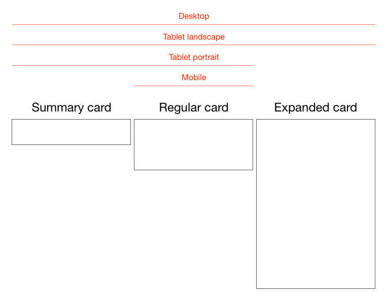
Cards are fast becoming the best design pattern for mobile devices.
We are currently witnessing a re-architecture of the web, away from
pages and destinations, towards completely personalised experiences
built on an aggregation of many individual pieces of content. Content
being broken down into individual components and re-aggregated is the
result of the rise of mobile technologies, billions of screens of all
shapes and sizes, and unprecedented access to data from all kinds of
sources through APIs and SDKs. This is driving the web away from many
pages of content linked together, towards individual pieces of content
aggregated together into one experience.
The aggregation depends on:
The person consuming the content and their interests, preferences, behaviour.
Their location and environmental context.
Their friends’ interests, preferences and behaviour.
The targeting advertising eco-system.
If the predominant medium of our time is set to be the portable
screen (think phones and tablets), then the predominant design pattern
is set to be cards. The signs are already here…
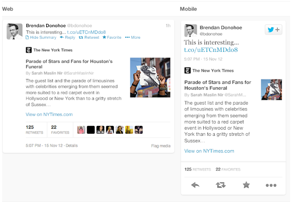
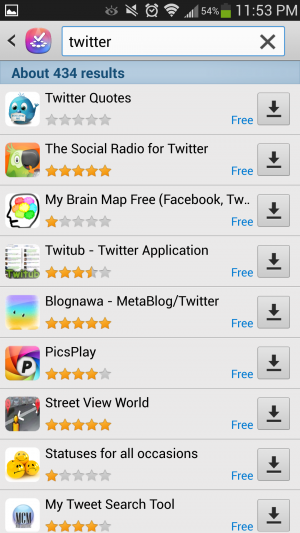
Twitter is moving to cards
Twitter recently launched Cards,
a way to attached multimedia inline with tweets. Now the NYT should
care more about how their story appears on the Twitter card (right hand
in image above) than on their own web properties, because the likelihood
is that the content will be seen more often in card format.
Google is moving to cards
With Google Now,
Google is rethinking information distribution, away from search, to
personalised information pushed to mobile devices. Their design pattern
for this is cards.
Everyone is moving to cards
Pinterest (above left) is built around cards. The new Discover feature on Spotify
(above right) is built around cards. Much of Facebook now represents
cards. Many parts of iOS7 are now card based, for example the app
switcher and Airdrop.
The list goes on. The most exciting thing is that despite these many
early card based designs, I think we’re only getting started. Cards are
an incredible design pattern, and they have been around for a long time.
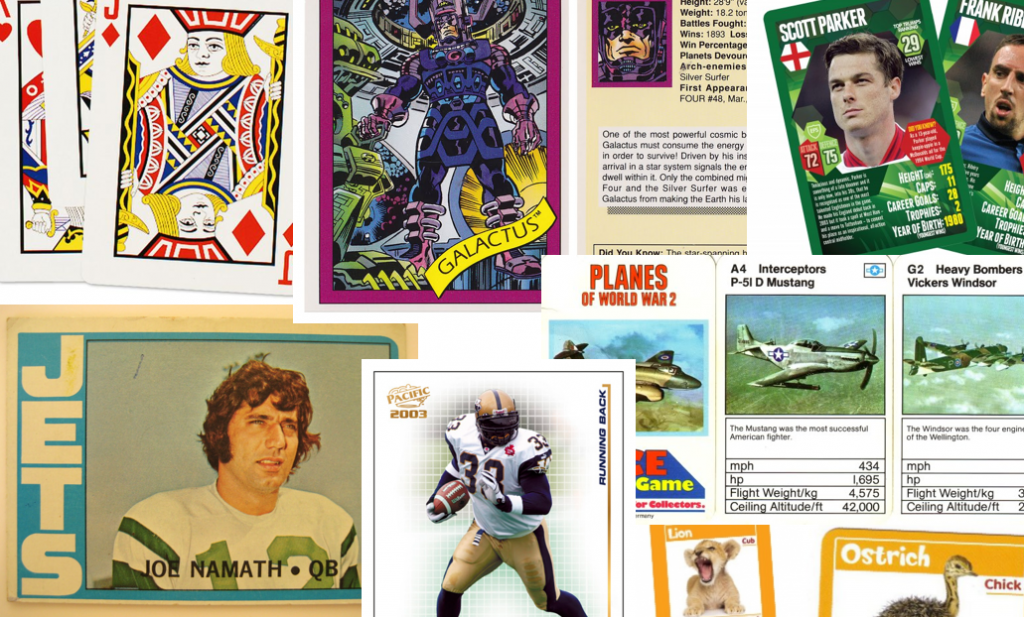
Cards give bursts of information
Cards as an information dissemination medium have been around for a
very long time. Imperial China used them in the 9th century for
games. Trade cards in 17th century London helped people find businesses.
In 18th century Europe footmen of aristocrats used cards to introduce
the impending arrival of the distinguished guest. For hundreds of years
people have handed around business cards.
We send birthday cards, greeting cards. My wallet is full of debit
cards, credit cards, my driving licence card. During my childhood, I was
surrounded by games with cards. Top Trumps, Pokemon, Panini sticker
albums and swapsies. Monopoly, Cluedo, Trivial Pursuit. Before computer
technology, air traffic controllers used cards to manage the planes in
the sky. Some still do.
Cards are a great medium for communicating quick stories. Indeed the
great (and terrible) films of our time are all storyboarded using a card
like format. Each card representing a scene. Card, Card, Card. Telling
the story. Think about flipping through printed photos, each photo
telling it’s own little tale. When we travelled we sent back postcards.
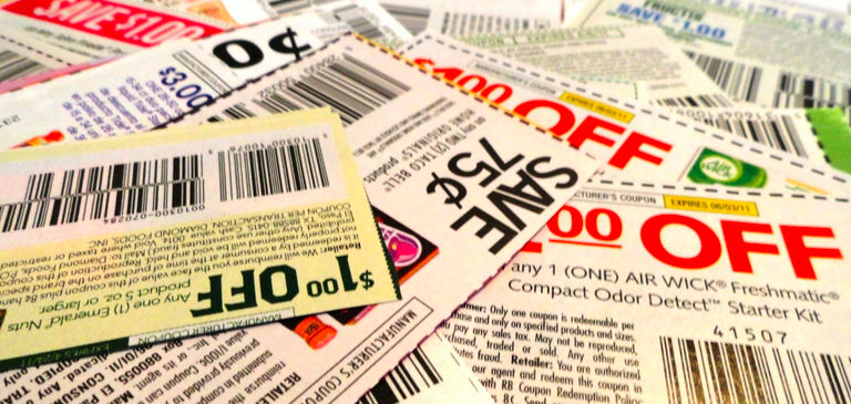
What about commerce? Cards are the predominant pattern for coupons.
Remember cutting out the corner of the breakfast cereal box? Or being
handed coupon cards as you walk through a shopping mall? Circulars, sent
out to hundreds of millions of people every week are a full page
aggregation of many individual cards. People cut them out and stick them
to their fridge for later.
Cards can be manipulated.
In addition to their reputable past as an information medium, the
most important thing about cards is that they are almost infinitely
manipulatable. See the simple example above from Samuel Couto
Think about cards in the physical world. They can be turned over to
reveal more, folded for a summary and expanded for more details, stacked
to save space, sorted, grouped, and spread out to survey more than one.
When designing for screens, we can take advantage of all these
things. In addition, we can take advantage of animation and movement. We
can hint at what is on the reverse, or that the card can be folded out.
We can embed multimedia content, photos, videos, music. There are so
many new things to invent here.
Cards are perfect for mobile devices and varying screen sizes.
Remember, mobile devices are the heart and soul of the future of your
business, no matter who you are and what you do. On mobile devices,
cards can be stacked vertically, like an activity stream on a phone.
They can be stacked horizontally, adding a column as a tablet is turned
90 degrees. They can be a fixed or variable height.
Cards are the new creative canvas
It’s already clear that product and interaction designers will
heavily use cards. I think the same is true for marketers and creatives
in advertising. As social media continues to rise, and continues to
fragment into many services, taking up more and more of our time,
marketing dollars will inevitably follow. The consistent thread through
these services, the predominant canvas for creativity, will be card
based. Content consumption on Facebook, Twitter, Pinterest, Instagram,
Line, you name it, is all built on the card design metaphor.
I think there is no getting away from it. Cards are the next big
thing in design and the creative arts. To me that’s incredibly exciting.
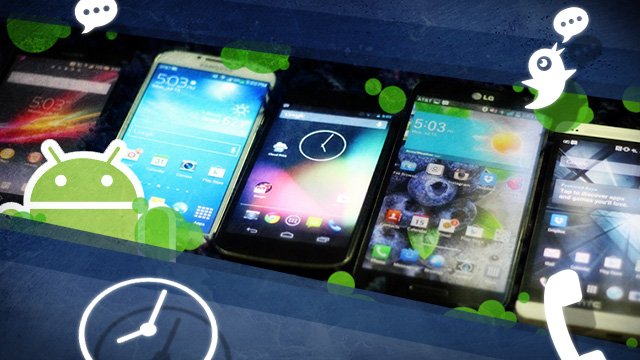
It’s been quite a year of surprises from Google. Before the company’s
annual developer conference in May, we anticipated at least an
incremental version of Android to hit the scene. Instead, we
encountered a different game plan—Google
not only started offering stock features like its keyboard as separate,
downloadable apps for other Android handset users, but it’s also
offering stock Android versions of non-Nexus-branded hardware like Samsung's Galaxy S4 and the HTC One
in the Google Play store. So if you’d rather not deal with OEM overlays
and carrier restrictions, you can plop down some cash and purchase
unlocked, untainted Android hardware.
But the OEM-tied handsets aren't all bad. Sometimes the
manufacturer’s Android offerings tack on a little extra something to the
device that stock or Nexus Android hardware might not. These perks
include things like software improvements and hardware
enhancements—sometimes even thoughtful little extra touches. We’ll take a
look at four of the major manufacturer overlays available right now to
compare how they stack up to stock Android. Sometimes the differences
are obvious, especially when it comes to the interface and user
experience. You may be wondering what the overall benefit is to sticking
with a manufacturer’s skin. The reasons for doing so can be very
compelling.
A brief history of OEM interfaces
Why do OEM overlays happen in the first place? iOS and Windows Phone 8
don’t have to deal with this nonsense, so what's the deal with Android?
Well, Android was unveiled in 2007 alongside the Open Handset Alliance
(a consortium of hardware, software, and carriers to help further
advance open standards for mobile devices). The mission was to keep the
operating system open and accessible to all so users could mostly do
whatever they wanted to do with it. As Samsung VP of Product Planning
and Marketing Nick DiCarlo told Gizmodo,
“Google has induced a system where some of the world's largest
companies—the biggest handset manufacturer and a bunch of other really
big ones—are also investing huge money behind their ecosystem. It's a
really powerful and honestly pretty brilliant business model.”
The main issue with all of these different companies using the same
software for their hardware is one of differentiation—how does Samsung
or HTC or LG or Sony make an Android phone that doesn't have the same
look, feel, and features as the competition's similarly specced phones?
Putting their own skins, software, and services on top of Android gives
them access to the good parts of Google's ecosystem (in most cases, the
Google Play store and the surrounding software ecosystem) while
theoretically helping them stand out from other phones on the shelf.
These skins haven't exactly been received with open arms. For many
enthusiasts, skinned Android sometimes means that outstanding hardware
is bogged down by all these extra offerings that manufacturers think
will make their handset more appealing. But the overlays—or skins, as
they’re often referred to—usually change the way the interface looks and
acts. Sometimes it introduces new features that don't already exist on
Android.
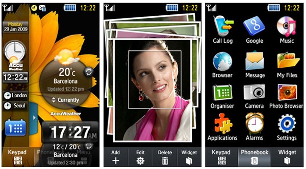
Samsung's TouchWiz overlay in its beginning stages.
For Samsung, its Android interface domination began with the Samsung
Behold II, which ran the first incarnation of the Samsung's TouchWiz
Android UI. The name previously referred to Samsung's own proprietary
operating system for its phones. Reviewers weren't too excited about
Samsung's iteration of the Android interface, with sites like CNET writing
that the “TouchWiz interface doesn't really add much to the user
experience and in fact, at times, hinders it." Sometimes it still feels
that way.
Samsung is notorious for packing in a breadth of features, but its
aesthetics are often lacking. But again, that’s subjective, and it all
comes down to the user. I’ve been using the last version of TouchWiz on a
Galaxy S III. While I’ve had some instances where it was frustrating,
I’ve come to appreciate some of the extra perks that shine through.
HTC's Sense UI back in the day
HTC's Android skin is called the Sense UI, and it was introduced in
2009. I’ve had some experience with it in my earlier Android days when I
had an HTC Incredible, but it’s come a long way since then. According
to Gizmodo,
the interface's roots go back to 2007, when HTC had to alter its
software for Windows Mobile to make it touch-sensitive so that it
wouldn't just be limited to stylus input. It was eventually ported over
to the HTC Hero, which was also the first Android device to feature a
manufacturer’s interface overlay.
As for LG and Sony, their interfaces have less storied histories (and
less prominent branding). Each borrows moves from what the two major
players do and then implements the ideas a little better or a little
worse. It’s an interesting dynamic, but the big theme here is choice:
there is so much to choose from when you’re an Android user that it can
be overwhelming if you’re not entirely sure of where to go next. Brand
loyalty and past experiences can only go so far as the constant stream
of updates and releases means manufacturers seek new directions nonstop.
Each manufacturer puts some flair on its version of Android.
Samsung's TouchWiz Nature UX 2.0, for instance, features a bubble blue
interface with bright, vibrant colors and drop shadows to accompany
every icon. LG’s Optimus UI uses... a similar aesthetic. But both
interfaces allow you to customize the font style and size from within
the Settings menu, even if the end product could ultimately end up as a
garish looking interface.
Among the selection of manufacturers, Sony and HTC have been the most
successful in designing an Android interface that complements the
chassis on their respective flagship devices. HTC's Sense UI has always
been one of my favorites for its overall sleekness and simplicity.
Though it's not as barebones as the stock Android interface, Sense 5.0
now sports a thin, narrow font with modern-looking iconography that
pairs well with its latest handset, the HTC One.
Sony's interface doesn't have an official name, but it can be referred to as the Xperia interface.
Sony's interface is not only pleasing to use, it also matches the
general design philosophy that the company continues to maintain
throughout its lifespan. Though it has no official alias, the Xperia
interface showcases clean lines and extra offerings that don’t
completely sour the overall user experience.
In this comparison, we're taking a look at recent phones from all of
the manufacturers: a Nexus 4 and a Samsung Galaxy S 4 equipped with
Android 4.2.2. The HTC One, LG Optimus G Pro, and Sony Xperia Z are all
still on Android 4.1.2. We were unable to actually get any hands-on time
with the latest Android 4.2 update to the HTC One.
We didn't include Motorola in the gang because the company is
undergoing a massive makeover right now. Plus, its last flagship handset
was the Droid Razr Maxx HD, which debuted back in October and has
relatively dated specifications. We have some high hopes for what might
be in store for Motorola’s future, especially with Google’s immediate
backing, but we’re waiting to see what’s to come of that acquisition
later this year.
Lock screens, home screens, and settings, too
Home screens and lock screens are perhaps the most important element
of a user interface because that's what the user will deal with the
most. Think about it: every time you turn on your phone, you see the
lock screen. We need to consider how many swipes it takes to get to the
thing you want to do from the time you unlock your phone to the next
executable action. (And hopefully there are some shortcuts that we can
implement along the way to save time.)
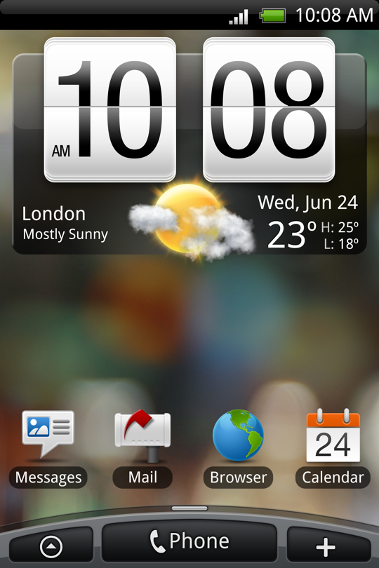
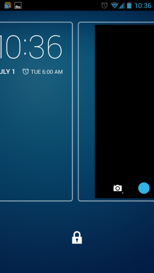
The lock screen on the stock version of Android 4.2.2 Jelly Bean.
On stock Android 4.2.2 Jelly Bean, Google included a
plethora of options for users to interact with their phone right from
the lock screen. The Jelly Bean update that hit late last year added
lock screen widgets and quick, swipe-over access to the camera
application. The lock screen can also be disengaged entirely if you
would rather have instant access to your applications by hitting the
power button.
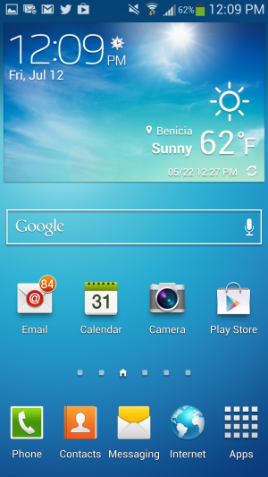
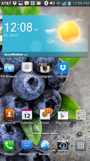
The home screen on the Galaxy S 4.
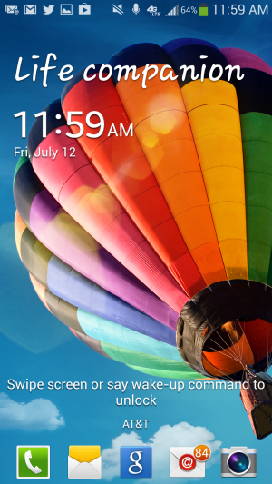
The lock screen on Samsung's TouchWiz.
In TouchWiz, Samsung kept the ability to add multiple widgets to the
lock screen, including one that provides one-touch access to favorite
applications and the ability to swipe over to the camera app. You can
also add a clock or a personal message to the lock screen. TouchWiz even
takes it a step further through the use of wake-up commands, which let
you check for missed calls and messages by simply uttering a phrase at
the lock screen. To actually unlock the device, you can choose to swipe
you finger across the lock screen or take advantage of common Android
features like Face unlock.
TouchWiz Easy mode is easy to set up...
..and still offers access to all apps.
As for the home screen, Samsung continues to offer the standard Android
experience here, except that it tacks on a few extra perks. Hitting the
Menu button on the home screen will bring up extra options, like the
ability to create a folder or easily edit and remove apps from a
particular page. There's also an "Easy" home screen mode, which dials
down the interface to a scant few options for those users with limited
smartphone experience—like your technophobic parents, for instance. Easy
mode will display bigger buttons and limit the interface to three home
screens, though basic app functionality remains.
Sense 5's home screen.
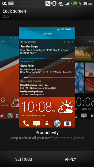
Sense 5's lock screen.
The HTC One just recently received an update for Android 4.2.2,
though we didn't receive it in time to update our unit for this article.
Regardless, HTC's Sense 5 is a far cry from its interface of yore—but
that’s not a bad thing. It features a flatter, more condensed design
with a new font that makes it appear more futuristic than other
interfaces.
And don't forget to choose your lock screen.
Choose your home screen—any home screen.
Rather than implement a lock screen widget feature, HTC lets users
choose between five different lock screen modes, including a Photo album
mode, music mode, and productivity mode, which lets you glance at your
notifications.
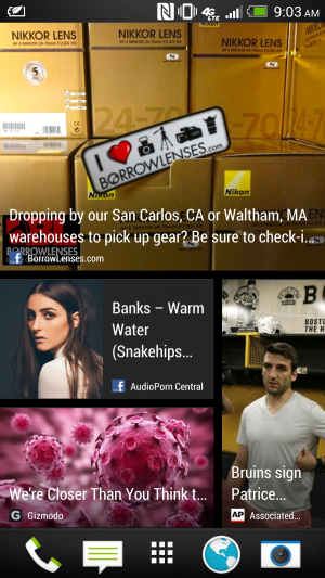
HTC Sense's BlinkFeed aggregates information for at-a-glance viewing.
Sense’s home screen can be a bit of a wreck if you’re looking for
something simplistic. Its BlinkFeed feature takes up an entire page.
Though it’s meant for aggregating news sites and social networks that
you set up yourself, you can’t link up your favorite RSS feeds. By
default, it’s your home page when you unlock the phone. You can change
the home page in Sense 5 so that you don’t have to actually use the
feature, but it can’t be entirely removed.
The home screen.
The lock screen for the Optimus UI.
LG's lock screen is just as busy and impacted as Samsung's, with a
Settings menu that's almost as disjointed. Like Samsung's, it offers
different unlock screen effects, varying clocks and shortcuts, and the
ability to display owner information in case you lose your phone. As for
the home screen, Optimus UI offers a home backup and restore option, as
well as the ability to display the home screen in constant Portrait
view.
Sony's home screen.
Sony's Xperia Z handset is currently limited to Android 4.1.2. Its
settings are laid out like stock Android, but there is no ability to add
widgets or different clocks to the lock screen. We'd expect this sort
of thing to become available when the phone is updated to Android 4.2.
Notifications
Samsung's TouchWiz notifications panel.
In the latest version of Jelly Bean, Google introduced Quick
Settings, meant to provide quick access to frequently used settings.
This is one area where the OEMs were ahead of Google—many of the
interfaces have integrated at least a few different quick settings
options for a while now.
LG's crowded notifications panel.
Samsung's TouchWiz has been the most successful in implementing these
features. You can scroll through a carousel of options or display them
as a grid by pressing a button. LG’s Optimus UI borrows this same idea
but overcrowds the Notifications panel with extra features like Qslide
(more on this later). Even on the Optimus G Pro’s 5.5-inch display, the
Quick Settings panel feels too congested to quickly find what you want
without glancing over everything else first.
Sense UI's Notifications panel.
Xperia Z's Notification panel.
Sony and HTC kept it simple with their Notifications shade for the
most part. Our HTC One and Xperia Z are running Android 4.1.2, so
there's no built-in Quick Settings panel to take advantage of. Neither
OEM implements its own version of the feature. The One's Android 4.2.2
update reportedly adds quick settings, and we assume that the same will
be true of the Xperia Z when it gets its update.
App drawers
Android 4.2.2 stock app drawer.
Sony's Xperia Z app drawer.
The only OEM overlay that keeps it as simplistic and straightforward
as stock Android is Sony. You can categorize how you want to display
apps and in what order, but beyond that there's not much else between
you and your applications. You can uninstall applications by
long-pressing them and dragging them to the "remove" icon that appears
rather than dragging them to one of the home screens.
LG's app drawer.
Samsung's app drawer.
That's not to say what Samsung and LG provide isn't user friendly.
Both manufacturers offer additional options once you head into the
applications drawer. LG enables you to sort alphabetically or by
download date, and you can increase icon size and change the wallpaper
just for the application menu. You can also choose which applications to
hide in case you would rather not be reminded of all the bloatware that
sometimes comes with handsets.
As for the Galaxy S 4, Samsung offers a quick hit button for the Play
Store. You can view your apps by category or by type, and you can share
applications, which essentially advertises the Play Store link to
various social networks.
Sense 5's app drawer.
HTC's interface falls short when it comes to the application launcher. As Phil Nickinson from Android Central put it,
the HTC Sense 5 application drawer makes simple look complicated. The
grid size, for instance, appears narrower and takes up precious space.
Rather than make good use of the screen resolution, HTC displays the
apps in a 3-by-4 icon grid by default, with the weather and clock widget
taking up a huge chunk at the top. You also can't long-press on an
application to place it on a home screen. Instead, you have to drag it
up to the top left corner and then select the shortcut button to finally
place it on the home screen—apparently, this feature is fixed in
the HTC One’s Android 4.2.2 update (but we've yet to try it ourselves).
It’s a bit of an ordeal to make the app drawer feel "normal" as defined
by the rest of the Android OEMs. In general, we feel like Sense takes
the most work to achieve some level of comfort.
Dialers
LG's Optimus UI includes a setting that lets you switch the side the
dialer is on so that it's easier to use with just one thumb.
The Optimus UI offers an information-dense Dialer app. You can sift
through logs, mark certain contacts as favorites, and peruse through
your contacts right from within the app. LG offers an option to make the
dialer easy to use one-handed.
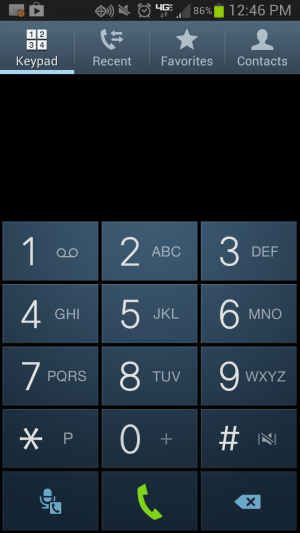
HTC's dialer application.
Although the Sense UI’s dialer layout feels a bit cramped, you can
still bring up a contact from your address book by simply typing in a
few letters of their name. You can cycle through your favorites, your
contacts, and different groups. However, it would be more convenient if
the Contacts screen worked like a carousel rather than a back-and-forth
type of menu screen. Extra dialer settings also take up quite a bit of
space at the top of the screen rather than being nested in menus as they
are in other phones. Each screen in the Dialer has a different set of
settings, which can be a bit confusing. Sense UI’s dialer app—and its
overall interface—has a bit of a learning curve to it, but at least the
aesthetic is nice.
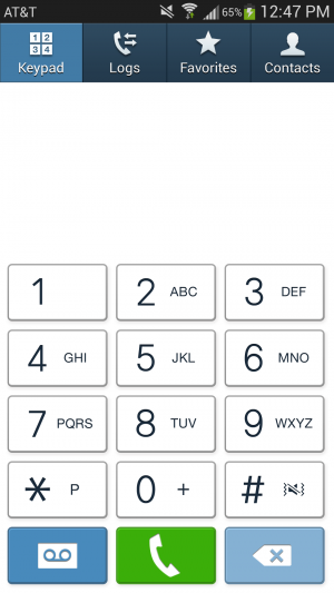
The TouchWiz dialer on a Galaxy S 4 running Android 4.2.2.
The TouchWiz dialer on a Galaxy S III running Android 4.1.2.
Samsung’s Dialer interface also has a favorites list and a separate
tab for the keypad, but otherwise It’s much more simplistic looking than
the rest of TouchWiz. Sony kept the Dialer relatively untouched too,
adding just an extra tab for favorites.
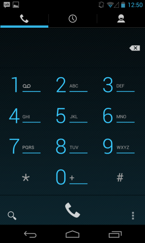
The stock Android dialer app.
In the end, Jelly Bean has the best, cleanest-looking dialer
application. While the extra categories are a good idea for users with a
hefty number of contacts and groups of people to compartmentalize,
sometimes minimizing the number of options is better—especially in the
case of an operating system that is wholly barebones to begin with.
Apps, apps, apps
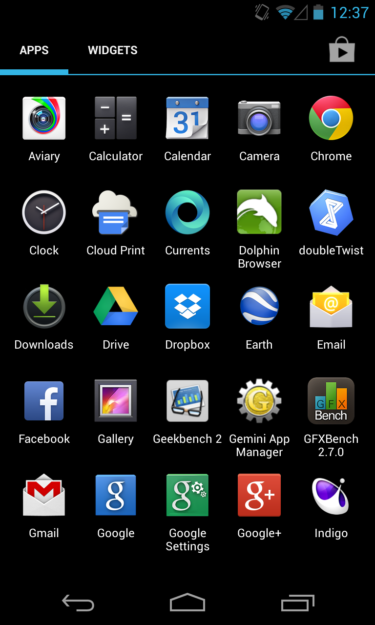
Google apps as far as the eye can see.
Google packs up a suite of applications with the stock version of
Android to perfectly complement the company's offerings. On the Nexus 4
and the Google Play editions of the Samsung Galaxy S 4 and HTC One,
you'll encounter applications like Google Calendar, Mail, Currents,
Chrome, and Earth. Not all of the manufacturer’s handsets come with this
whole set of apps out of the box. The regular edition of the Galaxy S
4, for instance, doesn't include Google Earth or Currents, but it does
have the Gmail and Maps application. Some carriers will package up
handsets with their own suite of apps, and carriers might also include
things like a backup application or an app that lets you check on your
minutes and data usage.
For the most part, however, these handsets do include their own
versions of calendar and mail apps (though the Google Calendar app is
available in the Play store, the non-Gmail email client isn't). They
have camera apps with software tweaks that are compatible with the
hardware contained on the device. Some handsets also have a bunch of
extra features just because; Samsung is especially fond of this.
Camera applications
The stock camera app interface on the Google Play edition of the HTC One.
Andrew Cunningham
Perhaps the biggest differentiator between interfaces is the camera
features and controls. We'll start with the HTC One, with its Ultrapixel
camera and myriad features. You can use things like Zoe to stitch
together several still images and create a Thrasher-like action
photo or just combine two slightly mediocre photos to make one worthy of
sharing on social networks. The Ultrapixel camera also automatically
adjusts exposure and the like to produce a fine looking photo, as we
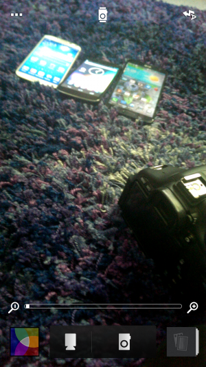
found out when we tested it out in our comparative review of the Google Play edition of the HTC One and the standard version.
The stock camera interface for the Nexus 4.
Andrew Cunningham
The stock Android camera application isn't totally devoid of
features, however. Android 4.2.2's new camera UI has scroll-up controls
that make it easy to quickly switch between things like Exposure and
Scene settings. And while it could certainly use a little oomph
like HTC introduced with its camera application, there is such a thing
as too much good stuff—especially when you look at what LG and Samsung
have crammed into their camera interfaces.
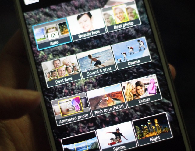
So many different camera modes to choose from on the Galaxy S 4.
Samsung's TouchWiz-provided camera application is a bit of a mess. On
the Galaxy S 4, you'll have to deal with buttons and features
splattered all over the place. There's a Mode button that lets you cycle
between the 12 different camera modes—things like Panorama, HDR, Beauty
face (which enhances the facial features of your subject), Sound &
shot (which shoots a photo and then some audio to accompany it), and
Drama (which works a little like HTC's Zoe feature). Those camera
options are all fun to use from time to time, and you can change the
menu screen from carousel to grid view so that you're not too
overwhelmed by the breadth of options. But there are still so many
buttons lining the sides of the viewfinder on the display.
There's also a general Settings button in the bottom corner that will
expand out with more icons, taking up even more room on the screen.
Below that are two buttons for switching between the front- and
rear-facing cameras, as well as the ability to use the dual-camera
functionality while snapping a photo. TouchWiz is great at offering a
bunch of choices, but it can get a bit exhausting. If there were a more
concise way of making these available, it would make the Camera
application less intimidating to use.
I'm not entirely sure what all of the symbols in LG's camera application stand for.
LG's Optimus UI camera application isn't any better. Rather than
allowing the entire screen to be used as a viewfinder with icons that
lay on top of it like with TouchWiz, the menu options take up the top
and bottom third of the screen. It’s nice that LG offers a little symbol
in the preview window to let you know how your battery life is doing
and which mode you’re shooting in, but figuring out what symbol does
what takes a bit of time. At least with Samsung’s large catalog of
offerings, there’s an explicit description about what each camera
function does.
Sony's camera interface is easier to use, but the preview window is still surrounded by buttons and things.
Sony’s camera app is a bit easier to navigate. It has found the right
medium between simplicity and feature-filled functionality.
Unfortunately for its hardware, that doesn't translate over to how well
the camera actually performs. But the interface is something that other
OEMs should strive for: a straightforward, easy-to-use preview window
that’s just what Goldilocks was looking for.
Where the camera application really matters is with handsets like the
HTC One. That extra bit of software that HTC packs up with its One is
essential for its camera functionality to operate at its prime. As our
own Andrew Cunningham put it in his review of the Google Play edition of the HTC One:
...there are the HTC-specific features that the
"ultrapixel" camera on the [GPe] One lacks, namely Zoe (which can stitch
together several still images to convey action), the ability to stitch
together "highlight movies" from short videos on your phone, and pretty
much any feature that lets you combine two unsatisfactory photos to get
one satisfactory one (like Always Smile or Object Removal). These have
been replaced by a slightly tweaked version of the stock Android camera,
which we assume will make it to the Nexus phones and tablets in the
next release of Android.
Additionally, the Google Play edition One had some image quality
issues when it shot in automatic shooting mode. The standard One—which
is fueled by HTC's Sense 5—can adjust its exposure based on its
surroundings. The Google Play edition—the stock Android 4.2.2
version—doesn't have those same software tweaks in its camera
application.
In some ways, this is actually the best argument for why you would
consider an OEM-tied Android handset over an unlocked, stock one: the
software has been tweaked to work best with that specific handset's
internals.
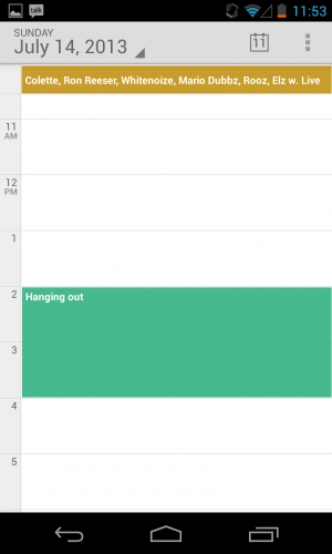
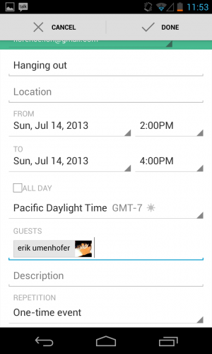
Calendars
In May, Google Calendar got a makeover in addition to color-coded
functionality in order to vary days and events for each calendar. The
new interface was particularly focused on streamlining the design
aesthetic across all Google applications, and while the update didn't
introduce too many new features, it did make Google's Calendar app a
little more palatable.
Samsung's TouchWiz calendar application.
Samsung's calendar application is not the prettiest thing to look at,
but it's certainly feature-filled. Users can switch between six
different calendar view modes and four different view styles, including
the ability to view the calendar in a list or pop-up form. There are
also a number of minor settings that you can individually adjust,
including the ability to select what day your week should start on.
Sense 5's calendar app.
HTC's Sense uses its own proprietary calendar application, too. You
can sync your accounts, choose the first day of the week, set the
default time zone (and another if you travel frequently), and even
display the weather within the calendar app. At the bottom of the
screen, Sense will show upcoming events at a glance, and you can tap to
add more throughout the day. You can also sort your calendar by meeting
invitations.
LG's calendar app.
Sony's calendar app.
LG's Optimus UI employs a similar interface to Sense UI’s with the
calendar view at the top and tasks for meeting invitations available at
the bottom. Still, it doesn't feel as informative as what stock Android
and Samsung are putting forward. Sony provides a Calendar app that uses a
similar icon to Google's stock app, and while the interface looks the
same, it doesn't have the color-coding abilities of Google Cal.
Mail
The Nexus 4 and Google Play edition handsets come with their own
suite of Google-branded applications, including two e-mail apps: Gmail
and a nondescript Email app. While Gmail is a little more
feature-filled, with the option to use things like Priority inbox, the
Email app's interface appears a little barren. You can add Exchange,
Yahoo!, Hotmail, and other POP3/IMAP accounts to it or add your Gmail
account to keep them synced up in one app. However, with the app's
straightforward nature, there's not much else to it. Mail applications
offered by other manufacturers don't veer too far from what's here,
though. They essentially offer the same basic functionality and settings
across the board.
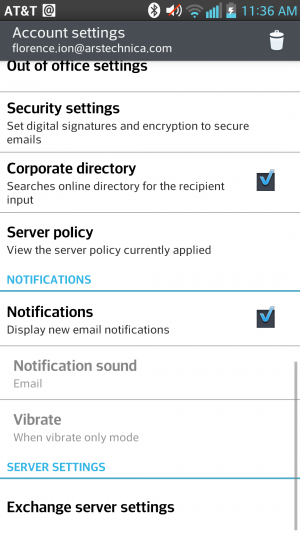
...the server settings are annoyingly featured at the end.
From one interface to the other...
Annoyingly, most of the Mail apps, like Samsung's and LG's, bury
server settings at the very end of the settings panel. But all of them
take a page out of stock Android's book by providing a combined inbox
view, which is especially helpful if you're juggling between a myriad of
different accounts.
Samsung features a combined inbox view, just like stock Android's.
Stock Android's combined inbox view.
HTC's e-mail application has the same design as its other OEM-offered
proprietary applications, but it's much easier to navigate than other
apps. The Settings button resides at the top of the page with a bunch of
options, including the ability to add an account or set an "out of
office" message. From there, you can even access additional settings.
HTC also provides a couple of different sync settings, for instance, to
help preserve battery life.
Sony's Mail app is so simple.
Sony's Mail application is nice and easy as well. You can hit the
settings button in the bottom right corner to mark a piece as unread,
star it, move it to another folder, or access the general settings
panel.
Other apps
With each OEM overlay comes a whole set of applications that could
prove to be useful in the end. Except Samsung's, that is—the
manufacturer has bundled a huge set of features and capabilities that
feel redundant and might even suck the life out of your battery if
you're not careful.
Samsung includes its own app store with TouchWiz.
The Galaxy S 4 comes preloaded with a bunch of applications,
including Samsung's own app store, entertainment hub, and app that
enables you to access content on your phone from a desktop computer. The
only perk of signing up for a Samsung account and going that route is
being able to track where your phone is in case you lose or misplace it.
Samsung can back up phone data too.
But there's more where this came from. Samsung includes a remote
control application for your television called Samsung WatchON, but it's
only compatible if you have an active cable or satellite television
subscription. There's also S Health, which helps you manage your
lifestyle and well-being. And if you're a hands-free type of user, you
can take advantage of gesture-based functionality like Air gestures or
enable the screen to keep track of your eye movement.
It will pop up in a desktop-like window on your screen.
Select the "small app" you want to use from the running apps screen.
Samsung isn't the only offender when it comes to stuffing
applications and features onto its flagship handsets, however. Sony
oversaturated its own music and movie store, and it has a Walkman
music-playing application alongside Google Music. When you hold down the
Menu button, there's a row of "small apps" that gives you quick access
to things like the browser, a calculator, and a timer. We covered these
briefly in the Xperia Tablet Z review, but they work the same on the
Xperia Z handset: once you launch the "small" app, the app will appear
in a pop out screen on top of the interface. It's kind of like
multitasking.
The Qslide multitasking app lets you do things like take notes while you're doing other stuff.
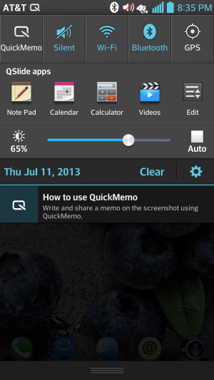
LG, on the other hand, lets the carrier pack it with apps. LG then
includes a multitasking feature called Qslide. You can choose from
several Qslide-compatible applications that pop up over an open
application in order to do things like leave a note and use the
calculator. It also has a setting that turns off the screen when you're
not looking.
Among all phones, there are a great number of features and apps to
adapt to using. While I don't find things like Samsung's Air gestures
and Smart scroll gimmicky, it can get frustrating to venture into the
apps drawer only to find it crowded with icons of applications that you
will never use. Some of these features and apps are things you'd never
find packed up with the stock version of Android—because they're not
always necessary.
The future
We're still waiting to hear about Android 4.3 and what it will bring
to the mobile platform. Every time Google launches an update, you can
bet that the manufacturers will follow suit with their interfaces (you
know, eventually). That's what causes the biggest conundrum for
Android users. I had things like Quick Settings already available on my
Galaxy S III before Google natively implemented them into Android 4.2
Jelly Bean, but for the OEMs that didn't build their own version of this
feature, I'm constantly at the mercy of my carrier and the
manufacturer. They dictate when I'll receive my update for the latest
version of Jelly Bean.
The biggest gripe about OEM overlays is that each company is selling its own brand of Android rather than Google's. Remember the
Android update alliance? That didn't work out too well in the end.
Carriers and hardware makers aren't keeping their promises, and as that
trickles down to the consumer, it eventually confuses the public. As
Google attempts to implement interface and performance standards,
manufacturers will go ahead and hire a team to make Android look
virtually unrecognizable. Samsung's app and media store sort of feels
like an insult at times, but it knows that it doesn't have all the clout
to make strides with its own mobile operating system.
There is a silver lining to all this, at least for purists: why
should you even bother with OEM interfaces when you can now purchase two
of the most popular handsets with stock Android on them? Google has
already said that it will be working with the providers of Google Play
edition phones to provide timely updates, so you certainly don't have to
worry about fragmentation or waiting around to get the latest version
of Android.
The OEMs have provided several different experiences for both
hardcore and novice Android users alike, which has only contributed to
the proliferation of the platform. Here at Ars, we prefer the stock
version of Android on a Google-backed handset like the Nexus 4 and
Google Play editions. Even if they're not chock full of perks and
applications, they'll receive the most timely updates from Android
headquarters, and their interfaces are mostly free of the cruft you get
from the OEMs. For many consumers, it might not matter when Google
chooses to update the phone, but for us, we like to know that Google is
pushing through the software updates without any setbacks.
In the end, choosing an OEM-branded version of Android means that
you're a prisoner of that manufacturer's timeline—an especially
unfortunate situation when that manufacturer decides to stop supporting
software updates altogether. We've said it time and time again—in the
end, it's really your experience that will determine which interface
suits you best. So as far as the future of Android goes, it's not just
in Google's hands.
At SXSW this afternoon, Google provided developers with a first
glance at the Google Glass Mirror API, the main interface between Google
Glass, Google’s servers and the apps that developers will write for
them. In addition, Google showed off a first round of applications that
work on Glass, including how Gmail works on the device, as well as
integrations from companies like the New York Times, Evernote, Path and
others.
The Mirror API is essentially a REST API,
which should make developing for it very easy for most developers. The
Glass device essentially talks to Google’s servers and the developers’
applications then get the data from there and also push it to Glass
through Google’s APIs. All of this data is then presented on Glass
through what Google calls “timeline cards.” These cards can include
text, images, rich HTML and video. Besides single cards, Google also
lets developers use what it calls bundles, which are basically sets of
cards that users can navigate using their voice or the touchpad on the
side of Glass.
It looks like sharing to Google+ is a built-in feature of the Mirror
API, but as Google’s Timothy Jordan noted in today’s presentation,
developers can always add their own sharing options, as well. Other
built-in features seem to include voice recognition, access to the
camera and a text-to-speech engine.
Glass Rules
Because Glass is a new and unique form factor, Jordan also noted,
Google is setting a few rules for Glass apps. They shouldn’t, for
example, show full news stories but only headlines, as everything else
would be too distracting. For longer stories, developers can always just
use Glass to read text to users.
Essentially, developers should make sure that they don’t annoy users
with too many notifications, and the data they send to Glass should
always be relevant. Developers should also make sure that everything
that happens on Glass should be something the user expects, said Jordan.
Glass isn’t the kind of device, he said, where a push notification
about an update to your app makes sense.
Using Glass With Gmail, Evernote, Path and Others
As
part of today’s presentation, Jordan also detailed some Glass apps
Google has been working on itself, and apps that some of its partners
have created. The New York Times app, for example, shows headlines and
then lets you listen to a summary of the article by telling Glass to
“read aloud.” Google’s own Gmail app uses voice recognition to answer
emails (and it obviously shows you incoming mail, as well). Evernote’s
Skitch can be used to take and share photos, and Jordan also showed a
demo of social network Path running on Glass to share your location.
So far, there is no additional information about the Mirror API on
any of Google’s usual sites, but we expect the company to release more
information shortly and will update this post once we hear more.
How a little-known 1971 machine launched an industry.
Forty years ago, Nutting Associates released the world’s first
mass-produced and commercially sold video game, Computer Space. It was
the brainchild of Nolan Bushnell, a charismatic engineer with a creative
vision matched only by his skill at self-promotion. With the help of
his business partner Ted Dabney and the staff of Nutting Associates,
Bushnell pushed the game from nothing into reality only two short years
after conceiving the idea.
Computer Space pitted a player-controlled rocket ship against two
machine-controlled flying saucers in a space simulation set before a
two-dimensional star field. The player controlled the rocket with four
buttons: one for fire, which shoots a missile from the front of the
rocket ship; two directional rotation buttons (to rotate the ship
orientation clockwise or counterclockwise); and one for thrust, which
propelled the ship in whichever direction it happened to be pointing.
Think of Asteroids without the asteroids, and you should get the picture.
During play, two saucers would appear on the screen and shoot at the player while flying in a zig-zag formation. The player’s goal was to dodge the saucer fire and shoot the saucers.
Considering a game of this complexity playing out on a TV set, you
might think that it was created as a sophisticated piece of software
running on a computer. You’d think it, but you’d be wrong–and Bushnell
wouldn’t blame you for the mistake. How he and Dabney managed to pull it
off is a story of audacity, tenacity, and sheer force-of-will worthy of
tech legend. This is how it happened.
Microsoft Windows chief Steven Sinofsky has taken to theBuilding Windows 8 blogto explain the company’s decision to keep two interfaces: the traditional desktop UI and the more tablet-friendly Metro UI. His explanation seemed to be in response to criticism and confusion after the latest details were revealed on the newWindows 8 Explorer interface.
On Monday, details on the Windows 8 Explorer file manager interface were revealed showing what looked to be a very traditional Windows UI without any Metro elements. Reactions were mixed with many confused as to what direction Microsoft was heading with its Windows 8 interface. Well, Sinofsky is attempting to answer that and says that it is a “balancing act” of trying to get both interfaces working together harmoniously.
Sinofsky writes in his post:
Some of you are probably wondering how these parts work together to create a harmonious experience. Are there two user interfaces? Why not move on to a Metro style experience everywhere? On the other hand, others have been suggesting that Metro is only for tablets and touch, and we should avoid “dumbing down” Windows 8 with that design.
He proceeds to address each of these concerns, saying that the fluid and intuitive Metro interface is great on the tablet form factor, but when it comes down to getting serious work done, precision mouse and keyboard tools are still needed as well as the ability to run traditional applications. Hence, he explains that in the end they decided to bring the best of both worlds together for Windows 8.
With Windows 8 on a tablet, users can fully immerse themselves in the Metro UI and never see the desktop interface. In fact, the code for the desktop interface won’t even load. But, if the user needs to use the desktop interface, they can do so without needing to switch over to a laptop or other secondary device just for business or work.
A more detailed preview of Windows 8 is expected to take place during Microsoft’s Build developer conference in September. It’s been rumored that the first betas may be distributed to developers then along with a Windows 8 compatible hardware giveaway.
-----
Personal comments:
In order to complete the so-called 'Desktop Crisis' discussion, the point of view of Microsoft who has decided to avoid mixing functionalities between desktop's GUI and tablet's GUI.
At the Google I/O conference earlier this year, Google revealed that
the Android Market would come to the Google TV set-top platform. Some
evidence of the Honeycomb-based Google TV refresh surfaced in June when screenshots from developer hardware were leaked. Google TV development is now being opened to a broader audience.
In a post on the official Google TV blog, the search giant has announced the availability of a Google TV add-on
for the Android SDK. The add-on is an early preview that will give
third-party developers an opportunity to start porting their
applications to Google TV.
The SDK add-on will currently only work on Linux desktop systems
because it relies on Linux's native KVM virtualization system to provide
a Google TV emulator. Google says that other environments will be
supported in the future. Unlike the conventional phone and tablet
versions of Android, which are largely designed to run on ARM devices,
the Google TV reference hardware uses x86 hardware. The architecture
difference might account for the lack of support in Android's
traditional emulator.
We are planning to put the SDK add-on to the test later this week so
we can report some hands-on findings. We suspect that the KVM-based
emulator will offer better performance than the conventional Honeycomb
emulator that Google's SDK currently provides for tablet development.
In addition to the SDK add-on, Google has also published a detailed user interface design guideline document
that offers insight into best practices for building a 10-foot
interface that will work will on Google TV hardware. The document
addresses a wide range of issues, including D-pad navigation and
television color variance.
The first iteration of Google TV flopped in the market and didn't see
much consumer adoption. Introducing support for third-party
applications could make Google TV significantly more compelling to
consumers. The ability to trivially run applications like Plex could
make Google TV a lot more useful. It's also worth noting that Android's
recently added support for game controllers and other similar input
devices could make Google TV hardware serve as a casual gaming console.