Thursday, February 28. 2013
Via engadget
-----

We've had a bit of a love / hate relationship with the Google
Chromebook since the first one crossed our laps back in 2011 -- the Samsung Series 5.
We loved the concept, but hated the very limited functionality provided
by your $500 investment. Since then, the series of barebones laptops
has progressed, and so too has the barebones OS they run, leading to our
current favorite of the bunch: the 2012 Samsung Chromebook.
In that laptop's review, we concluded that "$249 seems like an
appropriate price for this sort of device." So, then, imagine our
chagrin when Google unveiled a very similar sort of device, but
one that comes with a premium. A very hefty premium. It's a high-end,
halo sort of product with incredible build quality, an incredible screen
and an incredible price. Is a Chromebook that starts at more than five
times the cost of its strongest competition even worth considering?
Let's do the math.
Hardware

Wow. This is certainly a departure. If you're going to charge an
obscene premium for a laptop with an incredibly limited OS, you'd better
produce something that is incredibly well-made. In that regard, the
Chromebook Pixel is a complete success. If you'll forgive us just one
cliche, Google has gone from zero to hero with the Pixel. It's truly
something to behold.
First impressions are of a laptop with
surprising density. Apple's MacBook Pros, with their precisely hewn
aluminum exteriors, have long been the benchmark against which other
laptops were held in when it comes to a sense of solidity. In its first
attempt, Google has managed to match that feeling of innate integrity
with the Pixel, and in some ways go beyond it.
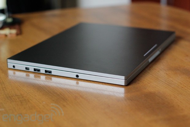
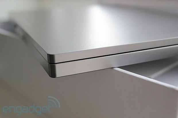
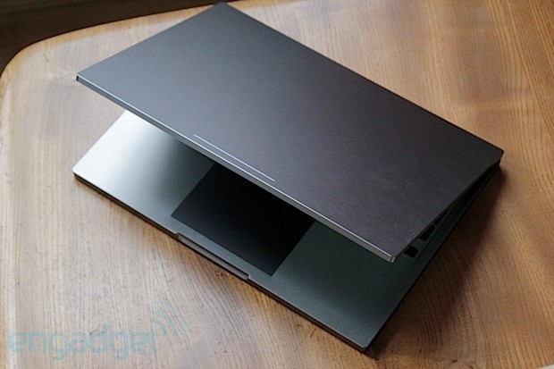
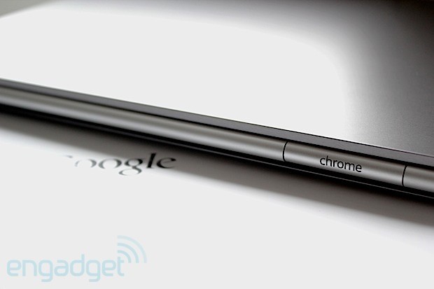
It's all machined
aluminum, anodized in a dark, almost gunmetal color that successfully
bridges the gap between sophisticated and cool. Everything is very
angular; vertical sides terminate abruptly at the horizontal plane that
makes up the typing surface. In fact, the only thing not bridged by
right angles is the cylindrical hinge running nearly the entire width of
the machine, but thankfully the edges of the entire laptop are just
rounded enough to keep it from digging into your wrists uncomfortably.
Battle scars received while typing have become a bit of an annoyance in
many modern, aluminum-bodied machines.
A good, quick test of a laptop's rigidity is to open it up, grab it
on both sides of the keyboard and try to twist. On a flimsy product
you'll hear some uncomfortable-sounding noises coming from beneath the
keys and, if you're really unlucky, you might send a letter or two
flying. Not so with the Pixel. The torsional rigidity is impressive for a
machine that is as thin, and as light, as this.

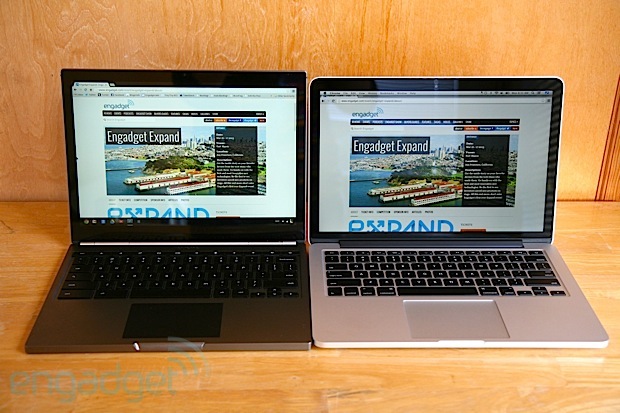
To put some numbers on that, the laptop measures 16mm (0.62 inch) in
thickness and 3.35 pounds (1.52kg) in heft. That compares very favorably
to the 13-inch MacBook Pro with Retina, the one that we would most
closely pit this against, which is 19mm (0.75 inch) thick and weighs
3.57 pounds (1.62kg). So it's thinner and lighter, and with a very
similar 12.85-inch, 2,560 x 1,700 display (which we'll thoroughly
discuss momentarily), but with lower performance. It is, however, on par
with the 13-inch MacBook Air when it comes to speed, and is only
slightly thicker (0.06 inch) and heavier (0.39 pound).
A
dual-core Intel 1.8GHz Core i5 chip is the one and only processor on
offer here, paired with 4GB of DDR3 RAM and generally providing more
than enough oomph to drive the very minimalist operating system, which
is installed on either a 32 or 64GB SSD. The larger option is only
available if you opt for the $1,449 laptop, which also adds
Verizon-compatible LTE to the mix (along with GPS). Either model sports
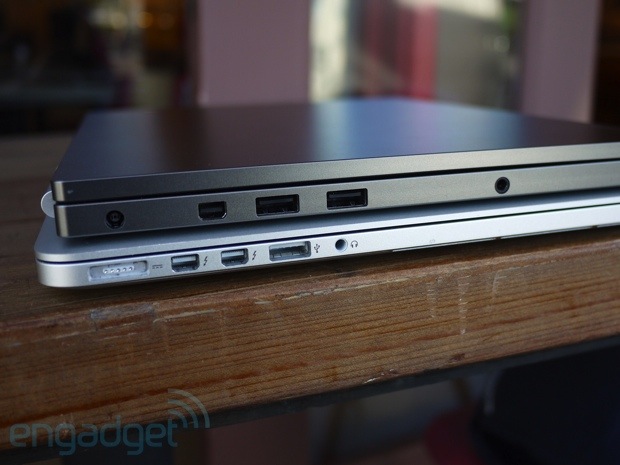
dual-band MIMO 802.11a/b/g/n along with Bluetooth 3.0. For those who
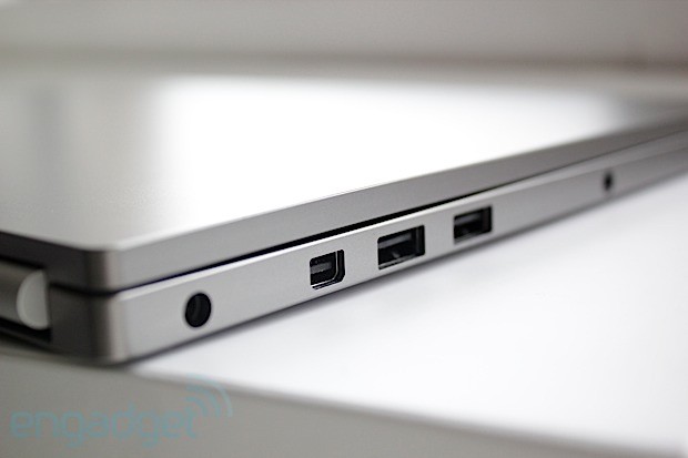
like to keep it physical, there are two USB ports on the left (sadly
just 2.0) situated next to a Mini DisplayPort and a 3.5mm headphone
jack. On the right is an SD card reader, along with the SIM card tray --
assuming you paid for the WWAN upgrade.
For those who aren't
interested in making use of that headphone jack, there are what Google
calls "powerful speakers" built in here -- though they're hard to spot.
They're integrated somewhere below the keyboard and, believe it or not,
that "powerful" description is quite apt. You won't be giving your
neighbors anything to complain about if these are cranked to maximum
volume, nor do you need to concern yourself about cracking the masonry
thanks to the bass, but the output here is respectably loud and
good-sounding. These speakers are at least on par with your average
mid-range Bluetooth unit, meaning you'll have one less thing to pack.

For the receiving end, Google has also integrated an array of
microphones throughout the machine to help with active noise
cancellation, including one positioned to detect (and eliminate)
keyboard clatter when you're typing whilst in a Hangout or the like.
Without the ability to selectively disable this microphone we can't be
sure how great an effect it had, but we can say that plenty of
QWERTY-based noise got through in our test calls. Google, though, has
indicated it will continue to refine the behavior of that mic, so
there's hope for improvement.
Integrated in the bezel is a webcam
situated in the center-top of the bezel, next to a small status LED to
let you know when Big Brother is watching. One final piece is the power
plug, a largish wall wart that takes a cue from Apple by including a
removable section. Here you can slot in either a flip-out, two-prong end
or a longer, three-prong cable. The inspiration is obvious, but we're
not complaining. This lets you have both a short, easy-to-pack version
when you're traveling light and a longer but rather more clunky version
for those times when you need a bit more reach.
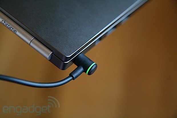
We do, however,
wish Google had also taken inspiration from Apple and Microsoft and
included some sort of magnetic power connector. We found that the small
plug, with its traditional, single-prong-style connector, had a tendency
to slowly work its way out of the laptop when the cable had any tension
from the left. Thankfully, a bright glowing light on the connector lets
you know when the laptop is charged or charging -- and thus when the
thing has slid out far enough to lose connection.
Keyboard and trackpad

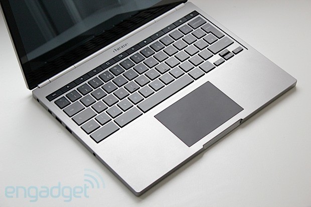
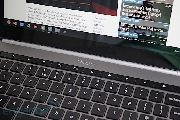
Island-style keyboards continue to be all the rage and, for the most
part, Google makes no exception for its latest Chromebook. The primary
keys float in a slightly recessed area, comfortably sized and
comfortably spaced. Each has great feel and great resistance. Typing on
this machine is a joy.
However, the row of function keys that
rest atop the number keys, discrete buttons for adjusting volume and
brightness and the like, is a different story. These are flush with each
other and far stiffer than the normal keys. This isn't much of a
bother, since you won't be using them nearly as frequently as the rest,
but butting them right up against each other makes them difficult to
find by touch. Thankfully, all are backlit, so locating them in the dark
is no problem.
We also wished for dedicated Home and End keys,
after finding the Chrome OS alternative of Ctrl + Alt + Up or Down to be
a bit of a handful. Regardless, you'll quickly learn to type around
these relatively minor shortcomings and enjoy the great keyboard.
Thankfully, the trackpad is equally good.
It's a glass unit,
darkly colored and positioned in the center of the wrist rest, which
makes it slightly shifted to the right compared to the space bar. It has
a matte coating but still feels quite smooth, resulting in a very nice
swiping sensation indeed. Of course, with a 12.85-inch touch-sensitive
display, you may find yourself using it less frequently than you think.
Display

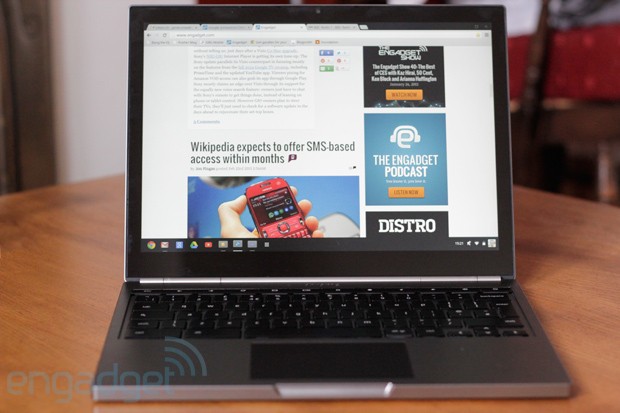
Again, up top is a 12.85-inch, 2,560 x 1,700 IPS LCD panel that we
can't look at without thinking of the very similar 13.3-inch, 2,560 x
1,600 panel on the 13-inch MacBook Pro with Retina display. It's smaller
but packs an extra 100 pixels vertically, giving it a slightly higher
pixel density of 239 ppi. Naturally, that's far from the full story
here, and those who are really into proportions will know that
resolution equates to a 3:2 aspect ratio. In other words: it's rather
tall.
A 16:9 aspect ratio (or something close to it) is the
prevailing trend among non-Macs these days, but even when acknowledging
that, this one feels particularly tall. Still, we didn't exactly mind
it. As mentioned above, the keyboard is plenty roomy, and given that
Chrome OS isn't particularly friendly to multi-window
multi-tasking (manually justifying windows is a real chore) we were
rarely left wanting a wider display.
That was, really, our only
minor reservation about this panel. Otherwise we have nothing but love
for the thing. It is, of course, a ridiculously high resolution, which
makes pixels basically disappear. Indeed the simple, clean and stark
Chrome OS looks great when rendered with such clarity, but we couldn't
help but lament the occasional excess of white space that's becoming
common across many of Google's web apps. For a display with a pixel
density this high, it feels somewhat under-utilized.
That is
until, of course, you boot up the 4K sample footage Google thoughtfully
pre-installed on the machine, which looks properly mind-blowing -- even
if it is only being rendered at slightly higher than half its native
resolution.
This is a glossy panel, tucked behind a pane of Gorilla Glass,
so glare may be a bit of a problem if your work setup has bright lights
positioned behind you. Still, reflectivity seemed to be on par with the
latest, optically bonded panels -- that is to say, far from the
"mirror, mirror" effect provided by many of the earlier gloss displays.
Contrast is quite good from all angles, though the color accuracy drops
off if you look at it from too high or low, with everything quickly
getting a bit pink. Slightly pretty.
And, finally, this is indeed
a touch-enabled panel, something we didn't know we needed on a
Chromebook -- and frankly we're still not sure we do. We'll discuss that
in more detail in the software section below.
Performance and battery life

Again we're dealing with a 1.8GHz Intel Core i5 processor here, a
bit on the mild side compared to most higher-end laptops. Still, it
proves to be more than enough to run the lightweight Chrome OS. That's
paired with 4GB of DDR3 RAM and, predictably, integrated graphics
courtesy of Intel's HD 4000 chipset.
It's no barnstormer, but it
runs a browser with aplomb. And, really, that's about all it's likely to
do with the limited selection of apps available for Chrome. Everything
we threw at it ran fine, though after extended sessions we did notice
heavier websites started to get a little bit stuttery. It's nothing that
rebooting the browser didn't fix.
High-def videos play smoothly,
though when pushing the pixels (or running games), the machine does get
fairly warm. The fan vents are below the hinge; a thin sliver of an
opening that thankfully doesn't seem to dump a lot of hot air into your
lap. It's noticeable, but it isn't particularly loud or annoying and
again, since you likely won't be doing too much taxing stuff here, don't
expect to hear it all that often.
When it comes to battery life,
Google estimates the 59Wh battery will provide "up to" five hours of
continuous use. And, indeed it may. On our standard battery run-down
test, which loops a video at fixed brightness, the machine clocked in at
four hours and eight minutes for the WiFi model. The LTE model, with
its LTE antenna on, came in about 30 minutes shorter at 3:34.
These numbers are rather poor, unfortunately. The 13-inch MacBook Pro
with Retina clocks in at more than six hours on the same battery test,
while both the 13-inch MacBook Air and the latest Samsung Chromebook
score about 30 minutes more even than that.
Connectivity

As mentioned above, both Chromebook Pixel models include dual-band MIMO
802.11a/b/g/n, which means you'll be sucking down bits at an optimal
rate more or less regardless of what sort of router you're connecting
to.
Stepping up to the $1,449 LTE version of course means you can
walk away from those routers. That machine includes a Qualcomm MDM9600
chipset to receive on LTE band 13, intended for Verizon in the US only.
So, then, we tested it in the US in two different LTE markets on both
coasts. Speeds varied widely from location to location, but in general
matched or exceeded the speeds we saw from other Verizon-compatible
mobile devices.
In terms of more practical connectivity concerns,
it's worth noting that the modem takes about 30 seconds to reconnect
after the laptop resumes from its suspended state, which is a bit
annoying but certainly no slower than your average LTE USB modem. Also,
Verizon is kindly including 100MB of data each month for free for your
first two years of Chromebook ownership, but after that you'll be stuck
paying up for one of Verizon's tiered data plans.
Oh, and the
Pixel lacks an Ethernet port, and does not include an adapter. We tried a
few standard USB Ethernet adapters and all worked without a hitch.
Software

As we concluded in our review of the most recent version,
Chrome OS has come a long, long way since that first Chromebook crossed
our laps. What we have now is a far more sophisticated and
comprehensive experience than we did a few years ago, but it's still
incredibly limited compared to the broader world of desktop operating
systems.
Simple tasks like file management can be a real chore if
you're doing anything other than moving a file into a subdirectory. And
while the OS itself has a refreshingly simple visual style, it's also
very stark and, frankly, a somewhat wasteful design. Not to keep harping
on the file explorer, but each file in a list is separated by a sea of
white big enough to basically double the effective height. When you're
skimming through a big 'ol list of files in a directory, it takes a lot
more scrolling than should be necessary given the resolution of this
display.
At least Google made the scrolling easy. As mentioned
above, the trackpad is quite good and very responsive. Multi-finger
gestures are responsive, so good that you might not be inclined to reach
up to that touch panel. But, you should, because the experience is
generally good as well, though you'll rarely be doing anything more than
scrolling webpages or documents. There's not really a whole lot more
Chrome OS can do, but even in games like Cut the Rope and Angry Birds, touch was just as good as... well, as it is on an Android tablet.
That said, it's disappointing that Google didn't introduce any
gestures to the OS to match its newfound touch compatibilities. In fact,
you can't even pinch-zoom in the image viewer or even on most pages in
the Chrome browser -- only in specifically pinch-friendly websites (like
Google Maps). There are no three- or four-finger gestures for switching
apps, and swiping in from the bezels does nothing. Except, that is, for
a swipe up from the bottom, which alternatively shows or hides the
launcher bar.
Again, we won't restate the entire review of Chrome
OS, but it's important to note at least briefly that functionality here
is still very minimal. There are built-in apps for viewing photos and
videos, for browsing files, for taking photos from the integrated
webcam, an app for taking notes and... the web browser. That, of course,
is the most important part. Suffice to say, if you can't do all your
work from inside of an instance of Chrome on some other platform (like
Windows or Mac), you probably won't be able to do it here, either.
Still, we did want to point out one important part of the software, and
that is it's easily replaceable. The bootloader is not locked and we've
already seen the thing rocking Linux -- and looking quite good
while doing it. So, if you happen to be looking for an incredibly
well-designed laptop to run that most noble of open-source operating
systems, this could be it.
Pricing and competition

We can keep the pricing bit short, because there are only two options
here. For $1,299, you can get yourself the WiFi model with 32GB of local
SSD storage. For $1,449 you step up to the LTE model, which throws in
64GB of storage in a bid to sweeten the deal.
Should that still
be too bitter for your tastes -- and we're thinking there's a very good
chance it will be -- Google has included plenty of other incentives that
are at least mildly saccharine. First among these are 12 free Gogo
passes for in-flight connectivity, each one worth about $14 for a total
of $168. The other, rather more compelling add-in, is 1TB of online
storage free for three years.
That, believe it or not, is worth a
whopping $1,800, which of course means that if you were looking to rent
that much data for a period of three years you'd actually be better off
just buying a Pixel. It would, effectively, just be a nice, free toy.
For everyone not
interested in storing copious quantities of stuff in the cloud, both
price points are rather dear to put it mildly. As ever, it's difficult
to compare a Chromebook to other laptops on the market thanks to the
limited functionality provided by the OS. So, we'll focus primarily on
hardware comparisons, and as we mentioned above, we find ourselves
inclined to compare this to the 13-inch MacBook Pro with Retina display.
That machine, with a full operating system and a faster, 2.5GHz Core
i5 processor, starts at $1,499. That, though, has a 128GB of SSD, twice
that of the biggest Pixel. We could also see many comparing this
against the 13-inch MacBook Air, which offers the same CPU, integrated
graphics and 4GB of RAM for the same $1,199. It's lacking the high-res
screen but it perhaps makes up for that with, again, 128GB of storage.
On the PC side of things, that resolution is unmatched, but the other
specs certainly aren't. We recently had reasonably good feelings about Samsung's Series 5 UltraTouch,
a 13-incher packing a similar Core i5 CPU, 4GB of RAM, but again a
500GB platter-based hard disk. An SSD isn't an option, but the $849
price is certainly more palatable.
Again, none of these is an
apples-to-apples comparison, as the Pixel offers a touchscreen,
something all the Macs lack, and offers LTE connectivity, thus making it
even more of a rare bird on the laptop scene. Whether these unique
attributes, plus the various goodies Google is throwing in, turn this
into a compelling proposition compared to the competition is something
you'll have to decide for yourself.
Wrap-up

Again we reach the dreaded wrap-up section on a Chromebook review. It's
simply never easy to classify these machines. In some regards, the
Pixel is even harder to pigeonhole than its predecessors. The level of
quality and attention to detail here is quite remarkable for what is,
we'll again remind you, Google's first swing at building a laptop.
Boot-ups are quick, performance is generally good and, of course,
there's that display.
But, with one single statistic, Google has
made the Chromebook Pixel even easier to write off than any of its
quirky predecessors: price. For an MSRP that is on par with some of the
best laptops in the world, the Pixel doesn't provide anywhere near as
much potential when it comes to functionality. It embraces a world where
everyone is always connected and everything is done on the web -- a
world that few people currently live in.
The Chromebook Pixel, then, is a lot like the Nexus Q:
it's a piece of gorgeous hardware providing limited functionality at a
price that eclipses the (often more powerful) competition. It's a lovely
thing that everyone should try to experience but, sadly, few should
seriously consider buying.
Tuesday, February 26. 2013
Via The Verge
-----
The frosted-glass doors on the 11th floor of Google’s NYC
headquarters part and a woman steps forward to greet me. This is an
otherwise normal specimen of humanity. Normal height, slender build; her
eyes are bright, inquisitive. She leans in to shake my hand and at that
moment I become acutely aware of the device she’s wearing in the place
you would expect eyeglasses: a thin strip of aluminum and plastic with a
strange, prismatic lens just below her brow. Google Glass.
What was a total oddity a year ago, and little more than an
experiment just 18 months ago is now starting to look like a real
product. One that could be in the hands (or on the heads, rather) of
consumers by the end of this year. A completely new kind of computing
device; wearable, designed to reduce distraction, created to allow you
to capture and communicate in a way that is supposed to feel completely
natural to the wearer. It’s the anti-smartphone, explicitly fashioned to
blow apart our notions of how we interact with technology.
But as I release from that handshake and study the bizarre device
resting on my greeter’s brow, my mind begins to fixate on a single
question: who would want to wear this thing in public?
Finding Glass
The Glass project was started "about three years ago" by an engineer
named Babak Parviz as part of Google’s X Lab initiative, the lab also
responsible for — amongst other things — self-driving cars and neural
networks. Unlike those epic, sci-fi R&D projects at Google, Glass is
getting real much sooner than anyone expected. The company offered
developers an option to buy into an early adopter strategy called the
Explorer Program during its I/O conference last year, and just this week
it extended that opportunity to people in the US
in a Twitter campaign which asks potential users to explain how they
would put the new technology to use. Think of it as a really aggressive
beta — something Google is known for.
I was about to beta test Glass myself. But first, I had questions.
Seated in a surprisingly bland room — by Google’s whimsical office
standards — I find myself opposite two of the most important players in
the development of Glass, product director Steve Lee and lead industrial
designer Isabelle Olsson. Steve and Isabelle make for a convincing pair
of spokespeople for the product. He’s excitable, bouncy even, with big
bright eyes that spark up every time he makes a point about Glass.
Isabelle is more reserved, but speaks with incredible fervency about the
product. And she has extremely red hair. Before we can even start
talking about Glass, Isabelle and I are in a heated conversation about
how you define the color navy blue. She’s passionate about design — a
condition that seems to be rather contagious at Google these days — and
it shows.
Though the question of design is at the front of my mind, a picture
of why Glass exists at all begins to emerge as we talk, and it’s clearly
not about making a new fashion accessory. Steve tries to explain it to
me.
"Why are we even working on Glass? We all know that people love to be
connected. Families message each other all the time, sports fanatics
are checking live scores for their favorite teams. If you’re a frequent
traveler you have to stay up to date on flight status or if your gate
changes. Technology allows us to connect in that way. A big problem
right now are the distractions that technology causes. If you’re a
parent — let’s say your child’s performance, watching them do a soccer
game or a musical. Often friends will be holding a camera to capture
that moment. Guess what? It’s gone. You just missed that amazing game."
Isabelle chimes in, "Did you see that Louis C.K. stand up when he was
telling parents, ‘your kids are better resolution in real life?’"
Everyone laughs, but the point is made.
Human beings have developed a new problem since the advent of the
iPhone and the following mobile revolution: no one is paying attention
to anything they’re actually doing. Everyone seems to be looking down at
something or through something. Those perfect moments watching your
favorite band play or your kid’s recital are either being captured via
the lens of a device that sits between you and the actual experience, or
being interrupted by constant notifications. Pings from the outside
world, breaking into what used to be whole, personal moments.
Steve goes on. "We wondered, what if we brought technology closer to
your senses? Would that allow you to more quickly get information and
connect with other people but do so in a way — with a design — that gets
out of your way when you’re not interacting with technology? That’s
sort of what led us to Glass." I can’t stop looking at the lens above
his right eye. "It’s a new wearable technology. It’s a very ambitious
way to tackle this problem, but that’s really sort of the underpinning
of why we worked on Glass."
I get it. We’re all distracted. No one can pay attention. We’re
missing all of life’s moments. Sure, it’s a problem, but it’s a new
problem, and this isn’t the first time we’ve been distracted by a new
technology. Hell, they used to think car radios would send drivers
careening off of the highways. We’ll figure out how to manage our
distraction, right?
Maybe, but obviously the Glass team doesn’t want to wait to find out.
Isabelle tells me about the moment the concept clicked for her. "One
day, I went to work — I live in SF and I have to commute to Mountain
View and there are these shuttles — I went to the shuttle stop and I saw
a line of not 10 people but 15 people standing in a row like this," she
puts her head down and mimics someone poking at a smartphone. "I don’t
want to do that, you know? I don’t want to be that person. That’s when
it dawned on me that, OK, we have to make this work. It’s bold. It’s
crazy. But we think that we can do something cool with it."
Bold and crazy sounds right, especially after Steve tells me that the
company expects to have Glass on the market as a consumer device by the
end of this year.
Google-level design
Forget about normal eyeglasses for a moment. Forget about chunky
hipster glasses. Forget about John Lennon’s circle sunglasses. Forget
The Boys of Summer; forget how she looks with her hair slicked back and
her Wayfarers on. Pretend that stuff doesn’t exist. Just humor me.
The design of Glass is actually really beautiful. Elegant,
sophisticated. They look human and a little bit alien all at once.
Futuristic but not out of time — like an artifact from the 1960’s,
someone trying to imagine what 2013 would be like. This is Apple-level
design. No, in some ways it’s beyond what Apple has been doing recently.
It’s daring, inventive, playful, and yet somehow still ultimately
simple. The materials feel good in your hand and on your head, solid but
surprisingly light. Comfortable. If Google keeps this up, soon we’ll be
saying things like "this is Google-level design."
Even the packaging seems thoughtful.
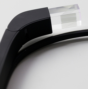
The system itself is made up of only a few basic pieces. The main
body of Glass is a soft-touch plastic that houses the brains, battery,
and counterweight (which sits behind your ear). There’s a thin metal
strip that creates the arc of the glasses, with a set of rather typical
pad arms and nose pads which allow the device to rest on your face.
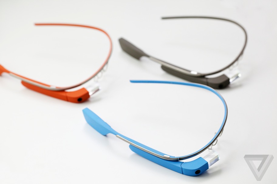
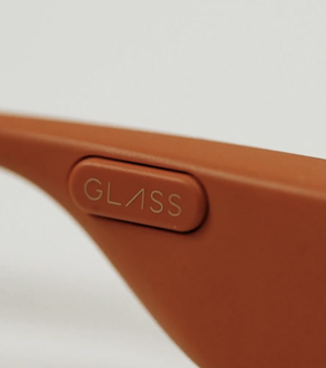
Google is making the first version of the device in a variety of
colors. If you didn’t want to get creative, those colors are: gray,
orange, black, white, and light blue. I joke around with Steve and
Isabelle about what I think the more creative names would be. "Is the
gray one Graphite? Hold on, don’t tell me. I’m going to guess." I go
down the list. "Tomato? Onyx? Powder — no Avalanche, and Seabreeze."
Steve and Isabelle laugh. "That’s good," Isabelle says.
But seriously. Shale. Tangerine. Charcoal. Cotton. Sky. So close.
That conversation leads into discussion of the importance of color in
a product that you wear every day. "It’s one of those things, you think
like, ‘oh, whatever, it is important,’ but it’s a secondary thing. But
we started to realize how people get attached to the device… a lot of it
is due to the color," Isabelle tells me.
And there is something to it. When I saw the devices in the different
colors, and when I tried on Tangerine and Sky, I started to get
emotional about which one was more "me." It’s not like how you feel
about a favorite pair of sunglasses, but it evokes a similar response.
They’re supposed to feel like yours.
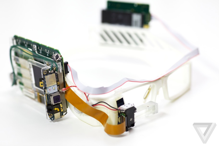
Isabelle came to the project and Google from Yves Behar’s design
studio. She joined the Glass team when their product was little more
than a bizarre pair of white eyeglass frames with comically large
circuit boards glued to either side. She shows me — perhaps ironically —
a Chanel box with the original prototype inside, its prism lens limply
dangling from the right eye, a gray ribbon cable strewn from one side to
the other. The breadboard version.
It was Isabelle’s job to make Glass into something that you could wear, even if maybe you still weren’t sure you wanted to wear it. She gets that there are still challenges.
The Explorer edition which the company will ship out has an
interchangeable sunglass accessory which twists on or off easily, and I
must admit makes Glass look slightly more sane. I also learn that the
device actually comes apart, separating that center metal rim from the
brains and lens attached on the right. The idea is that you could attach
another frame fitted for Glass that would completely alter the look of
the device while still allowing for the heads-up functionality. Steve
and Isabelle won’t say if they’re working with partners like Ray-Ban or
Tom Ford (the company that makes my glasses), but the New York Times
just reported that Google is speaking to Warby Parker, and I’m inclined
to believe that particular rumor. It’s obvious the company realizes the
need for this thing to not just look wearable — Google needs people to
want to wear it.
So yes, the Glass looks beautiful to me, but I still don’t want to wear it.

Topolsky in Mirrorshades
Finally I get a chance to put the device on and find out what using
Glass in the real world actually feels like. This is the moment I’ve
been waiting for all day. It’s really happening.
When you activate Glass, there’s supposed to be a small screen that
floats in the upper right-hand of your field of vision, but I don’t see
the whole thing right away. Instead I’m getting a ghost of the upper
portion, and the bottom half seems to melt away at the corner of my eye.
Steve and Isabelle adjust the nose pad and suddenly I see the glowing box. Victory.
It takes a moment to adjust to this spectral screen in your vision,
and it’s especially odd the first time you see it, it disappears, and
you want it to reappear but don’t know how to make it happen. Luckily
that really only happens once, at least for me.
Here’s what you see: the time is displayed, with a small amount of
text underneath that reads "ok glass." That’s how you get Glass to wake
up to your voice commands. Actually, it’s a two-step process. First you
have to touch the side of the device (which is actually a touchpad), or
tilt your head upward slowly, a gesture which tells Glass to wake up.
Once you’ve done that, you start issuing commands by speaking "ok glass"
first, or scroll through the options using your finger along the side
of the device. You can scroll items by moving your finger backwards or
forward along the strip, you select by tapping, and move "back" by
swiping down. Most of the big interaction is done by voice, however.
The device gets data through Wi-Fi on its own, or it can tether via
Bluetooth to an Android device or iPhone and use its 3G or 4G data while
out and about. There’s no cellular radio in Glass, but it does have a
GPS chip.
Let me start by saying that using it is actually nearly identical to
what the company showed off in its newest demo video. That’s not CGI —
it’s what Glass is actually like to use. It’s clean, elegant, and makes
relative sense. The screen is not disruptive, you do not feel burdened
by it. It is there and then it is gone. It’s not shocking. It’s not
jarring. It’s just this new thing in your field of vision. And it’s
actually pretty cool.
Glass does all sorts of basic stuff after you say "ok glass." Things
you’ll want to do right away with a camera on your face. "Take a
picture" snaps a photo. "Record a video" records ten seconds of video.
If you want more you can just tap the side of the device. Saying "ok
glass, Google" gets you into search, which plugs heavily into what
Google has been doing with Google Now and its Knowledge Graph. Most of
the time when you ask Glass questions you get hyper-stylized cards full
of information, much like you do in Google Now on Android.
The natural language search works most of the time, but when it
doesn’t, it can be confusing, leaving you with text results that seem
like a dead-end. And Glass doesn’t always hear you correctly, or the
pace it’s expecting you to speak at doesn’t line up with reality. I
struggled repeatedly with Glass when issuing voice commands that seemed
to come too fast for the device to interpret. When I got it right
however, Glass usually responded quickly, serving up bits of information
and jumping into action as expected.
Some of the issues stemmed from a more common problem: no data. A
good data connection is obviously key for the device to function
properly, and when taking Glass outside for stroll, losing data or
experiencing slow data on a phone put the headset into a near-unusable
state.
Steve and Isabelle know the experience isn’t perfect. In fact, they
tell me that the team plans to issue monthly updates to the device when
the Explorer program starts rolling. This is very much a work in
progress.
But the most interesting parts of Glass for many people won’t be its
search functionality, at least not just its basic ability to pull data
up. Yes, it can tell you how old Brad Pitt is (49 for those keeping
count), but Google is more interested in what it can do for you in the
moment. Want the weather? It can do that. Want to get directions? It can
do that and display a realtime, turn-by-turn overlay. Want to have a
Google Hangout with someone that allows them to see what you’re seeing?
Yep, it does that.
But the feature everyone is going to go crazy with — and the feature
you probably most want to use — is Glass’ ability to take photos and
video with a "you are there" view. I won’t lie, it’s amazingly powerful
(and more than a little scary) to be able to just start recording video
or snapping pictures with a couple of flicks of your finger or simple
voice commands.
At one point during my time with Glass, we all went out to navigate
to a nearby Starbucks — the camera crew I’d brought with me came along.
As soon as we got inside however, the employees at Starbucks asked us to
stop filming. Sure, no problem. But I kept the Glass’ video recorder
going, all the way through my order and getting my coffee. Yes, you can
see a light in the prism when the device is recording, but I got the
impression that most people had no idea what they were looking at. The
cashier seemed to be on the verge of asking me what I was wearing on my
face, but the question never came. He certainly never asked me to stop
filming.
Once those Explorer editions are out in the world, you can expect a
slew of use (and misuse) in this department. Maybe misuse is the wrong
word here. Steve tells me that part of the Explorer program is to find
out how people want to (and will) use Glass. "It’s really important," he
says, "what we’re trying to do is expand the community that we have for
Glass users. Currently it’s just our team and a few other Google people
testing it. We want to expand that to people outside of Google. We
think it’s really important, actually, for the development of Glass
because it’s such a new product and it’s not just a piece of software.
We want to learn from people how it’s going to fit into their
lifestyle." He gets the point. "It’s a very intimate device. We’d like
to better understand how other people are going to use it. We think
they’ll have a great opportunity to influence and shape the opportunity
of Glass by not only giving us feedback on the product, but by helping
us develop social norms as well."
I ask if it’s their attempt to define "Glass etiquette." Will there
be the Glass version of Twitter’s RT? "That’s what the Explorer program
is about," Steve says. But that’s not going to answer questions about
what’s right and wrong to do with a camera that doesn’t need to be held
up to take a photo, and often won’t even be noticed by its owner’s
subjects. Will people get comfortable with that? Are they supposed to?
The privacy issue is going to be a big hurdle for Google with Glass.
Almost as big as the hurdle it has to jump over to convince normal
people to wear something as alien and unfashionable as Glass seems right
now.

But what’s it actually like to have Glass on? To use it when you’re walking around? Well, it’s kind of awesome.
Think of it this way — if you get a text message or have an incoming
call when you’re walking down a busy street, there are something like
two or three things you have to do before you can deal with that
situation. Most of them involve you completely taking your attention off
of your task at hand: walking down the street. With Glass, that
information just appears to you, in your line of sight, ready for you to
take action on. And taking that action is little more than touching the
side of Glass or tilting your head up — nothing that would take you
away from your main task of not running into people.
It’s a simple concept that feels powerful in practice.
The same is true for navigation. When I get out of trains in New York
I am constantly jumping right into Google Maps to figure out where I’m
headed. Even after more than a decade in the city, I seem to never be
able to figure out which way to turn when I exit a subway station. You
still have to grapple with asking for directions with Glass, but
removing the barrier of being completely distracted by the device in
your hand is significant, and actually receiving directions as you walk
and even more significant. In the city, Glass make you feel more
powerful, better equipped, and definitely less diverted.
I will admit that wearing Glass made me feel self-conscious, and
maybe it’s just my paranoia acting up (or the fact that I look like a
huge weirdo), but I felt people staring at me. Everyone who I made eye
contact with while in Glass seemed to be just about to say "hey, what
the hell is that?" and it made me uncomfortable.
Steve claims that when those questions do come, people are excited to
find out what Glass is. "We’ve been wearing this for almost a year now
out in public, and it’s been so interesting and exciting to do that.
Before, we were super excited about it and confident in our design, but
you never know until you start wearing it out and about. Of course my
friends would joke with me ‘oh no girls are going to talk to you now,
they’ll think it’s strange.’ The exact opposite happened."
I don’t think Glass is right for every situation. It’s easy to see
how it’s amazing for parents to capture all of the adorable things their
kids are doing, or for skydivers and rock climbers who clearly don’t
have their hands free and also happen to be having life changing
experiences. And yes, it’s probably helpful if you’re in Thailand and
need directions or translation — but this might not be that great at a
dinner party, or on a date, or watching a movie. In fact, it could make
those situations very awkward, or at the least, change them in ways you
might not like.
Sometimes you want to be distracted in the old fashioned ways. And
sometimes, you want people to see you — not a device you’re wearing on
your face. One that may or may not be recording them right this second.
And that brings me back to the start: who would want to wear this thing in public?
Not if, but when
Honestly, I started to like Glass a lot when I was wearing it. It
wasn’t uncomfortable and it brought something new into view (both
literally and figuratively) that has tremendous value and potential. I
don’t think my face looks quite right without my glasses on, and I
didn’t think it looked quite right while wearing Google Glass, but after
a while it started to feel less and less not-right. And that’s
something, right?
The sunglass attachment Google is shipping with the device goes a
long way to normalizing the experience. A partnership with someone like
Ray-Ban or Warby Parker would go further still. It’s actually easy to
see now — after using it, after feeling what it’s like to be in public
with Glass on — how you could get comfortable with the device.
Is it ready for everyone right now? Not really. Does the Glass team
still have huge distance to cover in making the experience work just the
way it should every time you use it? Definitely.
But I walked away convinced that this wasn’t just one of Google’s
weird flights of fancy. The more I used Glass the more it made sense to
me; the more I wanted it. If the team had told me I could sign up to
have my current glasses augmented with Glass technology, I would have
put pen to paper (and money in their hands) right then and there. And
it’s that kind of stuff that will make the difference between this being
a niche device for geeks and a product that everyone wants to
experience.
After a few hours with Glass, I’ve decided that the question is no longer ‘if,’ but ‘when?’
Wednesday, November 14. 2012
Via BBC
-----
Governments around the world made nearly 21,000 requests for access to Google data in the first six months of this year, according to the search engine.
Its Transparency Reportindicates government surveillance of online lives is rising sharply.
The US government made the most demands, asking for details 7,969 times in the first six months of 2012.
Turkey topped the list for requests to remove content.
Government 'bellwether'
Google, in common with other technology and communication companies, regularly receives requests from government agencies and courts around the world to have access to content.
It has been publishing its Transparency Report twice a year since 2009 and has seen a steady rise in government demands for data. In its first report in 2009, it received 12,539 requests. The latest figure stands at 20,939.
"This is the sixth time we've released this
data, and one trend has become clear: government surveillance is on the
rise," Google said in a blog post.
The report acts as a bellwether for government behaviour around the world, a Google spokeswoman told the BBC.
"It reflects laws on the ground. For example in Turkey there
are specific laws about defaming public figures whereas in Germany we
get requests to remove neo-Nazi content," she said.
"And in Brazil we get a lot of requests to remove content
during elections because there is a law banning parodies of candidates.
"We hope that the report will shed light on how governments interact
with online services and how laws are reflected in online behaviour,"
she added.
The US has consistently topped the charts for data requests. France, Germany, Italy, Spain and the UK are also in the top 10.
In France and Germany it complied with fewer than half of all
requests. In the UK it complied with 64% of requests and 90% of
requests from the US.
Removing content
Google said the top three reasons cited by government for content removal were defamation, privacy and security.
Worldwide authorities made 1,789 requests for Google to remove content, up from 1,048 requests for the last six months of 2011.
In the period from January to June, Turkey made 501 requests for content removal.
These included 148 requests related to Mustafa Kemal Ataturk -
the first president of Turkey, the current government, national
identity and values.
Others included claims of pornography, hate speech and copyright.
Google has its own criteria for whether it will remove
content - the request must be specific, relate to a specific web address
and have come from a relevant authority.
In one example from the UK, Google received a request from
police to remove 14 search results that linked to sites allegedly
criticising the police and claiming individuals were involved in
obscuring crimes. It did not remove the content.
Monday, November 05. 2012
Via xda developpers
-----
Retaining the code name from Android 4.1, 4.2 is a revamped version of
Jelly Bean. Despite the lack of name change, 4.2 offers various new and
exciting features. Join us as we take a closer look at some of the
highlights!
Photo Sphere and Camera UI Improvements
Not too long ago, Google gave us native support for panoramic photos
with the launch of ICS. However, in their eyes, a standard panoramic
shot doesn’t properly convey the feeling of actually being there. Photo
Sphere takes us one step closer.

Once Photo Sphere mode is enabled, the app first guides you as you
move your device to capture the entire scene. By using the same
technology employed by Google Maps Street View, Photo Sphere then
stitches the shots into a 360-degree view that allows you to pan and
zoom, as you would in Street View. Those wishing to look at photo
spheres from photographers around the would can do so as well.
In addition to Photo Sphere, the Camera app’s UI also been updated
with gesture controls. Thanks to the gestures, the interface no longer
obscures the photo being taken with various controls. Instead, the app
now makes full use of the screen real estate so that you can take better
photos.
Gesture Typing

Taking a page from Swype’s play book, the new keyboard built into
Android 4.2 has slide gesture functionality. The heavily revised
keyboard differentiates itself from current versions of Swype, however,
by showing predictions in real time, as you slide around your fingers.
This isn’t the first time we’ve seen real time gesture recognition—dubstep aside.
That said, the interface looks to be better on Google’s latest
offering, but the real test will be in actual day to day usage. The
dictionaries have also been updated, as has voice recognition.
Multi-User

Remember all the buzz about enabling multi-user support on Android? Apparently, Google does too. We all knew this was coming; it was only a matter of “when.”
Well, it’s finally here. Multi-User support has finally made its way
to the OS officially. Each user is given his or her own personal space,
complete with a customized home screen, background, widgets, apps, and
games. While we don’t have access to the source code to verify, this is
likely accomplished by sectioning off the /data partition
between users. Interestingly, switching between user profiles is done
via fast user switching, rather than completely logging in and out.
Naturally, this feature is only available / practical on tablets, but
you can bet your bacon that this will find its way to phones in the
coming months, after 4.2 is released to AOSP.
TV Connect
 Many were disappointed to learn that the Nexus Q was only able to stream Google Play content rather
than supporting full device mirroring. Problem, no more. In Android
4.2, users will be able to wirelessly mirror their displays to various
supported devices. Many were disappointed to learn that the Nexus Q was only able to stream Google Play content rather
than supporting full device mirroring. Problem, no more. In Android
4.2, users will be able to wirelessly mirror their displays to various
supported devices.
While we can’t speak in regards to additional functionality for
Google’s enigmatic black orb, we can say that this will truly be a
useful feature if executed properly. The underlying technology is the
new industry standard Miracast, which was created by the Wi-Fi Alliance, and is based on Wi-Fi Direct.
DayDream

A fun, new feature present in 4.2 allows your device to display photo albums, news, and more when your device is docked.
Quick Settings
Remember AP’s video showing
the “future site of quick settings?” It’s finally here. Google has now
added a separate panel to the notification bar that can be accessed by a
two-finger swipe from the top of the screen or simple button tap in the
upper right corner if the notification tray is extended. Once summoned,
it gives you quick access to user accounts, brightness, device
settings, WiFi, Airplane Mode, Bluetooth, Battery, and Wireless Display.
Lock Screen Widgets
Much as we have seen in third party applications,
Android now natively supports widgets on the lock screen. In fact, you
can now add several pages of widgets to your device’s lock screen,
essentially giving you a home screen—before you get to your home screen.
Memetastic.
Enhanced Google Now
Google Now was also updated with more cards. A good example of this
is how the software can pick out shipping updates and flight details
from your email, and display them in a context-relevant manner. This,
however, is not exclusively tied with the updated OS, as those with
devices running 4.1 can access the update today.
Tuesday, October 16. 2012
Via Slash Gear
-----
European data protection regulators have demanded Google change its privacy policy,
though the French-led team did not conclude that the search giant’s
actions amounted to something illegal. The investigation, by the Commission Nationale de l’Informatique
(CNIL), argued that Google’s decision to condense the privacy policies
of over sixty products into a single agreement – and at the same time
increase the amount of inter-service data sharing – could leave users
unclear as to how different types of information (as varied as search
terms, credit card details, or phone numbers) could be used by the
company.

“The Privacy Policy makes no difference in terms of processing
between the innocuous content of search query and the credit card number
or the telephone communications of the user” the CNIL points out, “all
these data can be used equally for all the purposes in the Policy.” That
some web users merely interact passively with Google products, such as
adverts, also comes in for heightened attention, with those users
getting no explanation at all as to how their actions might be tracked
or stored.
“EU Data protection authorities ask Google to provide
clearer and more comprehensive information about the collected data and
purposes of each of its personal data processing operations. For
instance, EU Data protection authorities recommend the implementation of
a presentation with three levels of detail to ensure that information
complies with the requirements laid down in the Directive and does not
degrade the users’ experience. The ergonomics of the Policy could also
be improved with interactive presentations” CNIL
In a letter to Google [pdf
link] – signed by the CNIL and other authorities from across Europe –
the concerns are laid out in full, together with some suggestions as to
how they can be addressed. For instance, the search company could
“develop interactive presentations that allow users to navigate easily
through the content of the policies” and “provide additional and precise
information about data that have a significant impact on users
(location, credit card data, unique device identifiers, telephony,
biometrics).”
Ironically, one of Google’s arguments for initially changing its
policy system was that a single, harmonized agreement would be easier
for users to read through and understand. It also insisted that the
data-sharing aspects were little changed from before.
“The CNIL, all the authorities among the Working Party and data
protection authorities from other regions of the world expect Google to
take effective and public measures to comply quickly and commit itself
to the implementation of these recommendations” the commission
concluded. Google has a 3-4 month period to enact the changes requested,
or it could face the threat of sanctions.
“We have received the report and are reviewing it now” Peter Fleischer, Google’s global privacy counsel, told TechCrunch.
“Our new privacy policy demonstrates our long-standing commitment to
protecting our users’ information and creating great products. We are
confident that our privacy notices respect European law.”
Friday, May 11. 2012
Via makeuseof
-----
The cloud storage scene has heated up recently, with a long-awaited
entry by Google and a revamped SkyDrive from Microsoft. Dropbox has gone
unchallenged by the major players for a long time, but that’s changed –
both Google and Microsoft are now challenging Dropbox on its own turf,
and all three services have their own compelling features. One thing’s
for sure – Dropbox is no longer the one-size-fits-all solution.
These three aren’t the only cloud storage services – the cloud
storage arena is full of services with different features and
priorities, including privacy-protecting encryption and the ability to
synchronize any folder on your system.
Dropbox
introduced cloud storage to the masses, with its simple approach to
cloud storage and synchronization – a single magic folder that follows
you everywhere. Dropbox deserves credit for being a pioneer in this
space and the new Google Drive and SkyDrive both build on the foundation
that Dropbox laid.
Dropbox doesn’t have strong integration with any ecosystems – which
can be a good thing, as it is an ecosystem-agnostic approach that isn’t
tied to Google, Microsoft, Apple, or any other company’s platform.

Dropbox today is a compelling and mature offering supporting a wide
variety of platforms. Dropbox offers less free storage than the other
services (unless you get involved in their referral scheme) and its
prices are significantly higher than those of competing services – for
example, an extra 100GB is four times more expensive with Dropbox compared to Google Drive.
- Supported Platforms: Windows, Mac, Linux, Android, iOS, Blackberry, Web.
- Free Storage: 2 GB (up to 16 GB with referrals).
- Price for Additional Storage: 50 GB for $10/month, 100 GB for $20/month.
- File Size Limit: Unlimited.
- Standout Features: the Public folder is an easy way to share files.
Other services allow you to share files, but it isn’t quite as easy.
You can sync files from other computers running Dropbox over the local
network, speeding up transfers and taking a load off your Internet
connection.

Google Drive is the evolution of Google Docs,
which already allowed you to upload any file – Google Drive bumps the
storage space up from 1 GB to 5 GB, offers desktop sync clients, and
provides a new web interface and APIs for web app developers.
Google Drive is a serious entry from Google, not just an afterthought like the upload-any-file option was in Google Docs.

Its integration with third-party web apps – you can install apps and
associate them with file types in Google Drive – shows Google’s vision
of Google Drive being a web-based hard drive that eventually replaces
the need for desktop sync clients entirely.
- Supported Platforms: Windows, Mac, Android, Web, iOS (coming soon), Linux (coming soon).
- Free Storage: 5 GB.
- Price for Additional Storage: 25 GB for $2.49/month, 100 GB for $4.99/month.
- File Size Limit: 10 GB.
- Standout Features: Deep search with automatic OCR and image recognition, web interface that can launch files directly in third-party web apps.

You can actually purchase up to 16 TB of storage space with Google Drive – for $800/month!
Microsoft released a revamped SkyDrive
the day before Google Drive launched, but Google Drive stole its
thunder. Nevertheless, SkyDrive is now a compelling product,
particularly for people into Microsoft’s ecosystem of Office web apps, Windows Phone, and Windows 8, where it’s built into Metro by default.
Like Google with Google Drive, Microsoft’s new SkyDrive product imitates the magic folder pioneered by Dropbox.

Microsoft offers the most free storage space at 7 GB – although this is down from the original 25 GB. Microsoft also offers good prices for additional storage.
- Supported Platforms: Windows, Mac, Windows Phone, iOS, Web.
- Free Storage: 7 GB.
- Price for Additional Storage: 20 GB for $10/year, 50 GB for $25/year, 100 GB for $50/year
- File Size Limit: 2 GB
- Standout Features: Ability to fetch unsynced files from outside the synced folders on connected PCs, if they’ve been left on.

Other Services
SugarSync is a popular
alternative to Dropbox. It offers a free 5 GB of storage and it lets you
choose the folders you want to synchronize – a feature missing in the
above services, although you can use some tricks
to synchronize other folders. SugarSync also has clients for mobile
platforms that don’t get a lot of love, including Symbian, Windows
Mobile, and Blackberry (Dropbox also has a Blackberry client).

Amazon also offers their own cloud storage service, known as Amazon Cloud Drive.
There’s one big problem, though – there’s no official desktop sync
client. Expect Amazon to launch their own desktop sync program if
they’re serious about competing in this space. If you really want to use Amazon Cloud Drive, you can use a third-party application to access it from your desktop.

Box is popular, but its 25 MB file
size limit is extremely low. It also offers no desktop sync client
(except for businesses). While Box may be a good fit for the enterprise,
it can’t stand toe-to-toe with the other services here for consumer
cloud storage and syncing.
If you’re worried about the privacy of your data, you can use an encrypted service, such as SpiderOak or Wuala, instead. Or, if you prefer one of these services, use an app like BoxCryptor to encrypt files and store them on any cloud storage service.
Wednesday, April 04. 2012
Via Christian Babski
-----
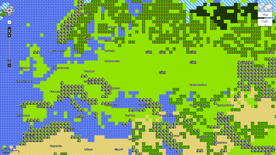
8 bits edition of Google maps. We are all stars now in the game show.


Monday, April 02. 2012
Via The Atlantic Wire
-----

flickr/Jeff Dlouhy
While Apple and Google are busy getting bad press for their privacy
issues, labor practices and general big-evil-company wrongdoings,
Microsoft has done some brand regeneration, making it look like the
hippest tech company on the block these days. As Apple and Google
captured a younger, cooler demographic, the Windows maker, with its
stodgy business oriented PC-compatible operating system and notoriously
annoying browser, became synonymous with lameness. Remember all those
highly effective Mac versus PC commercials?
That PC dork (writer-performer John Hodgman) represented all things
Microsoft: Slow, uptight, badly dressed. But as Apple and Google have
grown up, they've lost their hip sheen. And, Microsoft's taking
advantage. In this era of awesomely bad, it doesn't look so lame anymore
-- especially in comparison to the other guys.
We noticed this new-found hipness when we came across the endearing Browser You Love(d) to Hate
campaign. With some admirable self-awareness, Microsoft used its own
bad reputation to argue that its hated Internet Explorer browser is on
the verge of a comeback. Layering on the hipster-irony, Microsoft
compares itself to once-passe things like PBR and mustaches, suggesting
it's just another brand that's so bad, it's cool again. It also doesn't
hurt that the overall look of the site matches that aesthetic. The Atlantic's own mustachio-ed tech man, Alexis Madrigal gave it his approval, calling this accompanying ad "definitely the funniest commercial Microsoft's ever put out." We agreed, finding the whole thing convincing enough to give our abandoned IE9 a try again. (We still prefer Chrome, by the way.)
But this image comeback isn't limited to IE. Over the last few days we've seen Hotmail ads running on Boing Boing and Jezebel,
two blogs that are hip for different reasons. Boing Boing catering to
the hippest of Internet lovers and Jezebel reaches a more mainstream but
still cool millennial audience. And in general, the overall
Microsoft-related press has been kind of good. Windows 8 surprised and excited
the tech blogger world, something a Windows browser hasn't done since
Windows 95. The company has some other exciting things going on inside
its labs. The other day, It did some Internet good with its Digital Crimes Unit. And, has even designed itself a decent looking logo. Apple's (maybe) new logo, on the other hand, with its rainbow mish-mash, feels dated.
Which brings us to the other aspect of Microsoft's renaissance: good
timing. The once-hipper than Microsoft foes, Google and Apple haven't
looked so good these days. Google, the once beloved search company, has
users uneasy with its Google+ integration, privacy issues and anti-trust concerns. Even Googlers aren't too sure
of Google's mission, these days. Appl still produces insane-popular
gadgets, but no longer wows reviewers like it once did. The new iPad is
still the best tablet out there, but it's not a must-have. Plus, it too
has gotten itself into its own privacy messes. It also had the misfortune of acting as the face of the last few months of Foxconn scandal.
Though the Foxconn protesters that threatened mass suicide back in
January made Microsoft's XBox, thanks to Mike Daisey and Apple's
financial successes, Apple not Microsoft absorbed most of the bad PR.
Part of this has to do with maturity, we suppose. An early bloomer,
Microsoft's already went through its tech company growing pains. It used
to be the evil one, remember? The one accused of monopolistic practices, of buying up the competition, of stifling innovation. But
it's no longer the bully. Google and Apple's misdeeds have
overshadowed the once dominant tech company, and while the other big
players make public messes out of themselves, Microsoft looks to be
cleaning up its image. And, we have to say, it looks good.
Thursday, February 16. 2012
Via Android Community
-----
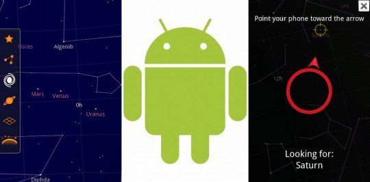
If you’re a fan of Google’s augmented reality astronomy app Google
Sky Map, I’ve got good news and bad news for you. Google announced that major development on the app has ended,
so there will be no more major official releases from the company. On
the plus side, they’ve decided to release the open-source code for Sky
Map, so given enough developer interest it should be around for quite
some time.

Sky Map started as one of Google’s famous 20% projects, which six of
its employees launched by working in their company-sponsored spare time.
The application was one of Android’s first showpiece apps, combining
basic astronomical data overlaid on a smartphone camera to easily
identify constellations, planets and other heavenly bodies by simply
pointing the phone towards the sky. The free app has been downloaded
over 10 million times from the Android Market.
Google is working with Carnegie Melon University so that its students
can continue direct development. The company didn’t say if direct
updated with computer scientist students’ code would make it into the
android Market, but it’s a pretty safe bet. If you’ d like to give it a
try for yourself, you can download the open-source code here.
I fully expect a Star Trek themed version of Sky Map in the next few
weeks which will allow me to view the Alpha Quadrant from my smartphone –
get to it, devs.
Wednesday, January 25. 2012
Via Gizmodo
-----
In a privacy policy shift,
Google announced today that it will begin tracking users universally
across all its services—Gmail, Search, YouTube and more—and sharing data
on user activity across all of them. So much for the Google we signed
up for.
The change was announced in a blog post today,
and will go into effect March 1. After that, if you are signed into
your Google Account to use any service at all, the company can use that
information on other services as well. As Google puts it:
Our new Privacy Policy makes clear that, if you're signed in, we may
combine information you've provided from one service with information
from other services. In short, we'll treat you as a single user across
all our products, which will mean a simpler, more intuitive Google
experience.
This has been long coming. Google's privacy policies have been
shifting towards sharing data across services, and away from data
compartmentalization for some time. It's been consistently
de-anonymizing you, initially requiring real names with Plus, for
example, and then tying your Plus account to your Gmail account. But
this is an entirely new level of sharing. And given all of the negative
feedback that it had with Google+ privacy issues, it's especially
troubling that it would take actions that further erode users' privacy.
What this means for you is that data from the things you search for,
the emails you send, the places you look up on Google Maps, the videos
you watch in YouTube, the discussions you have on Google+ will all be
collected in one place. It seems like it will particularly affect
Android users, whose real-time location (if they are Latitude users),
Google Wallet data and much more will be up for grabs. And if you have
signed up for Google+, odds are the company even knows your real name,
as it still places hurdles in front of using a pseudonym (although it no longer explicitly requires users to go by their real names).
All of that data history will now be explicitly cross-referenced.
Although it refers to providing users a better experience (read: more
highly tailored results), presumably it is so that Google can deliver
more highly targeted ads. (There has, incidentally, never been a better
time to familiarize yourself with Google's Ad Preferences.)
So why are we calling this evil? Because Google changed the rules
that it defined itself. Google built its reputation, and its
multi-billion dollar business, on the promise of its "don't be evil"
philosophy. That's been largely interpreted as meaning that Google will
always put its users first, an interpretation that Google has cultivated
and encouraged. Google has built a very lucrative company on the
reputation of user respect. It has made billions of dollars in that
effort to get us all under its feel-good tent. And now it's pulling the
stakes out, collapsing it. It gives you a few weeks to pull your data
out, using its data-liberation service, but if you want to use Google
services, you have to agree to these rules.
Google's philosophy speaks directly to making money without doing evil. And it is very explicit in calling out advertising in the section on "evil."
But while it emphasizes that ads should be relevant, obvious, and "not
flashy," what seems to have been forgotten is a respect for its users
privacy, and established practices.
Among its privacy principles, number four notes:
People have different privacy concerns and needs. To best serve the
full range of our users, Google strives to offer them meaningful and
fine-grained choices over the use of their personal information. We
believe personal information should not be held hostage and we are
committed to building products that let users export their personal
information to other services. We don‘t sell users' personal
information.
This crosses that line. It eliminates that fine-grained control, and
means that things you could do in relative anonymity today, will be
explicitly associated with your name, your face, your phone number come
March 1st. If you use Google's services, you have to agree to this new
privacy policy. Yet a real concern for various privacy concerns would
recognize that I might not want Google associating two pieces of
personal information.
And much worse, it is an explicit reversal of its previous policies. As Google noted in 2009:
Previously, we only offered Personalized Search for signed-in users,
and only when they had Web History enabled on their Google Accounts.
What we're doing today is expanding Personalized Search so that we can
provide it to signed-out users as well. This addition enables us to
customize search results for you based upon 180 days of search activity
linked to an anonymous cookie in your browser. It's completely separate
from your Google Account and Web History (which are only available to
signed-in users). You'll know when we customize results because a "View
customizations" link will appear on the top right of the search results
page. Clicking the link will let you see how we've customized your
results and also let you turn off this type of customization.
The changes come shortly after Google revamped its search results to include social results it called Search plus Your World. Although that move has drawn heavy criticism from all over the Web, at least it gives users the option to not participate.
|
