Entries tagged as gui
Related tags
data visualisation ai art artificial intelligence big data car crowd-sourcing data mining flickr google hardware history innovation&society internet internet of things maps mobile network photos privacy desktop interface os software tablet technology 3d 3d printing 3d scanner ad amd android api apple ar arduino army asus augmented reality automation camera chrome cloud advertisements algorythm amazon API book browser cloud computing code computer history display game interaction mouse programming sdk touch tv laptop hybrid mobility windows 8 chrome os homeos linux microsoft mobile phone usb web app app store botnet phone remote display wifi 3g cpu cray data center sensorsMonday, June 23. 2014
Metaio unveils Thermal Touch technology for making user interfaces out of thin air
Via GIGAOM
-----

User interfaces present one of the most interesting quandaries of modern computing: we’ve moved from big monitors and keyboards to touchscreens, but now we’re heading into a world of connected everyday objects and wearable computing — how will we interact with those? Metaio, the German augmented reality outfit, has an idea.
Augmented reality (AR) involves overlaying virtual imagery and information on top of the real world — you may be familiar with the concept of viewing a magazine page through your phone’s camera and seeing a static ad come to life. Metaio has come up with a way of creating a user interface on pretty much any surface, by combining traditional camera-driven AR with thermal imaging.
Essentially, what Metaio is demonstrating with its new “Thermal Touch” interface concept is an alternative to what a touchscreen does when you touch it — there, capacitive sensors know you’ve touched a certain part because they can sense the electrical charge in your finger; here, an infrared camera senses the residual heat left by your finger. So, for example, you could use smart glass to view a virtual chess board on an empty table, then actually play chess on it:
“Our R&D department had a few thermal cameras that they’d just received and kind of on a whim they started playing around,” Metaio spokesman Trak Lord told me. “One researcher noticed that every time he touched something, it left a very visible heat signature imprint.”
To be clear, a normal camera can do a lot of tracking if it has sufficiently powerful brains behind it – some of the theoretical applications shown off by Metaio on Thursday may be partly achievable without yet another sensor for your tablet or smart glass or whatever. But there’s a limit to what normal cameras can do when it comes to tracking interaction with three-dimensional surfaces. As Lord put it, “the thermal camera adds another dimension of understanding. If you have a [normal] camera it’s not as precise. The thermal imaging camera can very clearly see where exactly you’re touching.”
Metaio has a bunch of fascinating use cases to hand: security keypads that only the user can see; newspaper ads with clickable links; interactive car manuals that show you what you need to know about a component when you touch it. But right now this is just R&D – nobody is putting thermal imaging cameras into their smartphones and wearables just yet, and Lord reckons it will take at least 5 years before this sort of thing comes to market, if it ever does.
For now, this is the equipment needed to realize the concept:
Still, when modern mobile devices are already packing tons of sensors, why not throw in another if it can turn anything into a user interface? Here’s Metaio’s video, showing what Thermal Touch could do:
Monday, June 03. 2013
Touchscreens found on 10% of all notebook shipments in Q1
Via SlashGear
-----
Touchscreen laptops appear to be rising in popularity as the newest data from market research firm DisplayBank says that touchscreen notebook shipments have jumped 51.8% during Q1 2013 compared to the previous quarter. A total of 4.57 million touchscreen laptops were shipped during the quarter, making up 10% of all notebook shipments during Q1 2013.
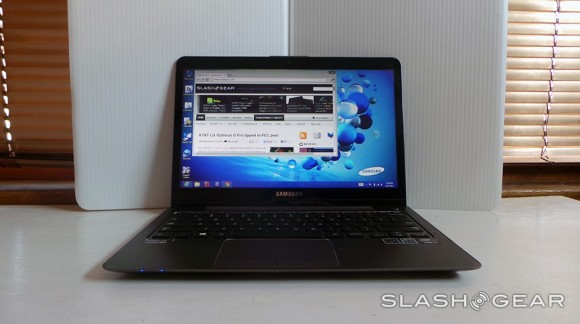
Throughout the entire Q1 2013 quarter, a total of 46 million laptops were shipped, so 4.57 million touchscreen variants certainly isn’t a lot, but with a healthy increase from the previous quarter, touchscreens in laptops are becoming more popular than ever. Most likely, the number of these kinds of laptops will only increase in the future.
Specifically, manufacturers like Lenovo, Acer and ASUS have set higher targets for themselves to achieve over 20% of touchscreen market share, which could be quite achievable, but it’s really only up to consumers who want to adopt touchscreens in their laptops. We already know Apple thinks that people don’t want them, but a 51.8% increase says otherwise.
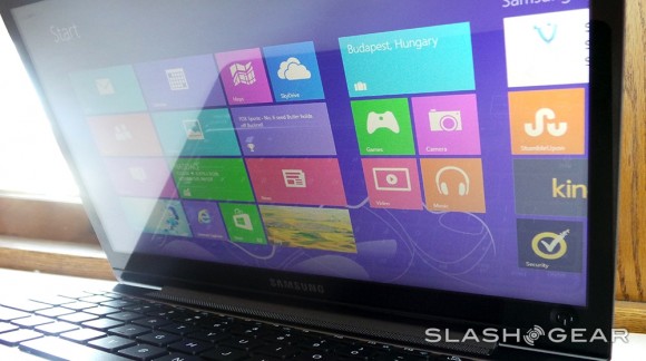
Much of the adoption of touchscreen technology in laptops is thanks to Windows 8, which includes a touchscreen-friendly start screen that you can swipe and navigate around using your fingers. Of course, the new operating system hasn’t received a lot of compliments lately, and its adoption rate is slightly slower than what Microsoft or PC makers were expecting, but most OEMs have added touchscreen laptops to their repertoire due in part to Windows 8.
Plus, as laptop prices get lower and lower, touchscreen laptops will become more affordable. Right now they’re quite on the pricey side, with a decent machine running over $1,000, but former Intel CEO Paul Otellini says that touchscreen laptops will break the $200 barrier in the near future, so the technology could eventually become the norm.
Thursday, July 12. 2012
Why the GUI Will Never Kill the Sacred Command Line
Via Wired
-----
He called himself “MSP,” and he appeared out of nowhere, launching a one-man flame war against a sacred cow of hardcore computing: the command line.
The venue was TuxRadar, a news and reviews site that shines a spotlight on the Linux operating system and other open source software. The site had just published a piece in praise of the command line — where you interact with a computer by passing it line after line of text, rather than using a graphical user interface, or GUI. “The command line isn’t a crusty, old-fashioned way to interact with a computer, made obsolete by GUIs, but rather a fantastically flexible and powerful way to perform tasks,” the site said.
Then MSP appeared with his flame thrower. “There seem to be a number of obvious errors in the introduction to this article,” he wrote. “The command line is a crusty, old-fashioned way to interact with a computer, made obsolete by GUIs, but a small hardcore of people who refuse to move on still use it.”
As he likely expected, the Linux-happy commenters at TuxRadar didn’t take kindly to his “corrections.” Dozens vehemently defended the command line, insisting it still has a very important place in the world of computing. And they’re right. Though the average computer user has no need for a command line, it’s still an essential tool for developers and system adminstrators who require access to guts of our machines — and it’s not going away anytime soon.
“People drive cars with steering wheels and gas pedals. Does that mean you don’t need wrenches?” says Rob Pike, who was part of the team at Bell Labs that developed the UNIX operating system and now works at Google, where he oversaw the creation of the Go programming language.
Back in ’70s and early ’80s, if you used a computer, you used a command line. DOS — the disk operating system that runs atop IBM PCs — used a command line interface, and that’s what UNIX used too. But then came the Apple Macintosh and Microsoft Windows, and by the mid-’90s, most of us had moved to GUIs. The GUI is more effective when you’re navigating an operating system you’re not exactly familiar with, but also when you’re typing large amounts of text. Your word processor, for instance, uses a WYSIWYG, or what-you-see-is-what-you-get graphical interface.
“Try creating a complex document in a mark-up language using a text editor,” writes one commenter on TuxRadar. “It can be done, but generally using a graphical WYSIWYG interface is a far faster and accurate approach.”
GUIs have even reinvented the world of software development, beginning with tools like Visual Basic, before extending coding tasks to the average joe with new-age tools such as Scratch and Google’s App Inventor.
But among hardcore computer types — i.e., the audience reading TuxRadar — the command line persists. If you’re a developer or a sysadmin, there are times when it makes more sense to use the command line interface, or “shell,” built into operating systems like Linux and UNIX. “It depends on what you’re doing,” Pike tells Wired. “All computing, at some level, is abstraction and yet deep down beneath there are hardware instructions doing the job. It depends on the level you’re working at.”
In some cases, command line interfaces provide access to lower levels of a machine’s software and hardware. And they’re often easier to manipulate with “scripts,” mini text programs that automate processes for system adminstrators and others.
“Anyone insisting the command line is a relic of a by-gone time is hopelessly deluded,” argues another commenter in the Tuxradar debate. “I have a very nice [desktop] set up at home, with lots of graphical applications, but I just find it quicker to write scripts and use the shell than to hunt through menus to find what I want.”
But in other cases, geeks like command lines just because you have to know what you’re doing to use it. You have to know the commands. You can’t hunt and peck like you do with a GUI.
Pike calls the kerfuffle sparked by MSP a “sterile debate.” But MSP insists that the command line should disappear. The problem, he writes, is that GUIs just aren’t as effective as they should be. “When people using a particular system say ‘the command line is better because it can do things you can’t do in the GUI’ they are not talking about the strengths of the command line interface, but about the shortcomings in the GUI,” he says.
OK. Fine. But until the GUI evolves again, the command is here to stay.
Thursday, February 02. 2012
Introducing the HUD. Say hello to the future of the menu.
-----
The desktop remains central to our everyday work and play, despite all the excitement around tablets, TV’s and phones. So it’s exciting for us to innovate in the desktop too, especially when we find ways to enhance the experience of both heavy “power” users and casual users at the same time. The desktop will be with us for a long time, and for those of us who spend hours every day using a wide diversity of applications, here is some very good news: 12.04 LTS will include the first step in a major new approach to application interfaces.
This work grows out of observations of new and established / sophisticated users making extensive use of the broader set of capabilities in their applications. We noticed that both groups of users spent a lot of time, relatively speaking, navigating the menus of their applications, either to learn about the capabilities of the app, or to take a specific action. We were also conscious of the broader theme in Unity design of leading from user intent. And that set us on a course which lead to today’s first public milestone on what we expect will be a long, fruitful and exciting journey.
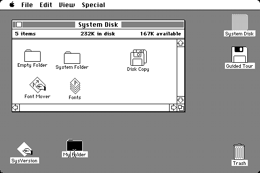
The menu has been a central part of the GUI since Xerox PARC invented ‘em in the 70?s. It’s the M in WIMP and has been there, essentially unchanged, for 30 years.
We can do much better!
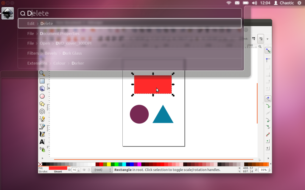
Say hello to the Head-Up Display, or HUD, which will ultimately replace menus in Unity applications. Here’s what we hope you’ll see in 12.04 when you invoke the HUD from any standard Ubuntu app that supports the global menu:
The intenterface – it maps your intent to the interface
This is the HUD. It’s a way for you to express your intent and have the application respond appropriately. We think of it as “beyond interface”, it’s the “intenterface”. This concept of “intent-driven interface” has been a primary theme of our work in the Unity shell, with dash search as a first class experience pioneered in Unity. Now we are bringing the same vision to the application, in a way which is completely compatible with existing applications and menus.
The HUD concept has been the driver for all the work we’ve done in unifying menu systems across Gtk, Qt and other toolkit apps in the past two years. So far, that’s shown up as the global menu. In 12.04, it also gives us the first cut of the HUD.
Menus serve two purposes. They act as a standard way to invoke commands which are too infrequently used to warrant a dedicated piece of UI real-estate, like a toolbar button, and they serve as a map of the app’s functionality, almost like a table of contents that one can scan to get a feel for ‘what the app does’. It’s command invocation that we think can be improved upon, and that’s where we are focusing our design exploration.
As a means of invoking commands, menus have some advantages. They are always in the same place (top of the window or screen). They are organised in a way that’s quite easy to describe over the phone, or in a text book (“click the Edit->Preferences menu”), they are pretty fast to read since they are generally arranged in tight vertical columns. They also have some disadvantages: when they get nested, navigating the tree can become fragile. They require you to read a lot when you probably already know what you want. They are more difficult to use from the keyboard than they should be, since they generally require you to remember something special (hotkeys) or use a very limited subset of the keyboard (arrow navigation). They force developers to make often arbitrary choices about the menu tree (“should Preferences be in Edit or in Tools or in Options?”), and then they force users to make equally arbitrary effort to memorise and navigate that tree.
The HUD solves many of these issues, by connecting users directly to what they want. Check out the video, based on a current prototype. It’s a “vocabulary UI”, or VUI, and closer to the way users think. “I told the application to…” is common user paraphrasing for “I clicked the menu to…”. The tree is no longer important, what’s important is the efficiency of the match between what the user says, and the commands we offer up for invocation.
In 12.04 LTS, the HUD is a smart look-ahead search through the app and system (indicator) menus. The image is showing Inkscape, but of course it works everywhere the global menu works. No app modifications are needed to get this level of experience. And you don’t have to adopt the HUD immediately, it’s there if you want it, supplementing the existing menu mechanism.
It’s smart, because it can do things like fuzzy matching, and it can learn what you usually do so it can prioritise the things you use often. It covers the focused app (because that’s where you probably want to act) as well as system functionality; you can change IM state, or go offline in Skype, all through the HUD, without changing focus, because those apps all talk to the indicator system. When you’ve been using it for a little while it seems like it’s reading your mind, in a good way.
We’ll resurrect the (boring) old ways of displaying the menu in 12.04, in the app and in the panel. In the past few releases of Ubuntu, we’ve actively diminished the visual presence of menus in anticipation of this landing. That proved controversial. In our defence, in user testing, every user finds the menu in the panel, every time, and it’s obviously a cleaner presentation of the interface. But hiding the menu before we had the replacement was overly aggressive. If the HUD lands in 12.04 LTS, we hope you’ll find yourself using the menu less and less, and be glad to have it hidden when you are not using it. You’ll definitely have that option, alongside more traditional menu styles.
Voice is the natural next step
Searching is fast and familiar, especially once we integrate voice recognition, gesture and touch. We want to make it easy to talk to any application, and for any application to respond to your voice. The full integration of voice into applications will take some time. We can start by mapping voice onto the existing menu structures of your apps. And it will only get better from there.
But even without voice input, the HUD is faster than mousing through a menu, and easier to use than hotkeys since you just have to know what you want, not remember a specific key combination. We can search through everything we know about the menu, including descriptive help text, so pretty soon you will be able to find a menu entry using only vaguely related text (imagine finding an entry called Preferences when you search for “settings”).
There is lots to discover, refine and implement. I have a feeling this will be a lot of fun in the next two years 
Even better for the power user
The results so far are rather interesting: power users say things
like “every GUI app now feels as powerful as VIM”. EMACS users just
grunt and… nevermind  . Another comment was “it works so well that the rare occasions when it
can’t read my mind are annoying!”. We’re doing a lot of user testing on
heavy multitaskers, developers and all-day-at-the-workstation personas
for Unity in 12.04, polishing off loose ends in the experience that
frustrated some in this audience in 11.04-10. If that describes you, the
results should be delightful. And the HUD should be particularly
empowering.
Even casual users find typing faster than mousing. So while there are modes of interaction where it’s nice to sit back and drive around with the mouse, we observe people staying more engaged and more focused on their task when they can keep their hands on the keyboard all the time. Hotkeys are a sort of mental gymnastics, the HUD is a continuation of mental flow.
Ahead of the competition
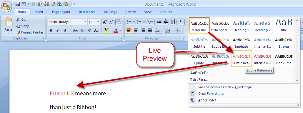
There are other teams interested in a similar problem space. Perhaps the best-known new alternative to the traditional menu is Microsoft’s Ribbon. Introduced first as part of a series of changes called Fluent UX in Office, the ribbon is now making its way to a wider set of Windows components and applications. It looks like this:
You can read about the ribbon from a supporter (like any UX change, it has its supporters and detractors  ) and if you’ve used it yourself, you will have your own opinion about
it. The ribbon is highly visual, making options and commands very
visible. It is however also a hog of space (I’m told it can be
minimised). Our goal in much of the Unity design has been to return
screen real estate to the content with which the user is working; the
HUD meets that goal by appearing only when invoked.
Instead of cluttering up the interface ALL the time, let’s clear out the chrome, and show users just what they want, when they want it.
Time will tell whether users prefer the ribbon, or the HUD, but we think it’s exciting enough to pursue and invest in, both in R&D and in supporting developers who want to take advantage of it.
Other relevant efforts include Enso and Ubiquity from the original Humanized team (hi Aza &co), then at Mozilla.
Our thinking is inspired by many works of science, art and entertainment; from Minority Report to Modern Warfare and Jef Raskin’s Humane Interface. We hope others will join us and accelerate the shift from pointy-clicky interfaces to natural and efficient ones.
Roadmap for the HUD
There’s still a lot of design and code still to do. For a start, we haven’t addressed the secondary aspect of the menu, as a visible map of the functionality in an app. That discoverability is of course entirely absent from the HUD; the old menu is still there for now, but we’d like to replace it altogether not just supplement it. And all the other patterns of interaction we expect in the HUD remain to be explored. Regardless, there is a great team working on this, including folk who understand Gtk and Qt such as Ted Gould, Ryan Lortie, Gord Allott and Aurelien Gateau, as well as designers Xi Zhu, Otto Greenslade, Oren Horev and John Lea. Thanks to all of them for getting this initial work to the point where we are confident it’s worthwhile for others to invest time in.
We’ll make sure it’s easy for developers working in any toolkit to take advantage of this and give their users a better experience. And we’ll promote the apps which do it best – it makes apps easier to use, it saves time and screen real-estate for users, and it creates a better impression of the free software platform when it’s done well.
From a code quality and testing perspective, even though we consider this first cut a prototype-grown-up, folk will be glad to see this:
Overall coverage rate:
   lines......: 87.1% (948 of 1089 lines)
   functions..: 97.7% (84 of 86 functions)
   branches...: 63.0% (407 of 646 branches)
Landing in 12.04 LTS is gated on more widespread testing. You can of course try this out from a PPA or branch the code in Launchpad (you will need these two branches). Or dig deeper with blogs on the topic from Ted Gould, Olli Ries and Gord Allott. Welcome to 2012 everybody!
Thursday, September 01. 2011
Microsoft explains Windows 8 dual-interface design
Via SlashGear
-----
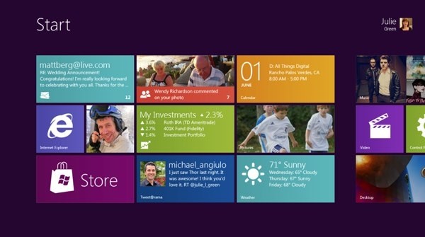
Microsoft Windows chief Steven Sinofsky has taken to the Building Windows 8 blog to explain the company’s decision to keep two interfaces: the traditional desktop UI and the more tablet-friendly Metro UI. His explanation seemed to be in response to criticism and confusion after the latest details were revealed on the new Windows 8 Explorer interface.
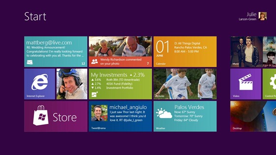
On Monday, details on the Windows 8 Explorer file manager interface were revealed showing what looked to be a very traditional Windows UI without any Metro elements. Reactions were mixed with many confused as to what direction Microsoft was heading with its Windows 8 interface. Well, Sinofsky is attempting to answer that and says that it is a “balancing act” of trying to get both interfaces working together harmoniously.
Sinofsky writes in his post:
Some of you are probably wondering how these parts work together to create a harmonious experience. Are there two user interfaces? Why not move on to a Metro style experience everywhere? On the other hand, others have been suggesting that Metro is only for tablets and touch, and we should avoid “dumbing down” Windows 8 with that design.
He proceeds to address each of these concerns, saying that the fluid and intuitive Metro interface is great on the tablet form factor, but when it comes down to getting serious work done, precision mouse and keyboard tools are still needed as well as the ability to run traditional applications. Hence, he explains that in the end they decided to bring the best of both worlds together for Windows 8.
With Windows 8 on a tablet, users can fully immerse themselves in the Metro UI and never see the desktop interface. In fact, the code for the desktop interface won’t even load. But, if the user needs to use the desktop interface, they can do so without needing to switch over to a laptop or other secondary device just for business or work.
A more detailed preview of Windows 8 is expected to take place during Microsoft’s Build developer conference in September. It’s been rumored that the first betas may be distributed to developers then along with a Windows 8 compatible hardware giveaway.
-----
Personal comments:
In order to complete the so-called 'Desktop Crisis' discussion, the point of view of Microsoft who has decided to avoid mixing functionalities between desktop's GUI and tablet's GUI.
The Subjectivity of Natural Scrolling
Tuesday, August 09. 2011
The Subjectivity of Natural Scrolling
Via Slash Gear
-----
Apple released its new OS X Lion for Mac computers recently, and there was one controversial change that had the technorati chatting nonstop. In the new Lion OS, Apple changed the direction of scrolling. I use a MacBook Pro (among other machines, I’m OS agnostic). On my MacBook, I scroll by placing two fingers on the trackpad and moving them up or down. On the old system, moving my fingers down meant the object on the screen moved up. My fingers are controlling the scroll bars. Moving down means I am pulling the scroll bars down, revealing more of the page below what is visible. So, the object moves upwards. On the new system, moving my fingers down meant the object on screen moves down. My fingers are now controlling the object. If I want the object to move up, and reveal more of what is beneath, I move my fingers up, and content rises on screen.
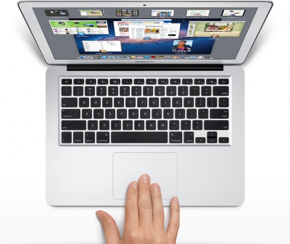
The scroll bars are still there, but Apple has, by default, hidden them in many apps. You can make them reappear by hunting through the settings menu and turning them back on, but when they do come back, they are much thinner than they used to be, without the arrows at the top and bottom. They are also a bit buggy at the moment. If I try to click and drag the scrolling indicator, the page often jumps around, as if I had missed and clicked on the empty space above or below the scroll bar instead of directly on it. This doesn’t always happen, but it happens often enough that I have trained myself to avoid using the scroll bars this way.
 So, the scroll bars, for now, are simply a visual indicator of where my view is located on a long or wide page. Clearly Apple does not think this information is terribly important, or else scroll bars would be turned on by default. As with the scroll bars, you can also hunt through the settings menu to turn off the new, so-called “natural scrolling.” This will bring you back to the method preferred on older Apple OSes, and also on Windows machines.
Some disclosure: my day job is working for Samsung. We make Windows computers that compete with Macs. I work in the phones division, but my work machine is a Samsung laptop running Windows. My MacBook is a holdover from my days as a tech journalist. When you become a tech journalist, you are issued a MacBook by force and stripped of whatever you were using before.
"Natural scrolling will seem familiar to those of you not frozen in an iceberg since World War II"I am not criticizing or endorsing Apple’s new natural scrolling in this column. In fact, in my own usage, there are times when I like it, and times when I don’t. Those emotions are usually found in direct proportion to the amount of NyQuil I took the night before and how hot it was outside when I walked my dog. I have found no other correlation.
The new natural scrolling method will probably seem familiar to those of you not frozen in an iceberg since World War II. It is the same direction you use for scrolling on most touchscreen phones, and most tablets. Not all, of course. Some phones and tablets still use styli, and these phone often let you scroll by dragging scroll bars with the pointer. But if you have an Android or an iPhone or a Windows Phone, you’re familiar with the new method.
My real interest here is to examine how the user is placed in the conversation between your fingers and the object on screen. I have heard the argument that the new method tries, and perhaps fails, to emulate the touchscreen experience by manipulating objects as if they were physical. On touchscreen phones, this is certainly the case. When we touch something on screen, like an icon or a list, we expect it to react in a physical way. When I drag my finger to the right, I want the object beneath to move with my finger, just as a piece of paper would move with my finger when I drag it.
This argument postulates a problem with Apple’s natural scrolling because of the literal distance between your fingers and the objects on screen. Also, the angle has changed. The plane of your hands and the surface on which they rest are at an oblique angle of more than 90 degrees from the screen and the object at hand.
Think of a magic wand. When you wave a magic wand with the tip facing out before you, do you imagine the spell shooting forth parallel to the ground, or do you imagine the spell shooting directly upward? In our imagination, we do want a direct correlation between the position of our hands and the reaction on screen, this is true. However, is this what we were getting before? Not really.
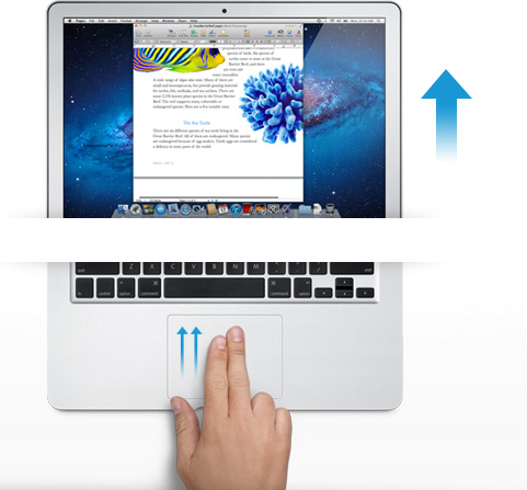
The difference between classic scrolling and ‘natural’ scrolling seems to be the difference between manipulating a concept and manipulating an object. Scroll bars are not real, or at least they do not correspond to any real thing that we would experience in the physical world. When you read a tabloid, you do not scroll down to see the rest of the story. You move your eyes. If the paper will not fit comfortably in your hands, you fold it. But scrolling is not like folding. It is smoother. It is continuous. Folding is a way of breaking the object into two conceptual halves. Ask a print newspaper reporter (and I will refrain from old media mockery here) about the part of the story that falls “beneath the fold.” That part better not be as important as the top half, because it may never get read.
Natural scrolling correlates more strongly to moving an actual object. It is like reading a newspaper on a table. Some of the newspaper may extend over the edge of the table and bend downward, making it unreadable. When you want to read it, you move the paper upward. In the same way, when you want to read more of the NYTimes.com site, you move your fingers upward.
"Is it better to create objects on screen that appropriate the form of their physical world counterparts?"The argument should not be over whether one is more natural than the other. Let us not forget that we are using an electronic machine. This is not a natural object. The content onscreen is only real insofar as pixels light up and are arranged into a recognizable pattern. Those words are not real, they are the absence of light, in varying degrees if you have anti-aliasing cranked up, around recognizable patterns that our eyes and brain interpret as letters and words.
The argument should be over which is the more successful design for a laptop or desktop operating system. Is it better to create objects on screen that appropriate the form of their physical world counterparts? Should a page in Microsoft Word look like a piece of paper? Should an icon for a hard disk drive look like a hard disk? What percentage of people using a computer have actually seen a hard disk drive? What if your new ultraportable laptop uses a set of interconnected solid state memory chips instead? Does the drive icon still look like a drive?
Or is it better to create objects on screen that do not hew to the physical world? Certainly their form should suggest their function in order to be intuitive and useful, but they do not have to be photorealistic interpretations. They can suggest function through a more abstract image, or simply by their placement and arrangement.
"How should we represent a Web browser, a feature that has no counterpart in real life?"In the former system, the computer interface becomes a part of the users world. The interface tries to fit in with symbols that are already familiar. I know what a printer looks like, so when I want to set up my new printer, I find the picture of the printer and I click on it. My email icon is a stamp. My music player icon is a CD. Wait, where did my CD go? I can’t find my CD?! What happened to my music!?!? Oh, there it is. Now it’s just a circle with a musical note. I guess that makes sense, since I hardly use CDs any more.
In the latter system, the user becomes part of the interface. I have to learn the language of the interface design. This may sound like it is automatically more difficult than the former method of photorealism, but that may not be true. After all, when I want to change the brightness of my display, will my instinct really be to search for a picture of a cog and gears? And how should we represent a Web browser, a feature that has no counterpart in real life? Are we wasting processing power and time trying to create objects that look three dimensional on a two dimensional screen in a 2D space?
I think the photorealistic approach, and Apple’s new natural scrolling, may be the more personal way to design an interface. Apple is clearly thinking of the intimate relationship between the user and the objects that we touch. It is literally a sensual relationship, in that we use a variety of our senses. We touch. We listen. We see.
But perhaps I do not need, nor do I want, to have this relationship with my work computer. I carry my phone with me everywhere. I keep my tablet very close to me when I am using it. With my laptop, I keep some distance. I am productive. We have a lot to get done.
Monday, August 01. 2011
Switched On: Desktop divergence
Via Engadget
By Ross Rubin
-----
Last week's Switched On discussed
how Lion's feature set could be perceived differently by new users or
those coming from an iPad versus those who have used Macs for some time,
while a previous Switched On discussed
how Microsoft is preparing for a similar transition in Windows 8. Both
OS X Lion and Windows 8 seek to mix elements of a tablet UI with
elements of a desktop UI or -- putting it another way -- a
finger-friendly touch interface with a mouse-driven interface. If Apple
and Microsoft could wave a wand and magically have all apps adopt
overnight so they could leave a keyboard and mouse behind, they probably
would. Since they can't, though, inconsistency prevails.
Yet, while the OS X-iOS mashup that is Lion
exhibits is share of growing pains, the fall-off effect isn't as
pronounced as it appears it will be for Windows 8. The main reasons for
this are, in order of increasing importance, legacy, hardware, and
Metro.
Legacy. Microsoft has an incredibly strong commitment
to backward compatibility. As long as Microsoft supports older Windows
apps (which will be well into the future), there will be a more
pronounced gap between that old user interface and the new. This will
likely become more of a difference between Microsoft and Apple over
time. For now, however, Apple is also treading lightly, and several of
Lion's user interface changes -- including "natural" scrolling
directions, Dashboard as a space, and the hiding of the hard drive on
the desktop -- can be reversed. Even some of Lion's "full-screen" apps
are only a cursor movement away from revealing their menus.
Hardware. As Apple continues to keep touchscreens off
the Mac, it brings over the look but not the input experience of iPad
apps, relying instead on the precision of a mouse or trackpad.
Therefore, these Mac apps do not have to embrace finger-friendliness. In
contrast, the "tablet" UI of Windows 8 is designed for fingertips and
therefore demands a cleaner break with an interface designed for mice
(although Microsoft preserves pointer control as well so these apps can
be used on PCs without touchscreens).
Metro. A late entrant to the gesture-driven touchscreen
handset wars, Microsoft sought to differentiate Windows Phone 7 with
its panoramic user interface. When Joe Belfiore introduced
Windows Phone 7 at Mobile World Congress in 2010, he repeatedly noted
that "the phone is not a PC." That's an accurate assessment, and perhaps
one worth repeating in light of all the feedback
Microsoft ignored over the years in the design of Pocket PC and Windows
Mobile. It also of couse holds true beond the user interface for design
around context and support of location-based services.
But now that the folks in Redmond have created an enjoyable phone
interface, have things actually changed? Was it true only that the phone
and PC shoud not have the same old Windows interface, or is it also
still true that the PC and phone should not have the same new Windows
Phone interface? Was it the nature of the user interface itself that was
at fault, or the notion of the same user interface across PC and phone
regardless of how good it is?
There is certainly room for more consistency across PCs, tablets and
handsets. However, Microsoft did not just differentiate Windows Phone 7
from iOS and Android, it differentiated it from Windows as well. And that
is the main reason why the shift in context between a classic Windows
app and a "tablet" Windows 8 app seems more striking at this point than
the difference between a classic Mac app and "full screen" Lion app.
Lion's full-screen apps could be the new point of crossover with Windows
8's "tablet" user interface mode. Based on what we've seen on the
handset side, it is certainly possible for developers to write the same
apps for the iPhone and Windows Phone 7, but these are generally simpler
apps (and then there are games, which generally ignore most user
interface conventions anyway).
Apple and Microsoft are both clearly striving for a simpler user
experience, but Microsoft is also trying to adapt its desktop OS to a
new form factor in the process of doing so. The balancing act for both
companies will be making their new combinations of software and hardware
(from partners in the case of Microsoft) embrace a new generation of
users while minimizing alienation for the existing one.
-----
Personal comments:
See also this article
Quicksearch
Popular Entries
- The great Ars Android interface shootout (131026)
- Norton cyber crime study offers striking revenue loss statistics (101637)
- MeCam $49 flying camera concept follows you around, streams video to your phone (100042)
- Norton cyber crime study offers striking revenue loss statistics (57866)
- The PC inside your phone: A guide to the system-on-a-chip (57427)
Categories
Show tagged entries
Syndicate This Blog
Calendar
|
|
February '26 | |||||
| Mon | Tue | Wed | Thu | Fri | Sat | Sun |
| 1 | ||||||
| 2 | 3 | 4 | 5 | 6 | 7 | 8 |
| 9 | 10 | 11 | 12 | 13 | 14 | 15 |
| 16 | 17 | 18 | 19 | 20 | 21 | 22 |
| 23 | 24 | 25 | 26 | 27 | 28 | |


